library(tidyverse)
library(ggbeeswarm)
library(ggrepel)
library(scales)
library(lme4) # for the sleepstudy dataset3 Understanding Your Data
ggplot has a lot to offer, and you can create many, many kinds of plots. This page will focus on a select few that you can use to understand your data. During our exploration and wrangling of our data, we will ask questions like these:
- How are the continuous variables distributed? Are they normal-ish? Skewed?
- What is the relationship between the continuous variables? Is a trend apparent?
- What are the counts for each level of the categorical variables? Were some observed much more than others?
- How are the continuous variables distributed within each level of the categorical variables? Are the distributions roughly the same, or do they vary considerably?
- Are any observations outliers? How can I identify them?
We will answer these questions and more in this page, and the exercises at the bottom allow you to practice answering them on your own with another dataset.
To begin, load the libraries necessary for this page:
3.1 Say cheese
The dataset we will explore for most of this page is about cheese. It has the characteristics of 922 kinds of cheese, pulled originally from cheese.com and then wrangled into a more usable format.
Download the data here by clicking here and then importing it into R with this line:
cheese <- readRDS("cheese.rds")Or, you may import it directly into R directly with this line:
cheese <- readRDS(url("https://www.sscc.wisc.edu/sscc/pubs/dvresearch/data/cheese.rds"))Its variables are as follows:
glimpse(cheese)Rows: 922
Columns: 19
$ cheese <chr> "Aarewasser", "Abbaye de Belloc", "Abbaye de Belva…
$ country <chr> "Switzerland", "France", "France", "France", "Fran…
$ family <chr> NA, NA, NA, NA, NA, NA, NA, "Cheddar", NA, NA, NA,…
$ fat_content_percent <dbl> NA, NA, 40, NA, NA, NA, 50, NA, 45, NA, NA, NA, 52…
$ calcium_content_mg <dbl> NA, NA, NA, NA, NA, NA, NA, NA, NA, NA, NA, NA, NA…
$ rind <fct> washed, natural, washed, washed, washed, washed, w…
$ color <fct> yellow, yellow, ivory, white, white, pale yellow, …
$ hardness <fct> semi-soft, semi-hard, semi-hard, semi-soft, soft, …
$ vegetarian <dbl> 0, 1, 0, 0, 0, 0, 0, 1, 0, 0, 0, 0, 1, NA, NA, NA,…
$ vegan <dbl> 0, 0, 0, 0, 0, 0, 0, 0, 0, 0, 0, 0, 0, NA, NA, NA,…
$ milk_cow <dbl> 1, 0, 1, 1, 1, 1, 1, 1, 0, 1, 1, 1, 0, 1, 1, 1, 1,…
$ milk_sheep <dbl> 0, 1, 0, 0, 0, 0, 0, 0, 1, 0, 0, 1, 1, 0, 0, 0, 0,…
$ milk_goat <dbl> 0, 0, 0, 0, 0, 0, 0, 0, 0, 0, 0, 1, 0, 0, 0, 0, 0,…
$ milk_buffalo <dbl> 0, 0, 0, 0, 0, 0, 0, 0, 0, 0, 1, 0, 0, 0, 0, 0, 0,…
$ milk_water_buffalo <dbl> 0, 0, 0, 0, 0, 0, 0, 0, 0, 0, 0, 0, 0, 0, 0, 0, 0,…
$ milk_plant_based <dbl> 0, 0, 0, 0, 0, 0, 0, 0, 0, 0, 0, 0, 0, 0, 0, 0, 0,…
$ milk_yak <dbl> 0, 0, 0, 0, 0, 0, 0, 0, 0, 0, 0, 0, 0, 0, 0, 0, 0,…
$ milk_camel <dbl> 0, 0, 0, 0, 0, 0, 0, 0, 0, 0, 0, 0, 0, 0, 0, 0, 0,…
$ milk_moose <dbl> 0, 0, 0, 0, 0, 0, 0, 0, 0, 0, 0, 0, 0, 0, 0, 0, 0,…In this dataset, each row is a type of cheese, and the columns give characteristics of that cheese:
cheese: the name of the cheesecountry: the country or countries where it is producedfamily: the family the particular cheese belongs to (e.g., cheddar)fat_content_percent: the minimum percentage of this cheese that is fatcalcium_content_mg: how much calcium, in mg, is present per 100 g of cheeserind: the type of rind, where only the 5 most common types are shown and the others have been combined into “other”color: the color of the cheese, where only the 4 most common colors are shown and the others have been combined into “other”vegetarianandvegan: indicators whether the cheese is vegetarian or veganmilk_*: indicators whether a certain milk can be used to make the cheese; these are not exclusive, in that a cheese may be made with any one of several types of milk, or a combination of multiple milks
When we look at our variable types, we can sort our variables into a few categories:
- Continuous
- The type is numeric and it can take on many values
fat_content_percent,calcium_content_mg
- Categorical
- The type can be factor, character, or numeric (for binary or integer data with few values)
family,rind,color,vegetarian,vegan,milk_*
- Data only useful in identifying observations because each value is unique
cheese
- Data that could be useful if we wrangle it more
countryis comma-separated within a column. We would need to first split it up with a function likeseparate_wider_delim()orseparate_longer_delim(). “Canada, United States” is considered distinct from both “Canada” and “United States” at this point because they are different strings. Here we might want to have a series of indicators, as we already have with the types of milk.
3.2 Show distributions and trends
We can use ggplot to explore and get a sense of our data. We are not running any statistical tests yet, so any apparent differences or trends may or may not be statistically significant. We are simply checking our variables to understand their distributions, the presence and/or directions of trends, counts by categories, and the presence of outliers.
This section is organized by the kind(s) of variables and number of variables we want to visualize.
3.2.1 One continuous
First, to understand the distribution of a continuous variable, use a density plot or histogram.
Make a density plot of fat_content_percent with geom_density():
ggplot(cheese,
       aes(x = fat_content_percent)) +
  geom_density()
Warning: Removed 674 rows containing non-finite outside the scale range
(`stat_density()`).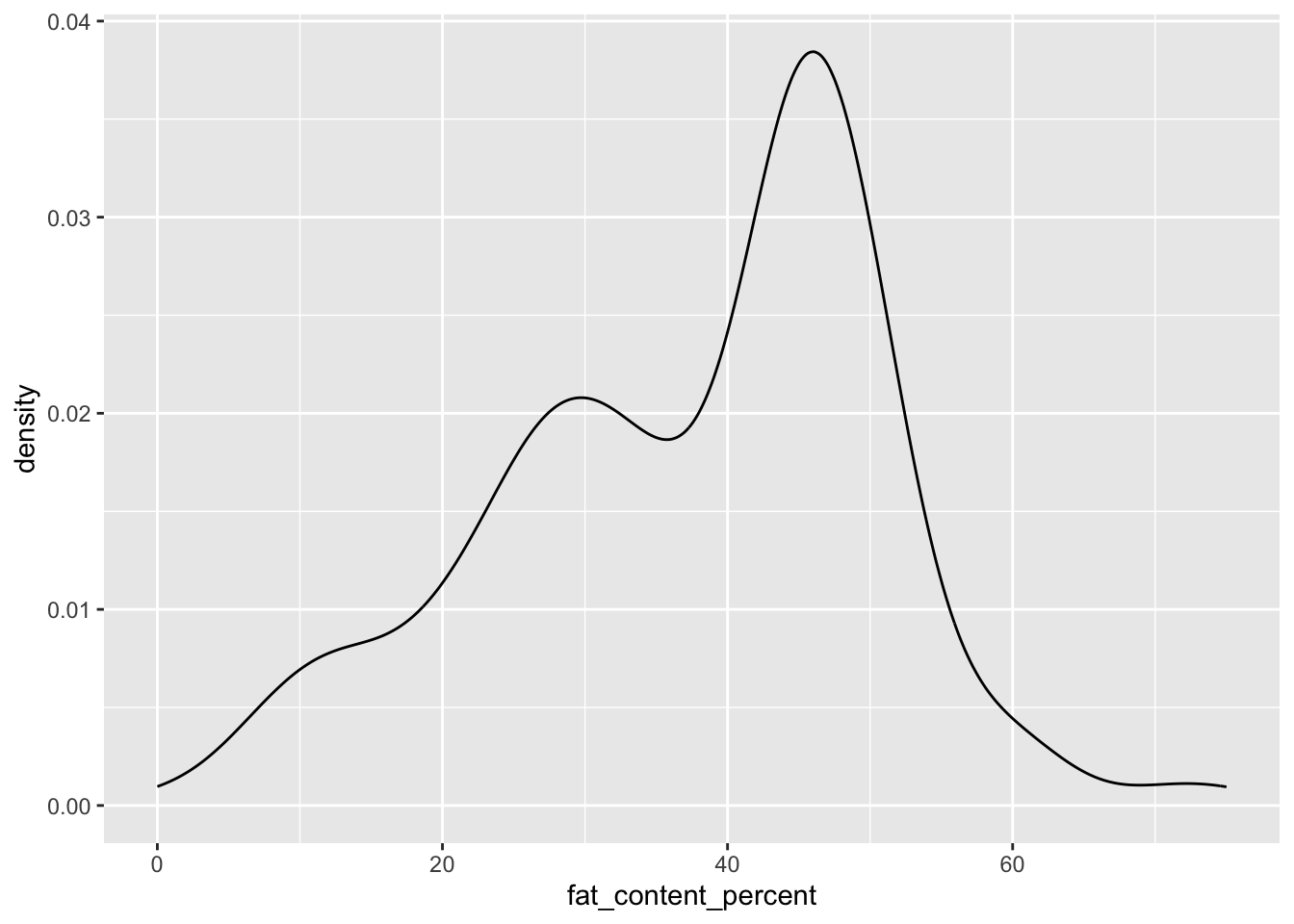
(We can ignore the scale on the y-axis. Density plots are scaled so that the area under the curve is 1, so it does not tell us anything more than the scale of the x variable.)
We see from the warning message that a lot of values in fat_content_percent are missing. When a continuous variable’s value is NA, it is dropped from the plot.
We can learn a few things about the distribution of this variable. Almost all of its values are 10-60, the most common values are in the 40s and 50s, and the distribution is left-skewed.
Now, try a histogram with geom_histogram():
ggplot(cheese,
       aes(x = fat_content_percent)) +
  geom_histogram()
`stat_bin()` using `bins = 30`. Pick better value `binwidth`.Warning: Removed 674 rows containing non-finite outside the scale range
(`stat_bin()`).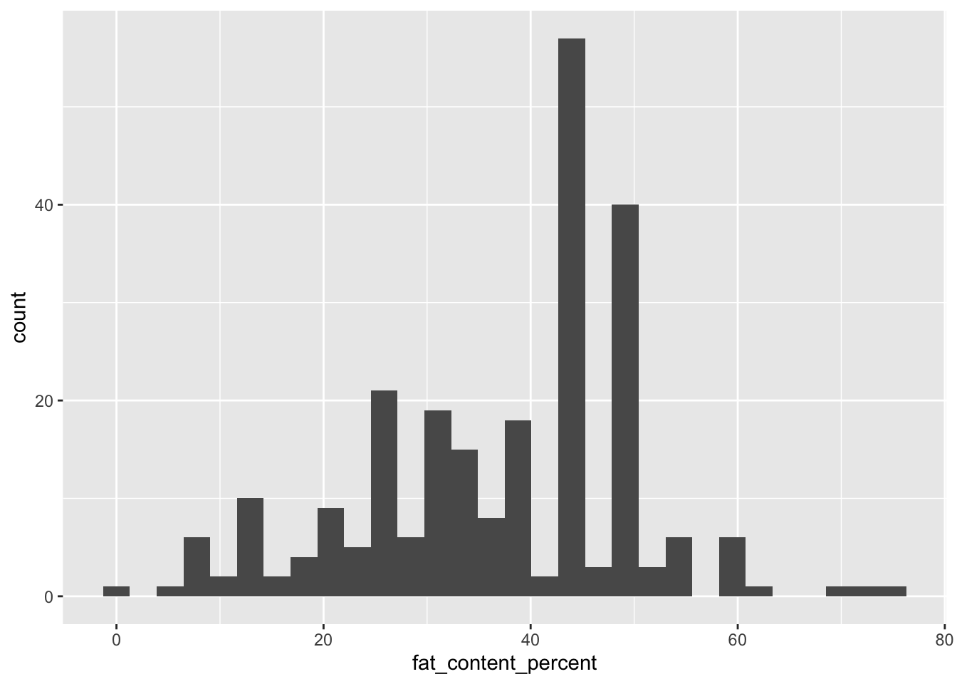
We can observe an odd pattern in this histogram. Tall and short bars alternate throughout, particularly in the 40s and 50s. Why?
Take a subset of the data where fat_content_percent is in the range 40-60:
cheese |>
  count(fat_content_percent) |>
  filter(fat_content_percent >= 40,
         fat_content_percent <= 60)
# A tibble: 16 × 2
fat_content_percent n
<dbl> <int>
1 40 16
2 40.5 1
3 42 1
4 43 1
5 43.3 2
6 45 54
7 46 3
8 48 10
9 49 1
10 50 29
11 51 2
12 52 1
13 54 1
14 54.2 1
15 55 4
16 60 6There is a tendency to use numbers divisible by 5. 40, 45, and 50 are far more common than anything in between.
We learned something about the data! This will be useful to keep in mind if we later model the data and have to make a decision about how continuous this variable really is. It may lead to violations of some assumptions about residual distributions.
3.2.2 Two continuous
For two continuous variables, make a scatterplot with geom_point(). Plot fat_content_percent as x and calcium_content_mg as y:
ggplot(cheese,
       aes(x = fat_content_percent,
           y = calcium_content_mg)) +
  geom_point()
Warning: Removed 898 rows containing missing values or values outside the scale range
(`geom_point()`).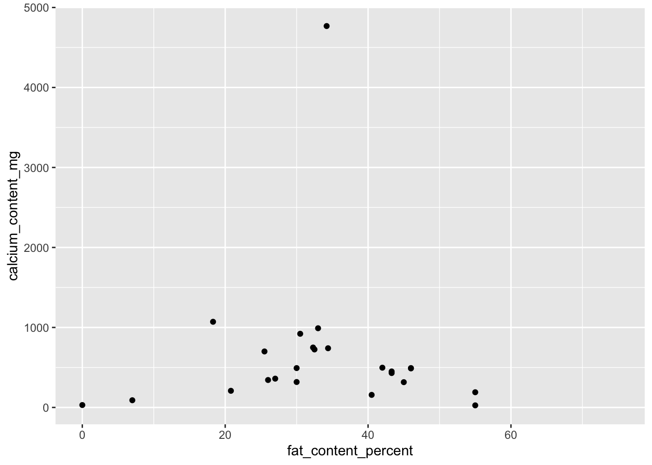
calcium_content_mg has even more missing values than fat_content_percent, and rows where they are both observed are fewer still. Nevertheless, we can learn a couple things about this bivariate distribution:
calcium_content_mgtends to be higher for cheeses with more average levels offat_content_percent(20-50), while cheeses with values ofcalcium_content_mgat the extremes (<10 or >50) tend to have lower values- There is an outlier for
calcium_content_mg, with nearly 5000 mg / 100 g. We will revisit this plot in the Identify Outliers section below.
For the first point, to get a better sense of the trend between the two variables, whether y rises, falls, or does something else as x increases, add a smoothed mean line with geom_smooth():
ggplot(cheese,
       aes(x = fat_content_percent, y = calcium_content_mg)) +
  geom_point() +
  geom_smooth()
`geom_smooth()` using method = 'loess' and formula = 'y ~ x'Warning: Removed 898 rows containing non-finite outside the scale range
(`stat_smooth()`).Warning: Removed 898 rows containing missing values or values outside the scale range
(`geom_point()`).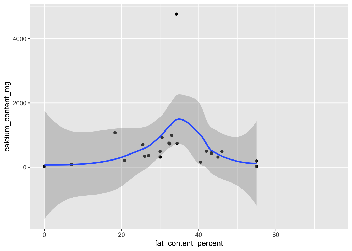
What do we learn from this plot?
The semi-transparent gray area around the blue mean line is a 95% confidence band. The width of the band suggests we are very uncertain about the mean. The rising and falling is partly from the majority of the data, how it peaks in the 30s, and partly from the outlier pulling the regression line up.
The wide confidence band and shape of the mean line together these warn us against trying to fit any sort of linear model to the data. The relationship is nonlinear, and the outlier exerts undue influence on the regression line.
3.2.3 One categorical
For a single categorical variable, view counts by category with geom_bar():
ggplot(cheese,
       aes(x = hardness)) +
  geom_bar()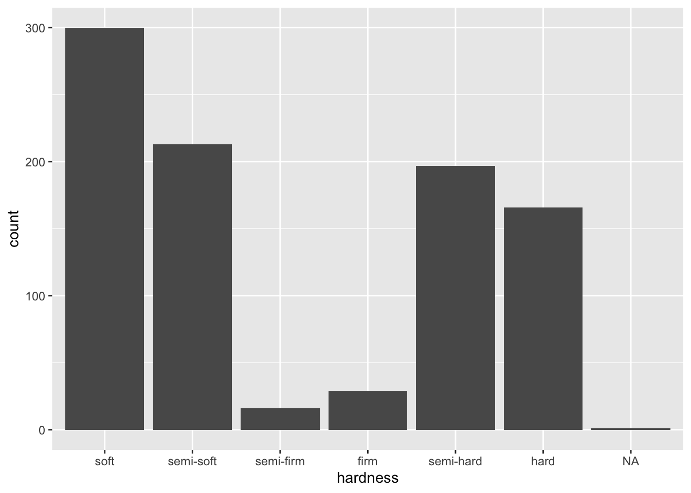
While NAs are omitted from continuous data, they are included with categorical data. We can drop them with a filter() before passing cheese to ggplot():
cheese |>
  filter(!is.na(hardness)) |>
  ggplot(aes(x = hardness)) +
  geom_bar()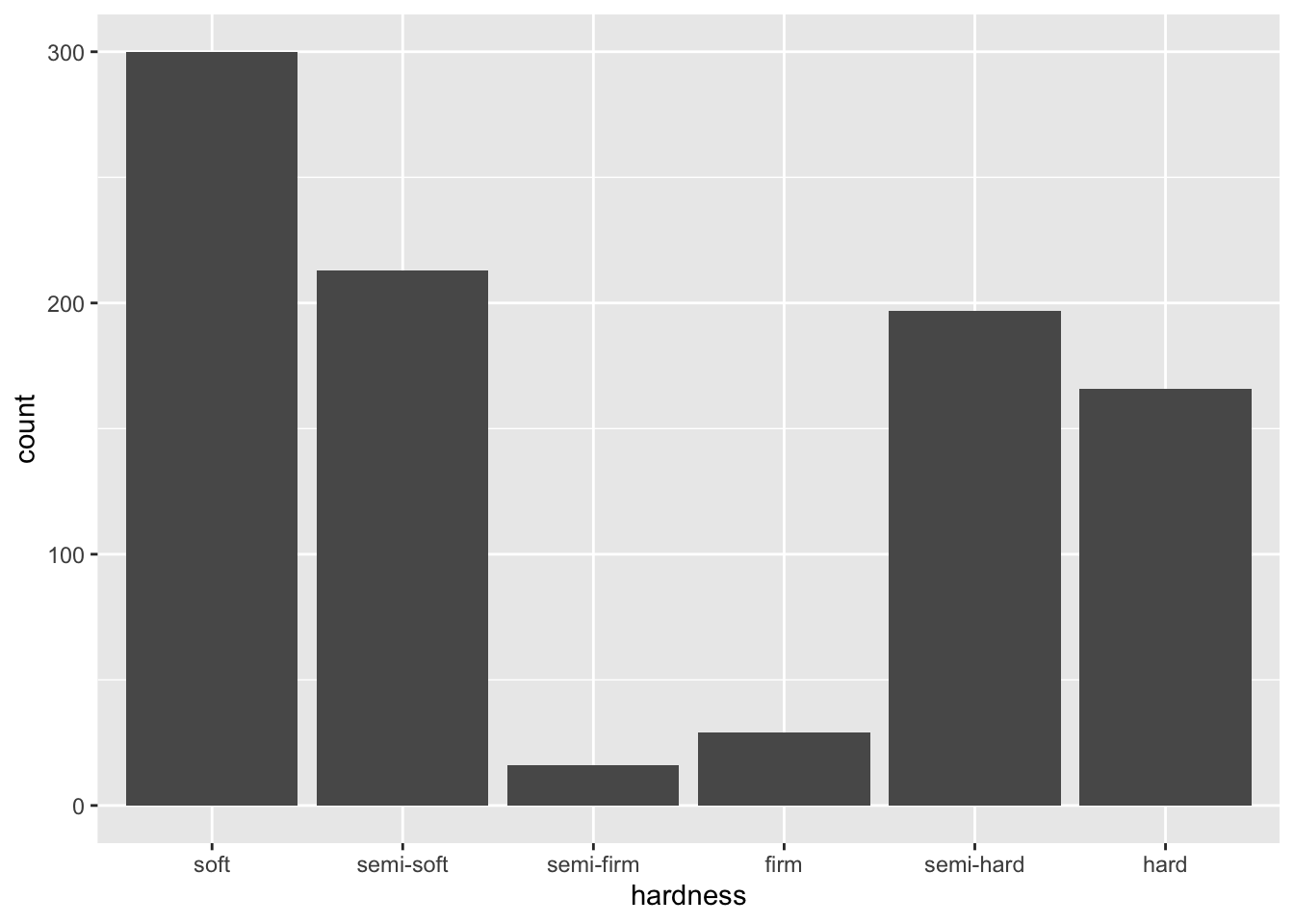
Here we learn that soft and hard cheeses are far more common than firm cheeses.
3.2.4 Two categorical
With two categorical variables, we can visualize the counts for each pair of their levels.
We can break the hardness plot above down by whether the cheese is made with cow’s milk (milk_cow). Because milk_cow is conceptually categorical but coded as numeric, we need to tell R it is categorical first. The simplest way to do that is to wrap it in factor(). If we do not do that, we will either get an error or a very strange plot.
Set milk_cow to the fill aesthetic, so that we get differently colored bars for the two values of milk_cow:
cheese |>
  filter(!is.na(hardness)) |>
  ggplot(aes(x = hardness,
             fill = factor(milk_cow))) +
  geom_bar()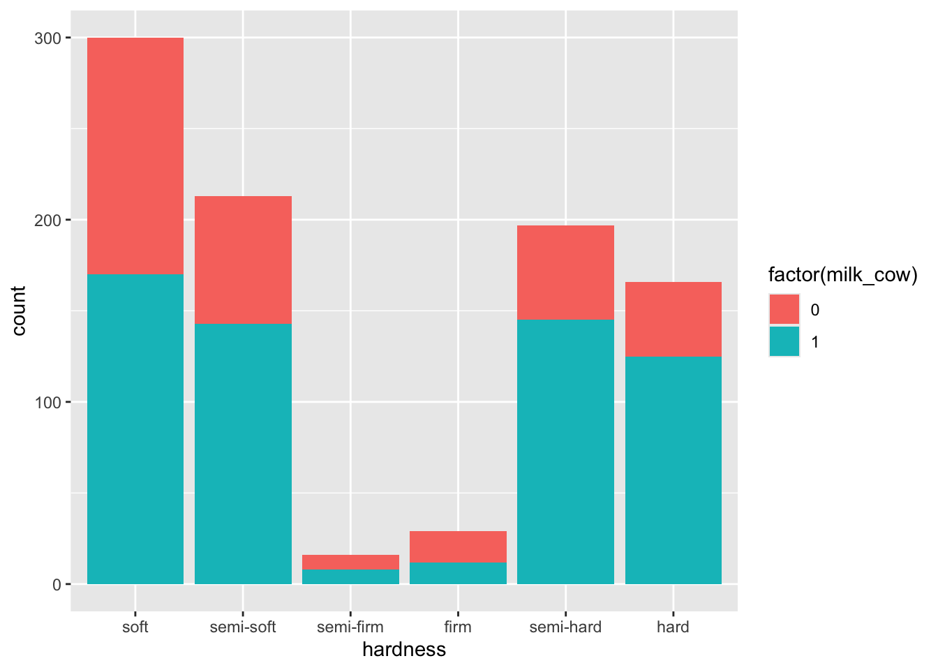
We successfully made a plot, but that legend has problems. The title is only understandable to an R user, and the 0/1 values are only understandable to somebody who has worked with this particular dataset, though others may be able to make an educated guess. We will learn how to fix legends like this in the chapter on Useful Customizations.
One customization we will allow ourselves at the moment is to change the color scheme. We prefer black-and-white plots because journals either require them or may charge extra for color.
To do that,
- Add a black border around each bar to better distinguish them with
color = "black"insidegeom_bar() - Add on
scale_fill_grey()to force grayscale.
cheese |>
  filter(!is.na(hardness)) |>
  ggplot(aes(x = hardness,
             fill = factor(milk_cow))) +
  geom_bar(color = "black") +
  scale_fill_grey()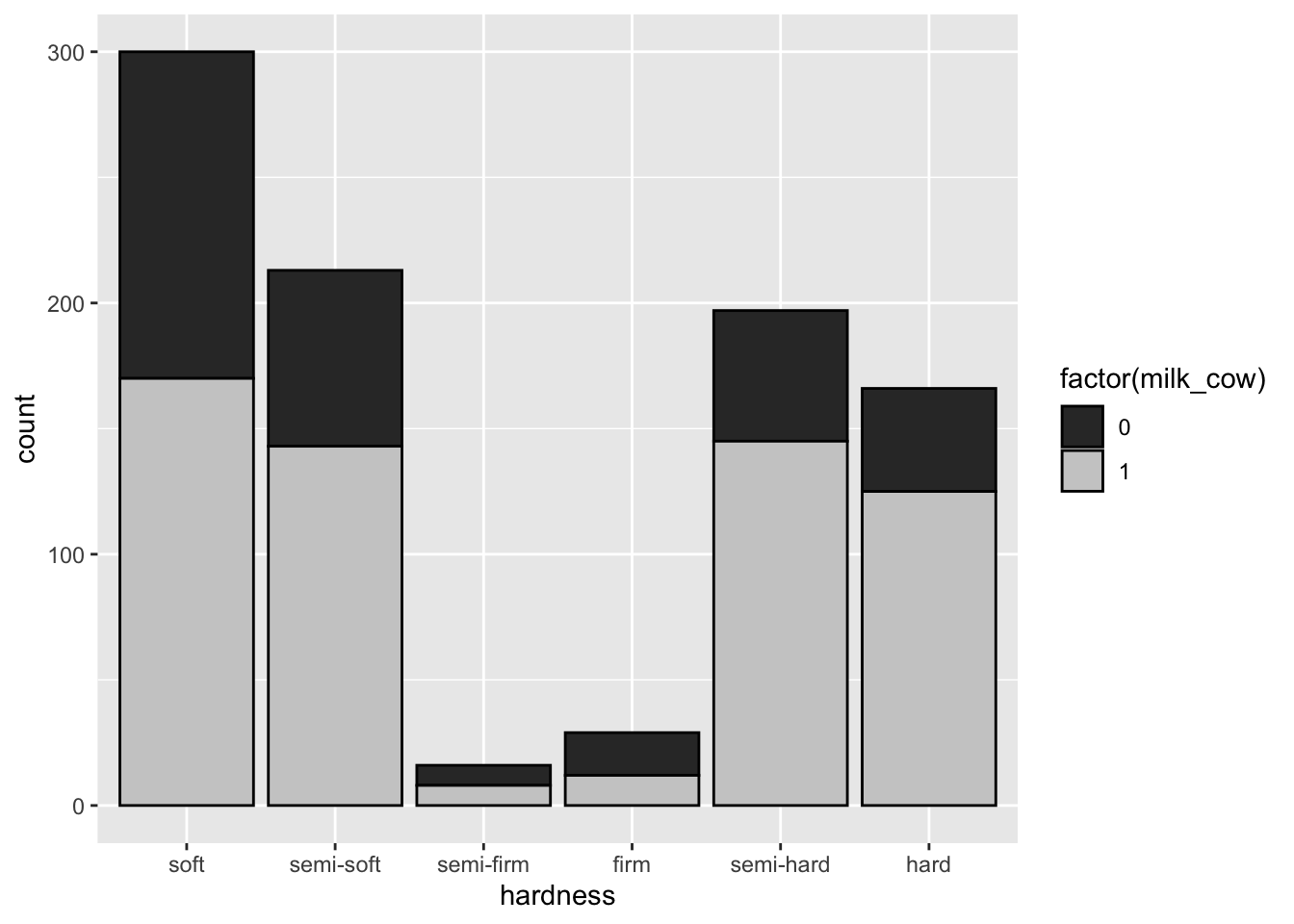
This is called a stacked bar chart. An advantage is that it still allows us to compare the total counts by the x variable (hardness), but we have trouble comparing counts within the subcategories of milk_cow across hardness.
We can pivot to using a dodged bar chart by adding position = "dodge" within geom_bar():
cheese |>
  filter(!is.na(hardness)) |>
  ggplot(aes(x = hardness,
             fill = factor(milk_cow))) +
  geom_bar(color = "black",
           position = "dodge") +
  scale_fill_grey()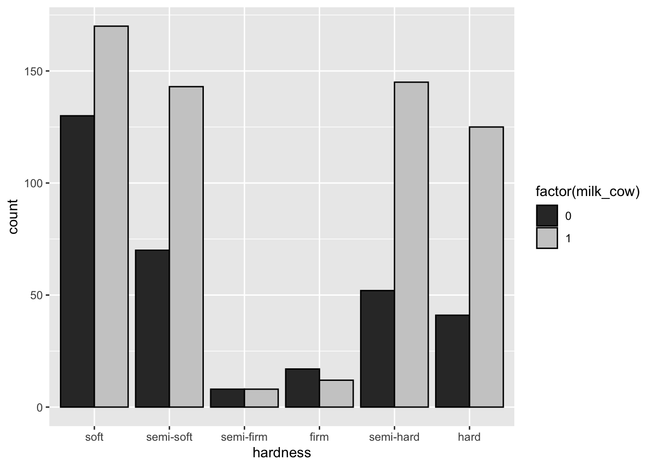
Now all bars start at the bottom of the y-axis, so we can better compare counts across categories. We can get a good idea of counts of whether cheeses of various hardnesses are made with cow’s milk, that cow’s milk is generally more popular than other milks for all hardnesses of cheese.
But, how do the relative counts compare across hardnesses? Is the proportion of soft cheeses made with cow’s milk higher or lower than the proportion of hard cheeses made with cow’s milk?
To answer that question
- Change
position = "dodge"toposition = "fill"insidegeom_bar() - Change the labels with
scale_y_continuous(labels = percent)to show percents (otherwise it will range 0-1)
cheese |>
  filter(!is.na(hardness)) |>
  ggplot(aes(x = hardness, fill = factor(milk_cow))) +
  geom_bar(color = "black", position = "fill") +
  scale_fill_grey() +
  scale_y_continuous(labels = percent)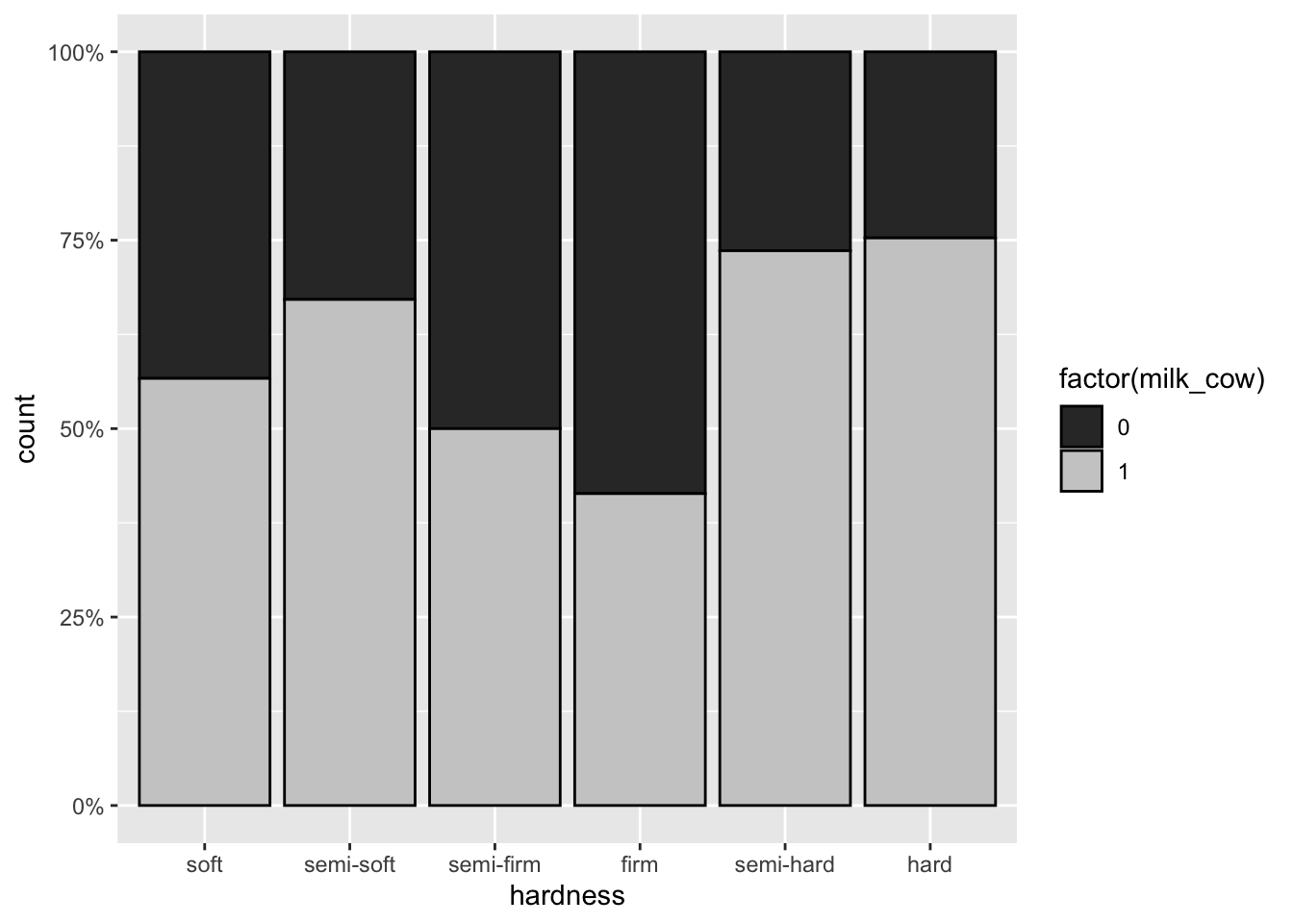
With this plot we learn even more about our cheese data:
- Half or fewer of semi-firm and firm cheeses are made with cow’s milk
- A higher proportion of semi-hard and hard cheeses are made with cow’s milk, compared with soft and semi-soft cheeses. This was previously masked because the overall counts of soft cheeses are higher than those of hard cheeses.
3.2.5 One continuous and one categorical
With one continuous and one categorical variable, we can view how the distribution of a continuous variable varies across the levels of a categorical variable.
When we think about the distribution of a variable, we typically consider two statistics:
- A measure of central tendency, like the mean or median
- A measure of spread, like the variance, range, or confidence interval
Therefore, we should never use a bar chart to simply display the mean of a continuous variable by category, even if we also include an error bar, because this representation conceals rather than reveals the distribution of the data.1
As an exaggerated heuristic, see this example where the distribution of a continuous variable (value) varies considerably across the values of a categorical variable (group), but the group means are fairly similar.
First, simulate the data:
set.seed(555)

n <- 100

dat <-
  data.frame(group = rep(LETTERS[1:3], each = n),
             value =
               c(rnorm(n, mean = 4),
                 rnorm(n/2, mean = 0), rnorm(n/2, mean = 8),
                 rgamma(n, shape = 2, rate = .5)))
Observe how different the distributions by group are:
ggplot(dat, aes(x = value)) +
  geom_density() +
  facet_wrap(~ group)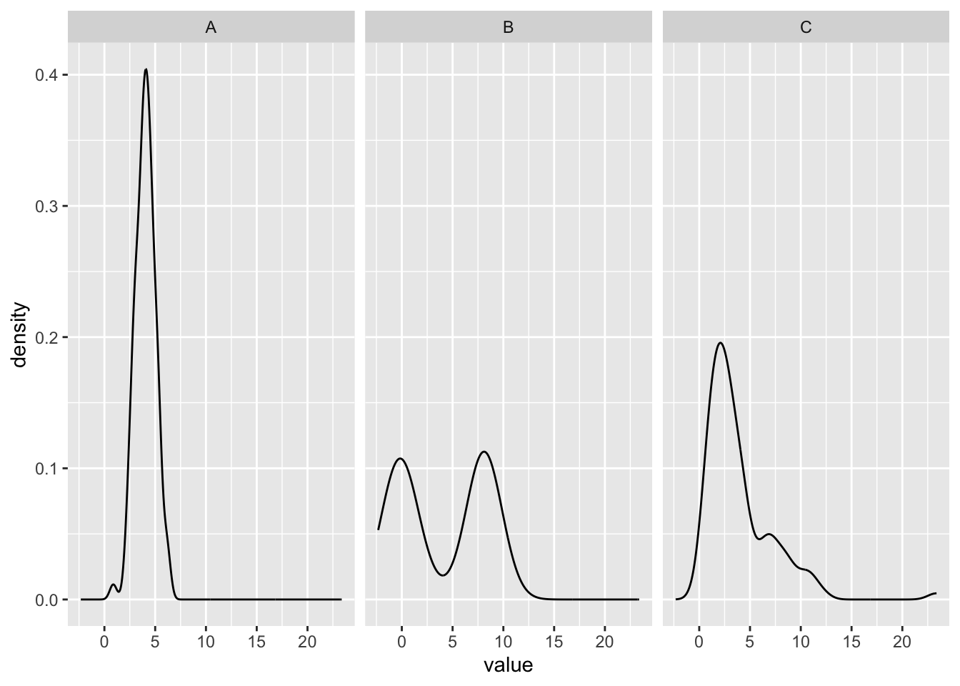
Group A is roughly normal, B is bimodal, and C is right-skewed.
Now, make a bar chart of means by group:
dat |>
  group_by(group) |>
  summarize(mean_value = mean(value)) |>
  ggplot(aes(x = group,
             y = mean_value)) +
  geom_col()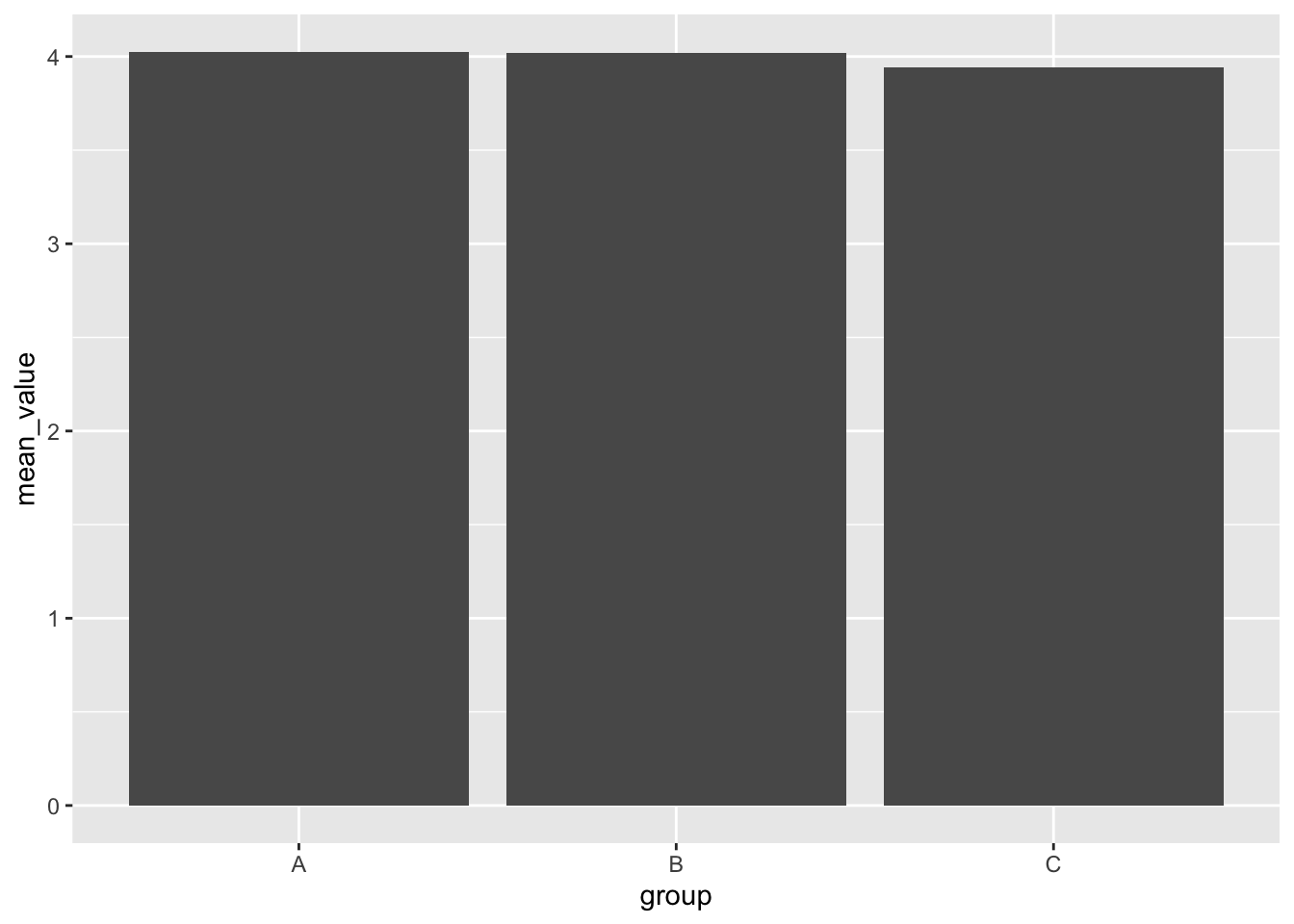
The means are quite similar in this chart, but we have two problems:
- We are only showing the central tendency, without any measure of spread.
- This plot implies that no data exists above the top of the chart, but that is wrong.
Instead, use a beeswarm, made with geom_beeswarm(). This is essentially a sideways dotplot, and if you turn your head to the left, they resemble the density plots above.
ggplot(dat, aes(group, value)) +
  geom_beeswarm()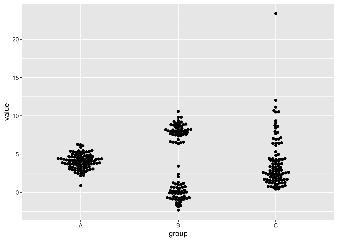
This is somewhat helpful, but we can make it better:
- Center the points with
method = "center". The default is asymmetric. - Deemphasize the individual points with
color = "gray70", so that we can… - Add a mean line to each group with
stat_summary(). This function lets us build a custom summary statistic (mean) with some geom (crossbar, a horizontal line). Also specifywidth = .2to make the line a little wider.
ggplot(dat,
       aes(x = group,
           y = value)) +
  geom_beeswarm(color = "gray70", method = "center", preserve.data.axis = T) +
  stat_summary(fun = "mean", geom = "crossbar", width = .2)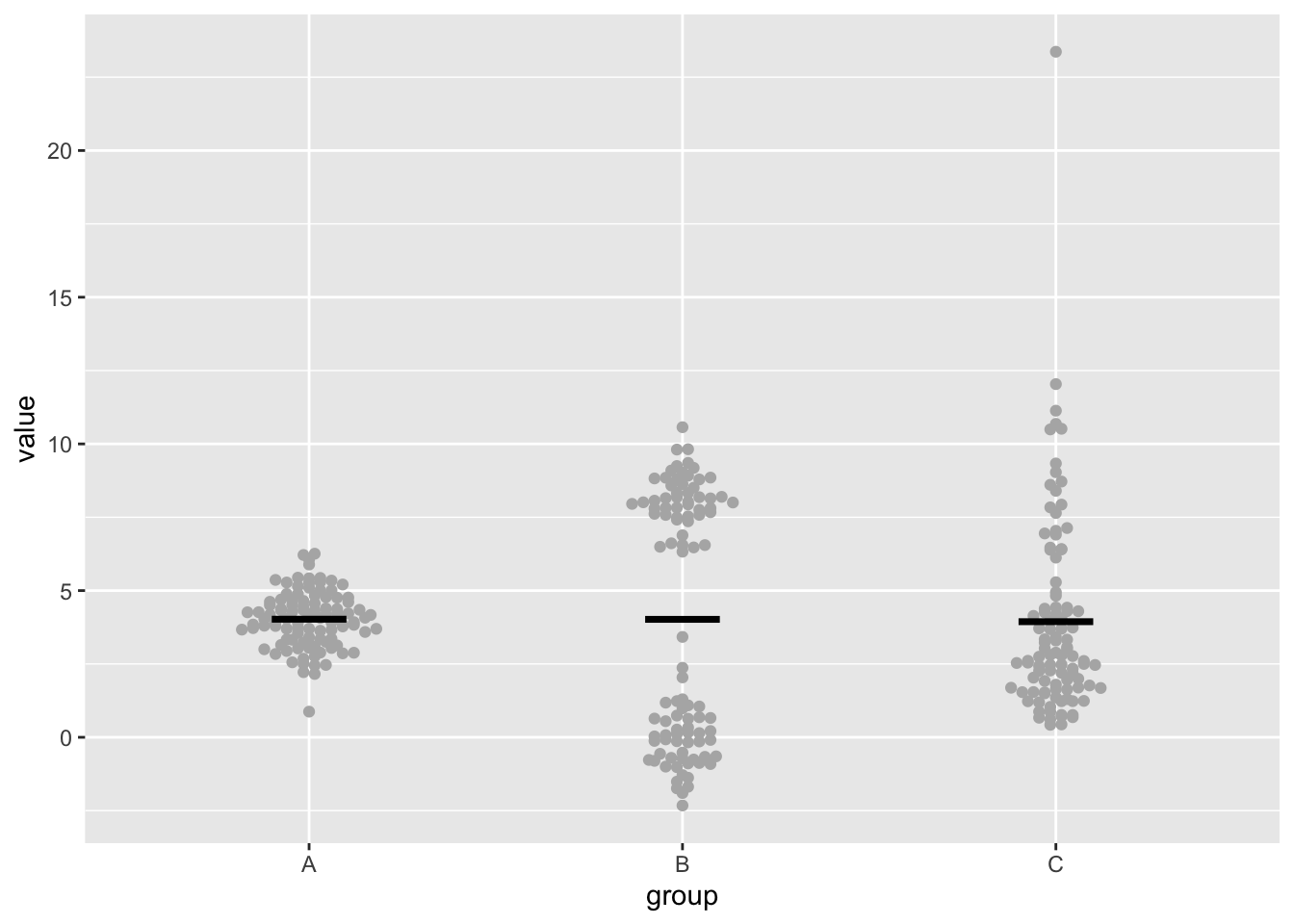
Because we know the data is skewed and that group C has an outlier, and that the mean is not an outlier-resistant statistic, we can change our summary to use the median instead. Just set fun = "median" inside stat_summary():
ggplot(dat,
       aes(x = group,
           y = value)) +
  geom_beeswarm(color = "gray70", method = "center", preserve.data.axis = T) +
  stat_summary(fun = "median", geom = "crossbar", width = .2)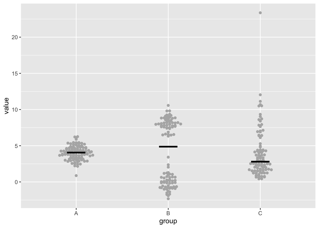
Showing one point per observation only works for small to medium datasets. If you have more data, switch to using a violin plot. This plot is a density plot that is rotated and mirrored, which sometimes resembles the shape of a violin.
ggplot(dat,
       aes(x = group,
           y = value)) +
  geom_violin()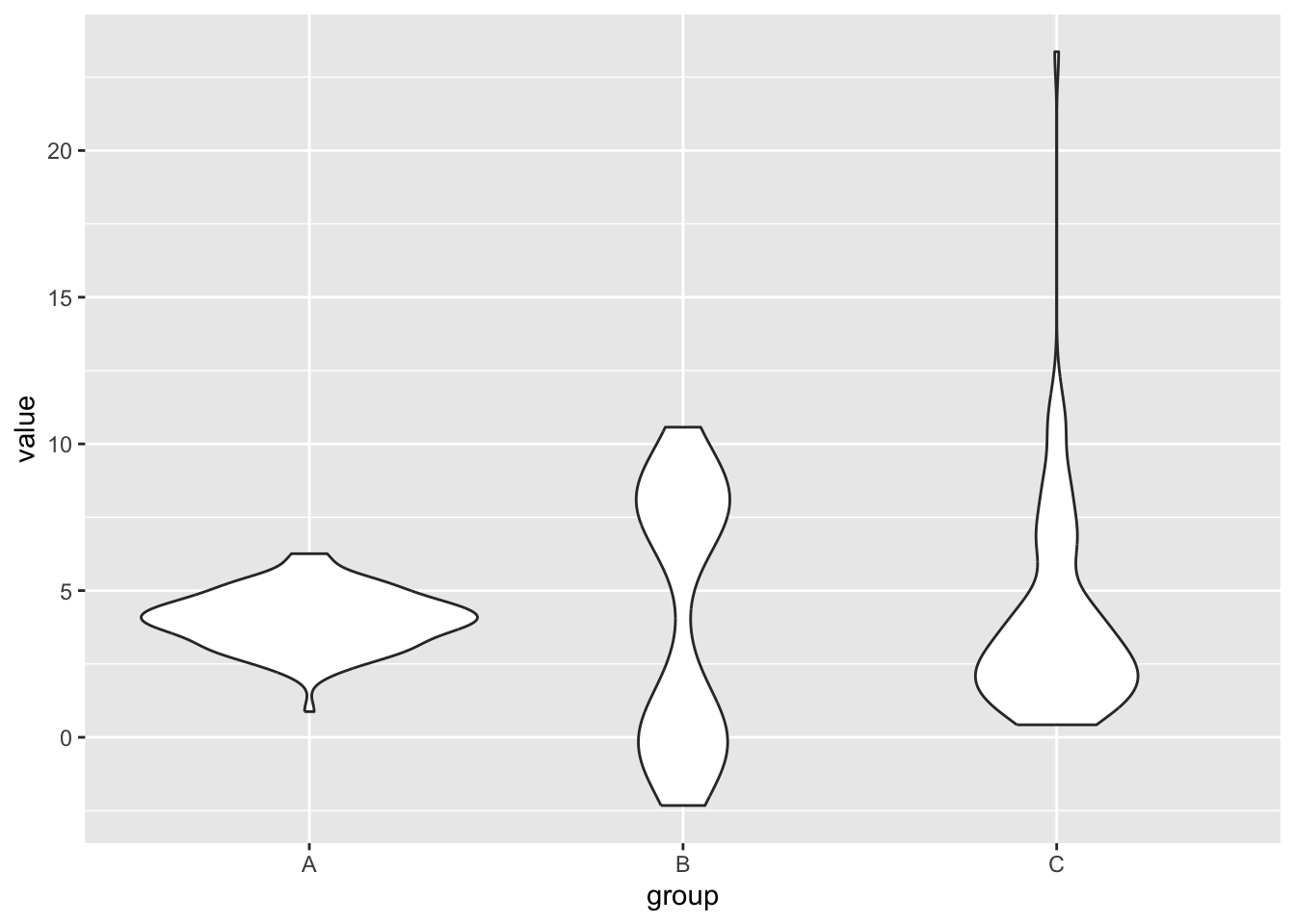
Now that we know how to visualize the shape of a continuous distribution by level of a categorical variable, we can examine the distribution of fat_content_percent by color:
ggplot(cheese,
       aes(x = color,
           y = fat_content_percent)) +
  geom_beeswarm(color = "gray70", method = "center", preserve.data.axis = T) +
  stat_summary(fun = "mean", geom = "crossbar", width = .2)
Warning: Removed 674 rows containing non-finite outside the scale range
(`stat_summary()`).Warning: Removed 674 rows containing missing values or values outside the scale range
(`geom_point()`).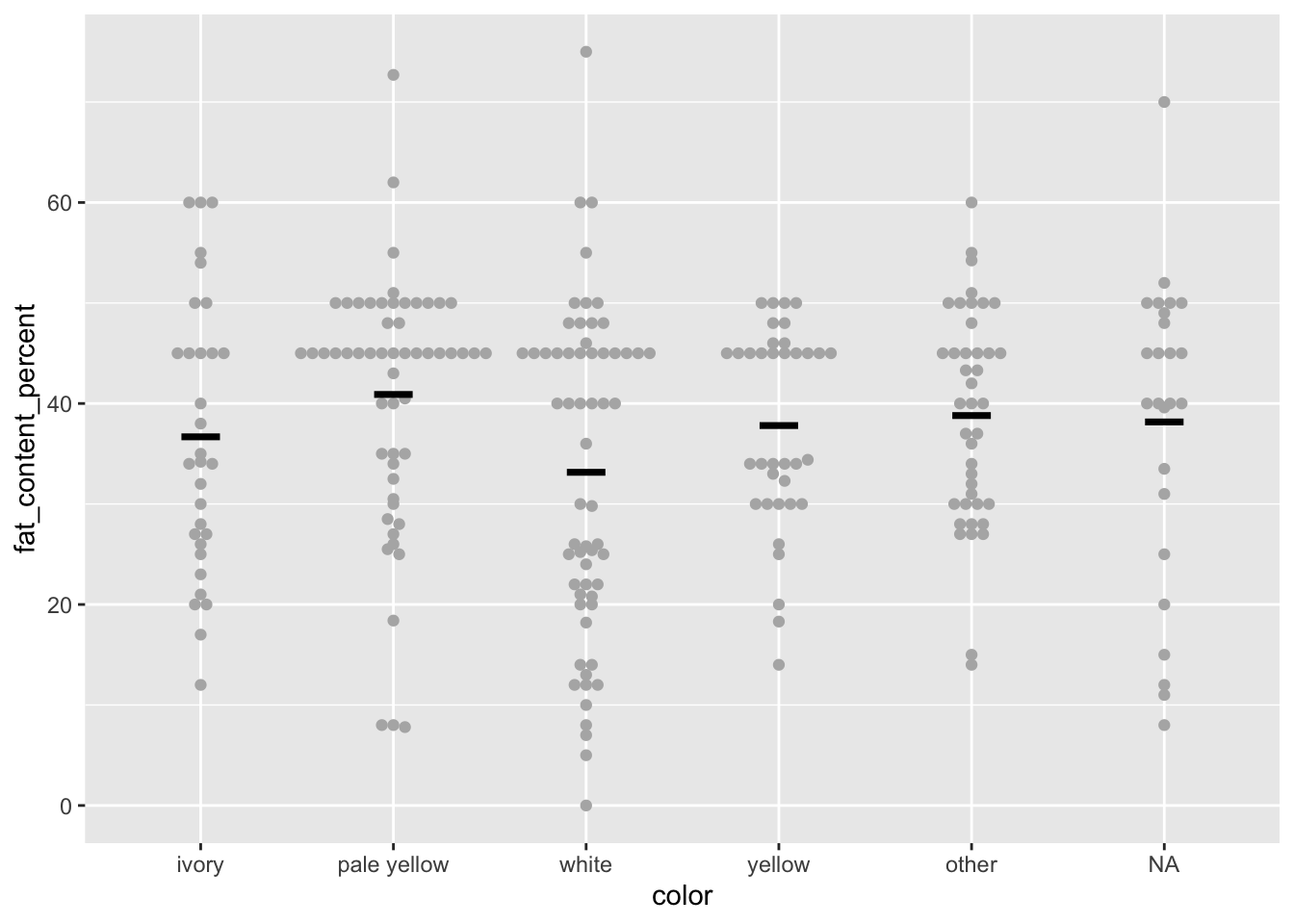
Here, we begin to have a few too many points for some values of color, so the dots are nearly touching each other. This might be a good time to use a violin plot. We can also add a boxplot on top with geom_boxplot(), and add the argument width = 0.2 to make the boxplot narrow enough to fit within the violin geom (for your data, adjust the width as necessary).
ggplot(cheese,
       aes(x = color,
           y = fat_content_percent)) +
  geom_violin() +
  geom_boxplot(width = 0.2)
Warning: Removed 674 rows containing non-finite outside the scale range
(`stat_ydensity()`).Warning: Removed 674 rows containing non-finite outside the scale range
(`stat_boxplot()`).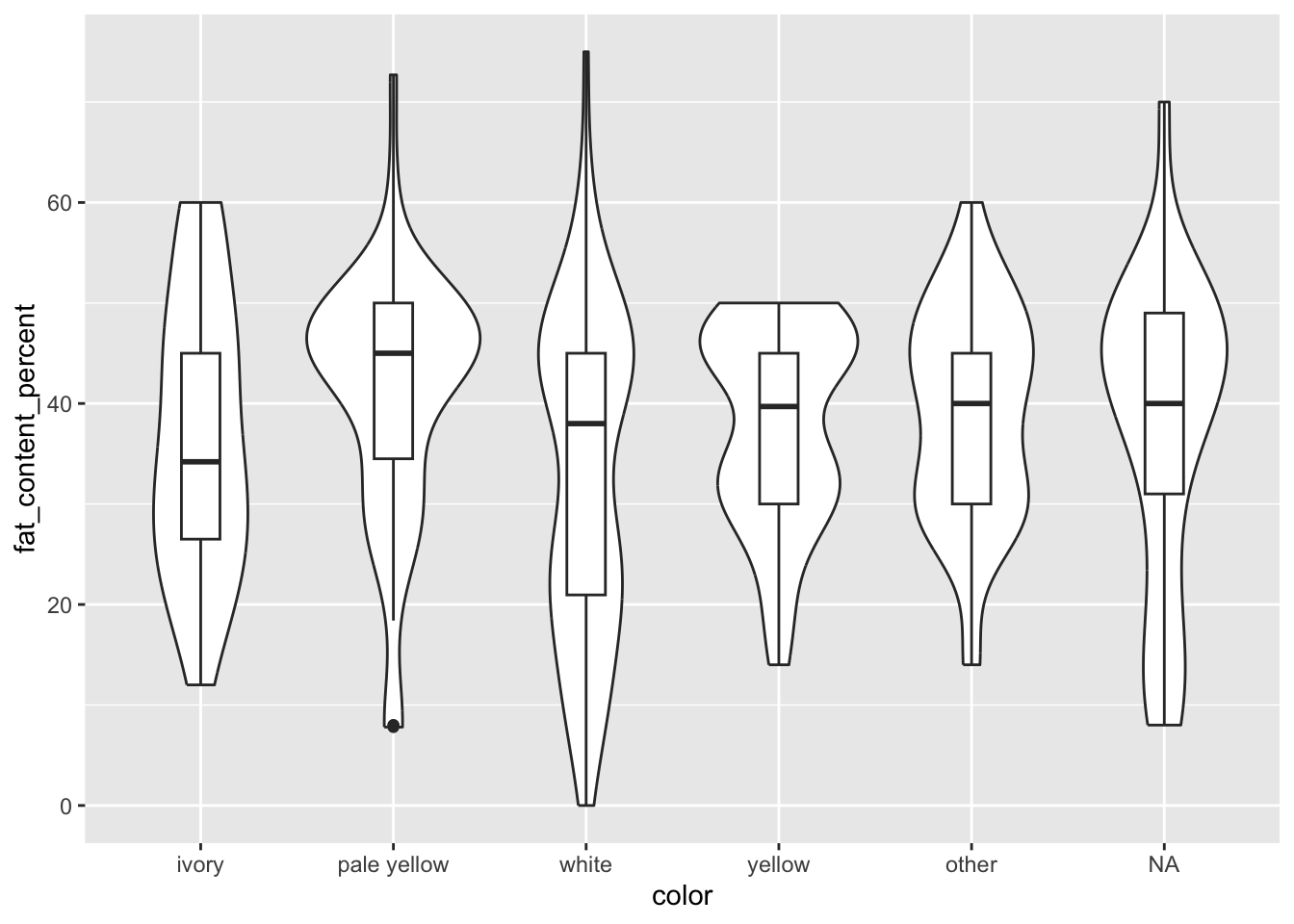
This plot helps us see how much the variance of fat_content_percent varies by color. Some distributions are very spread out (ivory), others skewed (pale yellow), and others bimodal (white). We need to keep these in mind as we communicate and model the data to our readers.
3.3 Break it down
The plots above use only one or two variables, mapping them to x and y, the only two dimensions in a two-dimensional plot. How do we add a third variable? A third dimension, in a 3D plot? No.
We can add a third (or fourth, or fifth…) variable in several ways:
- Facets: splitting a single plot into multiple plots, one for each level of a categorical variable
- Groups: using a separate geom for each level of a categorical variable
- Other aesthetics: using a separate linetype, shape, or color for each level of a categorical variable, or shades of a color for a continuous variable
You will notice in that list that it is easiest or most common to break a plot down by a categorical variable.
3.3.1 Facets
Facets, or small multiples, are a series of plots of subsets of the data. For example, we can plot the density of fat_content_percent for each level of hardness with the facet_wrap() function.
facet_wrap() takes a formula in the format ~ var for one variable or ~ var1 + var2 + and so on for more than one.
Before faceting, our density plot has all values of hardness in a single plot:
cheese |>
  filter(!is.na(hardness)) |>
  ggplot(aes(x = fat_content_percent)) +
  geom_density()
Warning: Removed 674 rows containing non-finite outside the scale range
(`stat_density()`).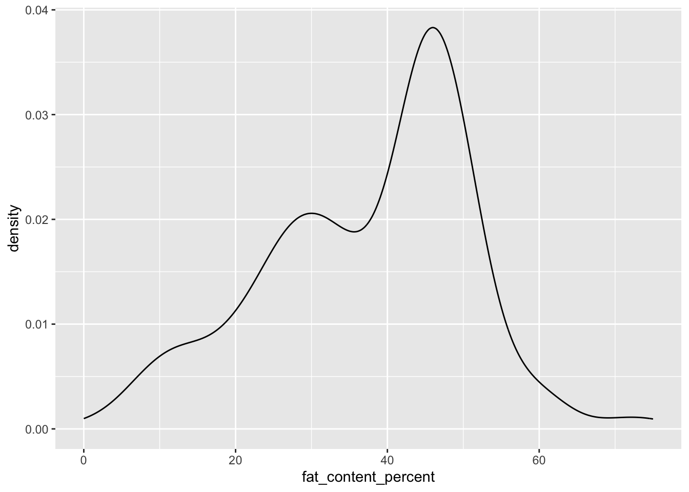
Simply adding on facet_wrap(~ hardness) creates six smaller plots, one for each level of hardness:
cheese |>
  filter(!is.na(hardness)) |>
  ggplot(aes(x = fat_content_percent)) +
  geom_density() +
  facet_wrap(~ hardness)
Warning: Removed 674 rows containing non-finite outside the scale range
(`stat_density()`).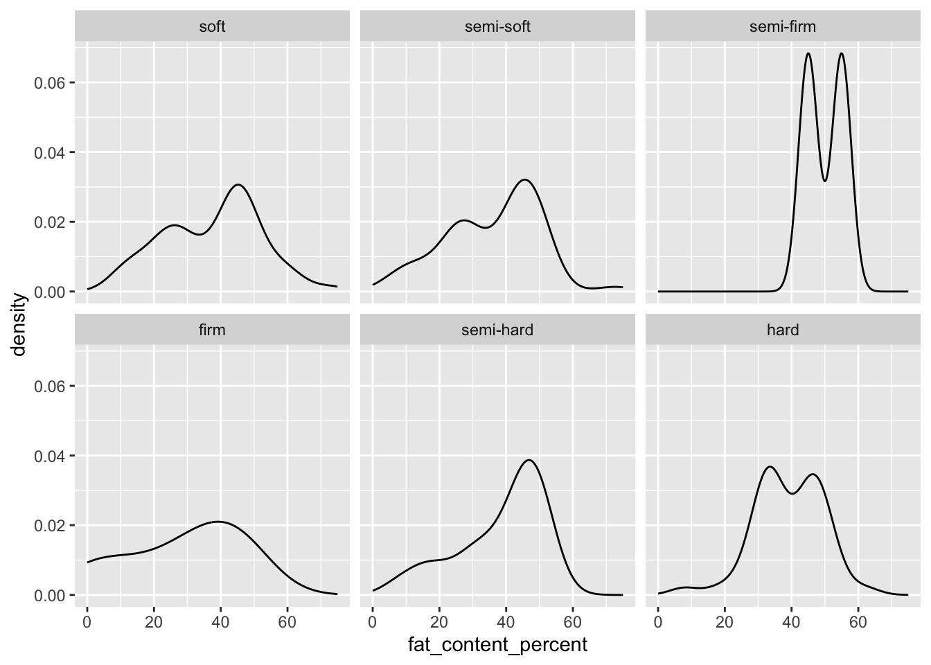
If we have some variables for which all pairwise combinations exist in the data, we can use facet_grid().
This function takes a two-sided formula, such as milk_cow ~ hardness. The variable on the left becomes the rows, so milk_cow, a binary variable, gives us two rows. The variable on the right becomes the columns, so hardness will give us six columns. How we choose to order the formula depends on the kind of graph we are making and the space it needs to fit into. With your own data, experiment between your options and choose whichever is easiest to read.
cheese |>
  filter(!is.na(hardness)) |>
  ggplot(aes(x = fat_content_percent)) +
  geom_density() +
  facet_grid(milk_cow ~ hardness)
Warning: Removed 674 rows containing non-finite outside the scale range
(`stat_density()`).Warning: Groups with fewer than two data points have been dropped.
Groups with fewer than two data points have been dropped.Warning: Removed 2 rows containing missing values or values outside the scale range
(`geom_density()`).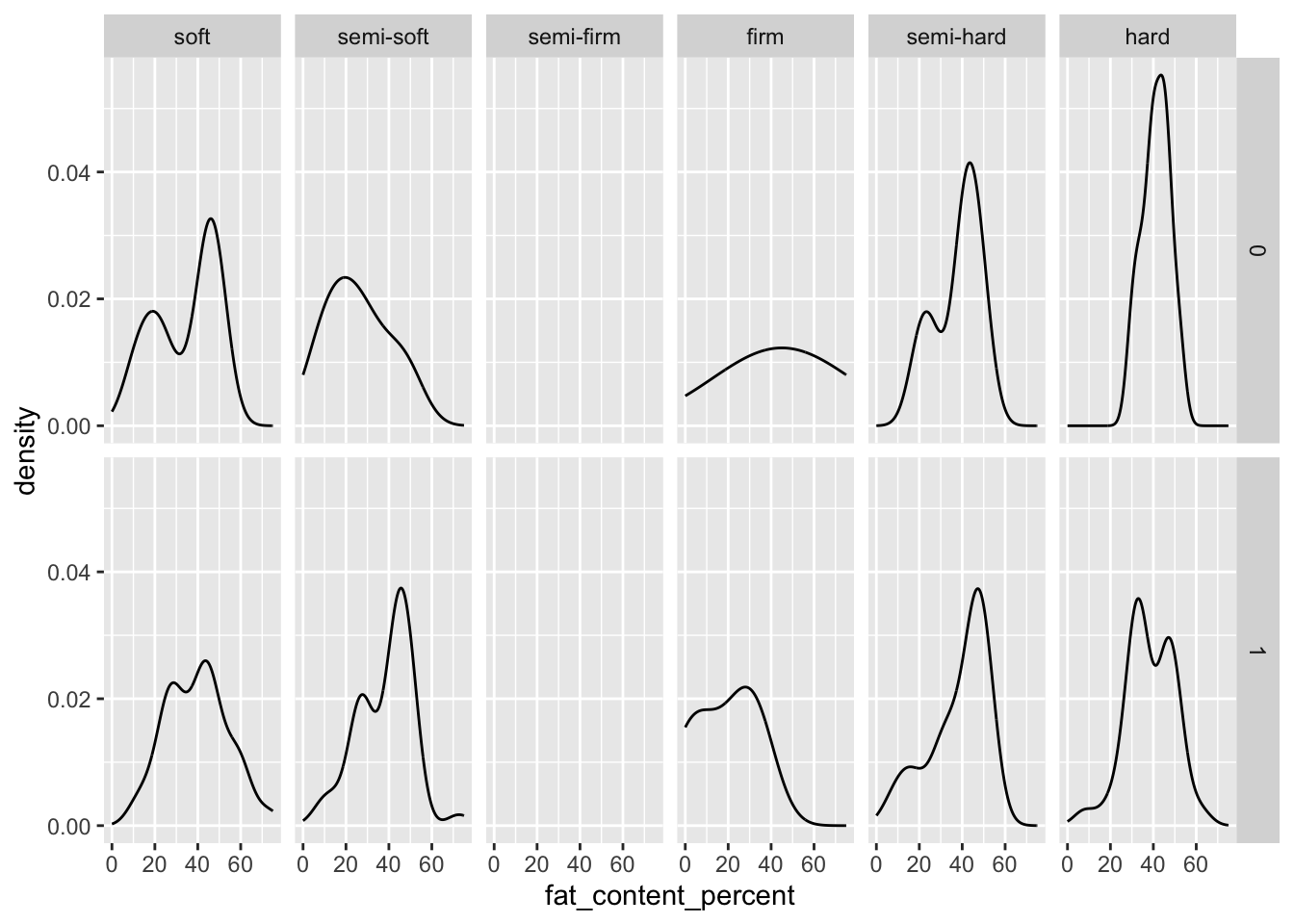
The warning messages above tell us that geom_density() requires 2+ data points. The “semi-firm” level of hardness only had two data points, one for each level of milk_cow, so neither one produced its own density plot. This also means that geom_density() actually made a density plot for just two data points before it was split by milk_cow! That was not originally apparent, but plotting our data helped us to see the sparsity in our categorical variables.
3.3.2 Groups
In ggplot, the group aesthetic makes separate geoms for each level of some grouping variable, but it does not produce a legend as we would get with linetype, shape, or color (below).
A use case for group is when we have two continuous variables (or at least a pre/post variable with some continuous outcome) and want to show trends by group, such as repeated measures experimental data. This yields what is commonly called a spaghetti plot.
Use the sleepstudy dataset from lme4. In this dataset, subjects’ reaction times (Reaction) were measured after sleep deprivation for some number of Days, which started on day 3. First drop days 0-2 to get data limited to the deprivation period, and then plot Reaction against Days:
sleepstudy |>
  filter(Days >= 3) |>
  ggplot(aes(x = Days,
             y = Reaction)) +
  geom_point()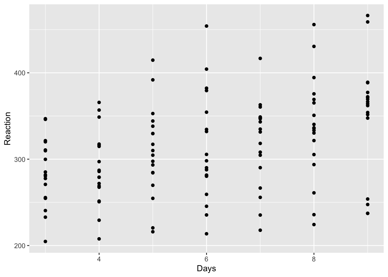
We can get an overall trend line with geom_smooth(). This function has a method argument we can set to be “lm” to fit a linear line. Then, setting se = F removes the confidence band to result in a cleaner plot:
sleepstudy |>
  filter(Days >= 3) |>
  ggplot(aes(x = Days,
             y = Reaction)) +
  geom_point() +
  geom_smooth(method = "lm", se = F)
`geom_smooth()` using formula = 'y ~ x'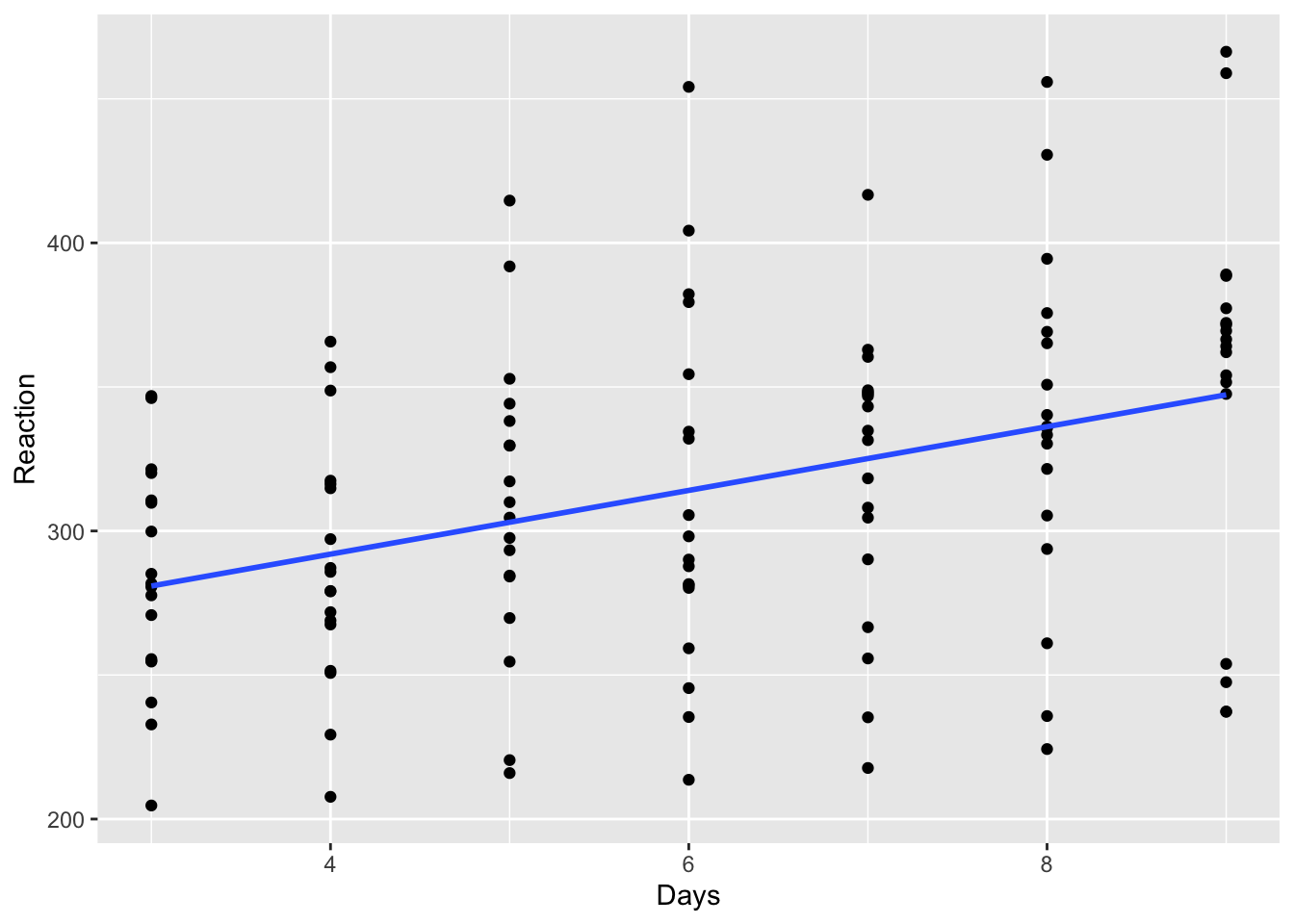
If we add the aesthetic mapping group = Subject, geom_smooth() now gives us a separate line for each Subject:
sleepstudy |>
  filter(Days >= 3) |>
  ggplot(aes(x = Days,
             y = Reaction,
             group = Subject)) +
  geom_point() +
  geom_smooth(method = "lm", se = F)
`geom_smooth()` using formula = 'y ~ x'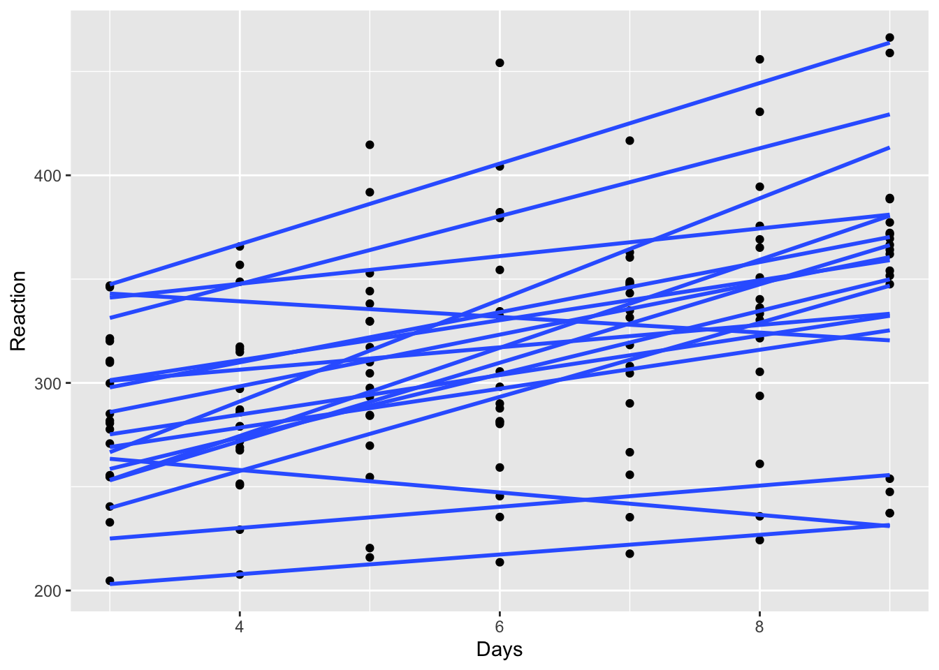
We see now what has been hidden all along, that ggplot() passes its aesthetic mappings to all subsequent layers in the plot. Adding something to aes() inside of ggplot() changed the behavior of the other plot elements. We can get our overall mean line back by overriding the aesthetic inheritance off with inherit.aes = F inside of geom_smooth().
While we are doing that, change a few more things in the plot to deemphasize, but still show, individual data, and emphasize the group mean line:
- Change
geom_point()to light gray (“gray70”) - Change the group-specific lines in
geom_smooth()to also be light gray (“gray70”) and thin (linewidth = 0.5)- If you submit a figure like this to a journal, check their minimum line width requirement. The numbers given to geoms are in millimeters.
- Add another
geom_smooth()for the overall trend, re-specifyingxandy, turning off aesthetic inheritance (inherit.aes = F), and making the line black and thicker (linewidth = 1.5)
sleepstudy |>
  filter(Days >= 3) |>
  ggplot(aes(x = Days,
             y = Reaction,
             group = Subject)) +
  geom_point(color = "gray70") +
  geom_smooth(method = "lm", se = F,
              color = "gray70",
              linewidth = 0.5) +
  geom_smooth(aes(x = Days,
                  y = Reaction),
              inherit.aes = F,
              method = "lm", se = F,
              color = "black",
              linewidth = 1.5)
`geom_smooth()` using formula = 'y ~ x'
`geom_smooth()` using formula = 'y ~ x'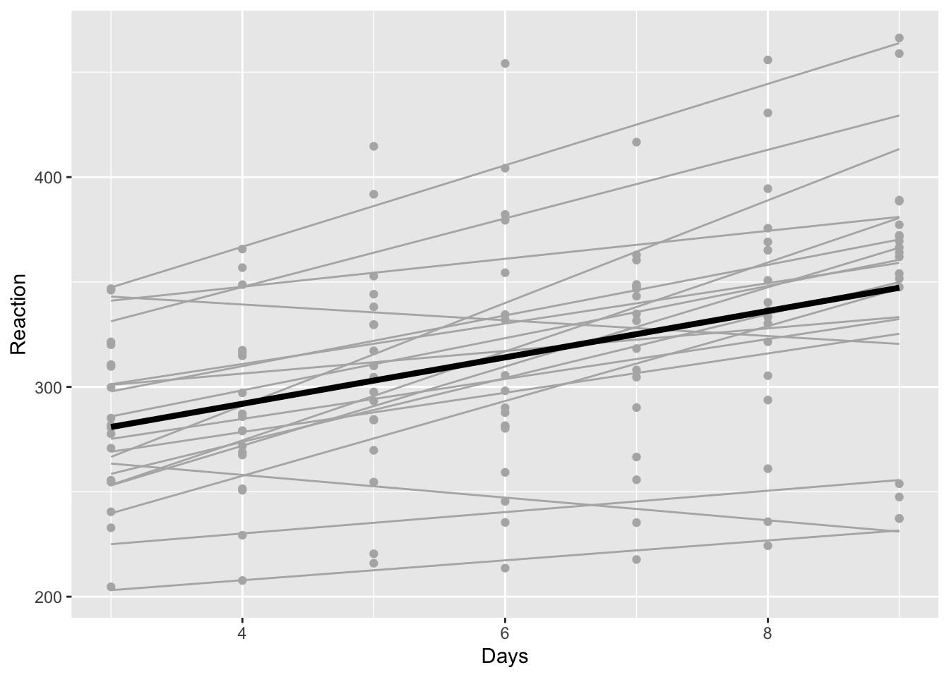
Now, comparing the individual lines to the overall line, we see some variance in individual slopes. Most are positive, but some are steeper or flatter, and others are even negative. When modeling, we should consider a random slope or some other way to account for between-subject variation in the effect of Days on Reaction.
3.3.3 Other aesthetics
3.3.3.1 Linetype
Mapping a variable to linetype works best when that variable has only two or three levels, since many kinds of linetype can be difficult to distinguish, especially given the small “sample” of the line provided in the legend. (However, see the chapter on Useful Customizations to learn how to lengthen the sample in the legend.)
cheese |>
  filter(calcium_content_mg < 2000,
         !is.na(vegetarian)) |>
  ggplot(aes(x = fat_content_percent,
             y = calcium_content_mg,
             linetype = factor(vegetarian))) +
  geom_point() +
  geom_smooth()
`geom_smooth()` using method = 'loess' and formula = 'y ~ x'Warning: Removed 1 row containing non-finite outside the scale range
(`stat_smooth()`).Warning: Removed 1 row containing missing values or values outside the scale range
(`geom_point()`).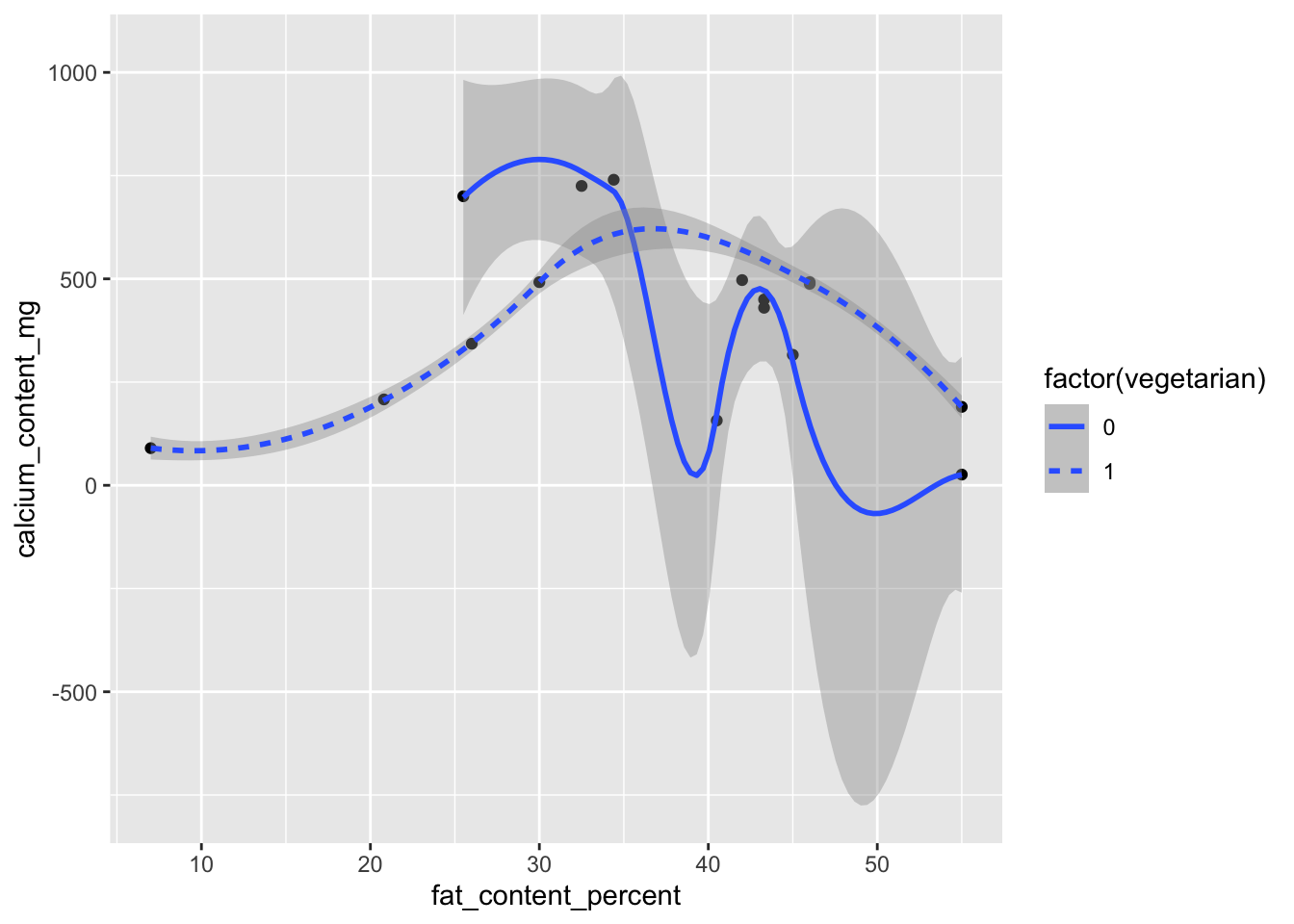
3.3.3.2 Shape
Like linetype, shape helps to distinguish a limited number of levels:
cheese |>
  filter(calcium_content_mg < 2000,
         !is.na(vegetarian)) |>
  ggplot(aes(x = fat_content_percent,
             y = calcium_content_mg,
             shape = factor(vegetarian))) +
  geom_point()
Warning: Removed 1 row containing missing values or values outside the scale range
(`geom_point()`).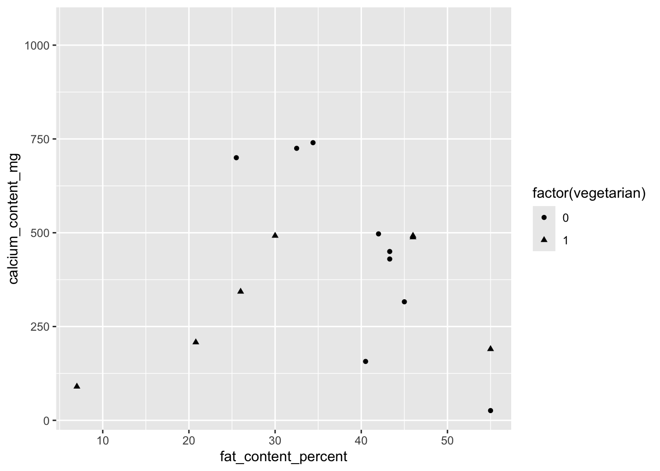
3.3.3.3 Color
Color, while something we want to avoid in plots destined for publication, can still be useful for internal use as we seek to understand our data. If we do decide to use color when plotting, we need to make sure our color palettes are colorblind-friendly. A quick search online for “colorblind friendly palettes ggplot” will yield plenty of packages and advice on this topic.
For now, we will make some plots with color for exploratory purposes only.
One of the plots above used facets to see the density of fat_content_percent by hardness. As an alternative, we can map hardness onto color to see all the densities in a single plot:
ggplot(cheese,
       aes(x = fat_content_percent,
           color = hardness)) +
  geom_density()
Warning: Removed 674 rows containing non-finite outside the scale range
(`stat_density()`).Warning: Groups with fewer than two data points have been dropped.Warning: Removed 1 row containing missing values or values outside the scale range
(`geom_density()`).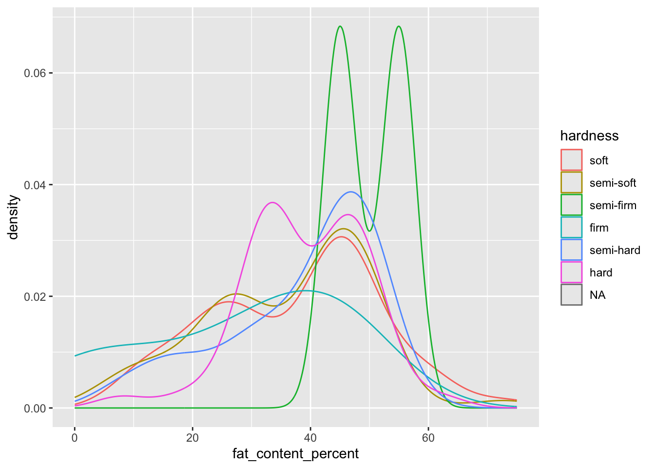
As another example, plot the values of fat_content_percent against rind, and color them by their value of calcium_content_mg.
In this plot, we use geom_jitter() with vertical noise added to each point (height = 0.2) to separate the points, and a larger-than-default size = 2.
cheese |>
  filter(calcium_content_mg < 4000,
         !is.na(fat_content_percent),
         !is.na(calcium_content_mg),
         !is.na(rind)) |>
  ggplot(aes(x = fat_content_percent,
             y = rind,
             color = calcium_content_mg)) +
  geom_jitter(height = 0.2, size = 2) +
  theme_bw()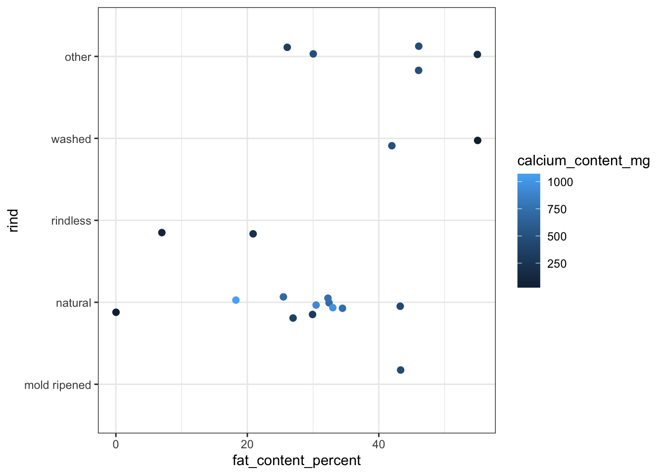
Make the plot again, but now take control over the gradient that is used for calcium_content_mg. scale_color_gradient() defines a custom gradient that goes from light gray (“gray75”) up to black.
cheese |>
  filter(calcium_content_mg < 4000,
         !is.na(fat_content_percent),
         !is.na(calcium_content_mg),
         !is.na(rind)) |>
  ggplot(aes(x = fat_content_percent,
             y = rind,
             color = calcium_content_mg)) +
  geom_jitter(height = 0.2, size = 2) +
  scale_color_gradient(low = "gray75", high = "black") +
  theme_bw()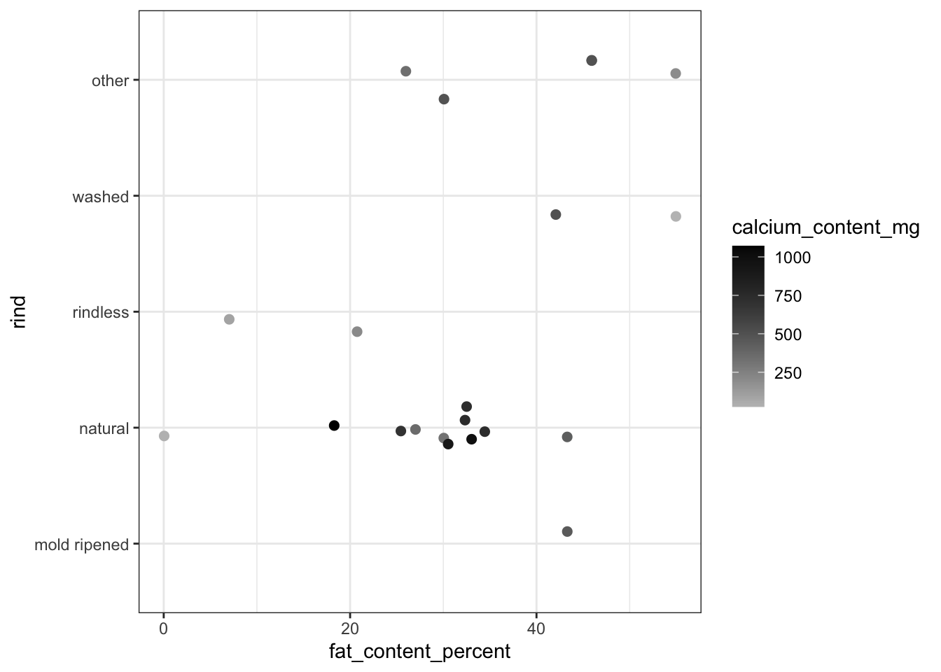
This plot gives us insights into the joint distribution of these three variables. The sample size for each rind type is limited, but it is natural rind cheeses that tend to see the highest values of calcium_content_mg, and also the highest range of this variable.
3.4 Identify outliers
In the scatterplot we made earlier with calcium_content_mg by fat_content_percent, we observed an outlier in calcium_content_mg.
To identify that outlier within a plot, we can add labels to the plot. Our cheese dataset already has an ID variable in its cheese column, but if not, we could create one with the row number with the row_number() function.
We can add the cheese names to the plot by mapping them to the label aesthetic, and then adding on a layer with geom_label_repel(). This function dds a label to each point with the value from the label column, and it omits labels where there would be too many overlaps. Usually we would want to thoughtfully and intentionally add labels to a plot, but here we can take advantage of the mechanic where too-close-together labels are omitted, since the result is that it will only label outlying points.
ggplot(cheese,
       aes(x = fat_content_percent,
           y = calcium_content_mg,
           label = cheese)) +
  geom_point() +
  geom_label_repel()
Warning: Removed 898 rows containing missing values or values outside the scale range
(`geom_point()`).Warning: Removed 898 rows containing missing values or values outside the scale range
(`geom_label_repel()`).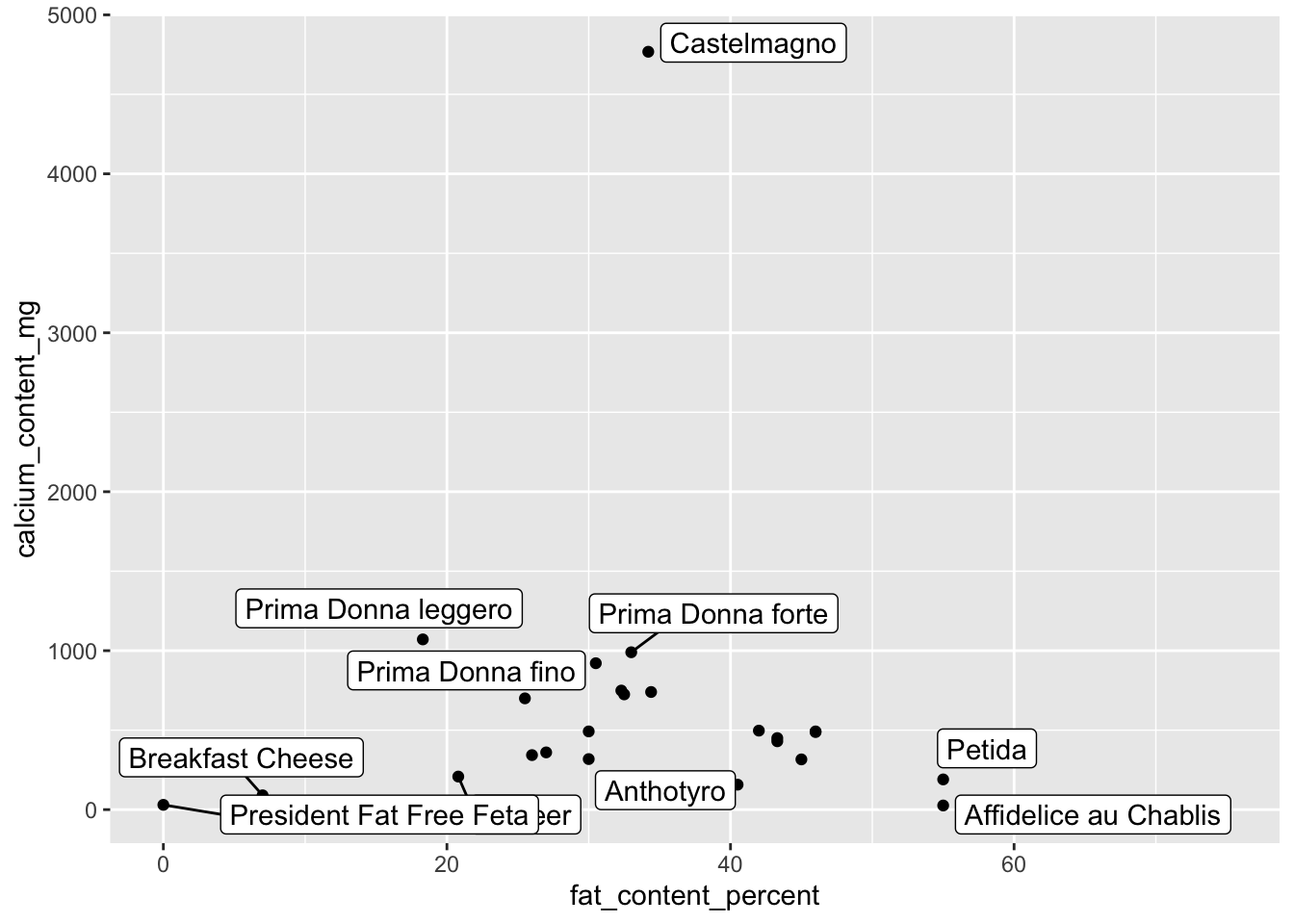
This plot helps us identify the outlying cheese, Castelmagno.
Another use of labeling is to thoughtfully select some subset of observations with which to associate labels, and then see where they are in a plot. Imagine we are particularly interested in cheeses with a washed rind. Add a label which is the name of the cheese, but only where the rind is washed. If the rind is not washed, give it a label of NA. (Using a blank (““) would result in a bunch of empty label boxes, which is not what we want. We want no label.)
In geom_label_repel(), also add min.segment.length = 0 to force the drawing of a line even if the label is right next to the point, so we can be confident of which point goes with each label.
cheese |>
  mutate(my_label = ifelse(rind == "washed", cheese, NA)) |>
  ggplot(aes(x = fat_content_percent,
             y = calcium_content_mg,
             label = my_label)) +
  geom_point() +
  geom_label_repel(min.segment.length = 0)
Warning: Removed 898 rows containing missing values or values outside the scale range
(`geom_point()`).Warning: Removed 919 rows containing missing values or values outside the scale range
(`geom_label_repel()`).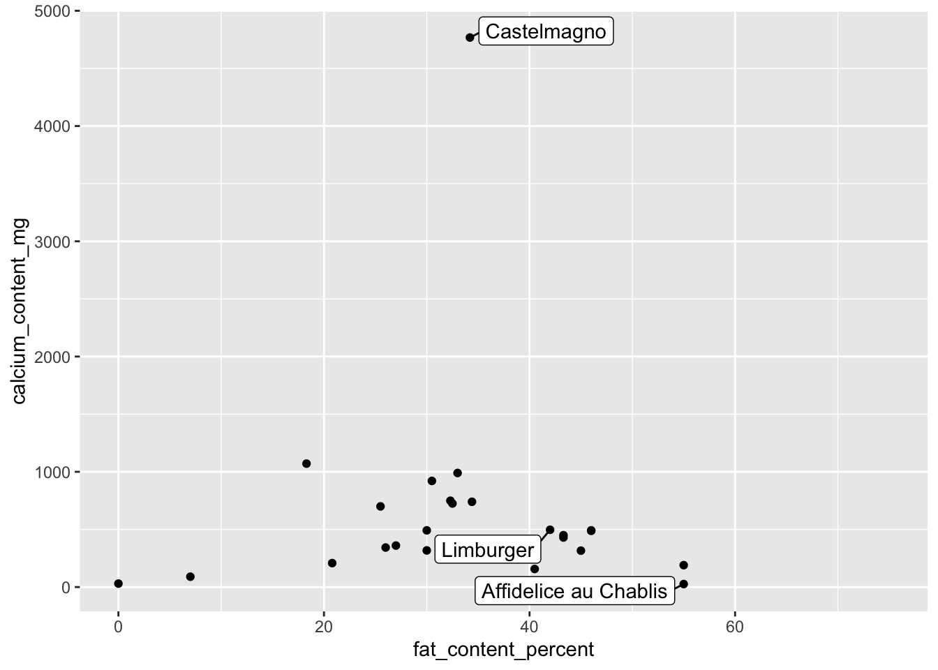
3.5 Exercises
Choose one of the following built-in datasets and answer the associated questions.
starwars- (Note: Ignore the list-columns.)
- Continuous: What is the distribution of
height? How aboutmass? - Continuous x continuous: What is the relationship between
heightandmass?- Label outlying characters.
- Categorical: How do the counts of character compare by
hair_color? - Categorical x categorical: How do the proportions of whether a character is of some
gendercompare acrosshair_color?- Switch which variable is
xand which isfill. Which plot is more readable?
- Switch which variable is
- Continuous x categorical: Compare the distributions of
heightacrossgender.
diamonds- (Note: Treat ordinal variables as categorical.)
- Continuous: What is the distribution of
carat? How aboutprice?- The distribution of
caratis not smooth. Why do you think that is?
- The distribution of
- Continuous x continuous: What is the relationship between
caratandprice?- Break it down: Add
cutas a color aesthetic. What patterns do you see?
- Break it down: Add
- Categorical: How do the counts of diamonds compare by
clarity?- Break it down: Facet the plot by
cut.
- Break it down: Facet the plot by
- Categorical x categorical: How do the proportions of
cutcompare acrosscolor? - Continuous x categorical: Compare the distributions of
caratacrosscut.- Should you use a beeswarm or violin here?
midwest- Continuous: What is the distribution of
popdensity? How aboutpercbelowpoverty? - Continuous x continuous: What is the relationship between
popdensityandpercbelowpoverty?- Label outlying counties.
- Categorical: How do the counts of county compare by
state? - Categorical x categorical: How do the proportions of whether a county is in a metro area (
inmetro) compare acrossstate? - Continuous x categorical: Compare the distributions of
percbelowpovertyacrossstate.
- Continuous: What is the distribution of
lakers- First filter the data to exclude plays without results:
lakers <- lakers |> filter(result != "") - Continuous: What is the distribution of
x? How abouty? - Continuous x continuous: What is the relationship between
xandy?- These two give the coordinates of each play.
yis the distance from the endline of the court, whilexis the distance from one of the sidelines. - Break it down: Color each point by its
resultor number ofpoints. What patterns do you see?
- These two give the coordinates of each play.
- Categorical: How do the counts of play compare by
result? - Categorical x categorical: How do the proportions of whether a shot made it (
result) compare acrossetype?- Which had a higher miss rate: free throw or shot?
- Break it down: Add
game_typeas a facet. Did the rates vary considerably based on whether it was a home or away game?
- Continuous x categorical: Compare the distributions of
yacrossresult.- Should you use a beeswarm or violin here?
- First filter the data to exclude plays without results:
Weissgerber, T. L., Winham, S. J., Heinzen, E. P., Milin-Lazovic, J. S., Garcia-Valencia, O., Bukumiric, Z., Savic, M. D., Garovic, V. D., & Milic, N. M. (2019). Reveal, don’t conceal: Transforming data visualization to improve transparency. Circulation, 140(18), 1506–1518. https://doi.org/10.1161/CIRCULATIONAHA.118.037777↩︎