library(tidyverse)
library(scales)
library(ggpubr)5 Useful Customizations
Once you have created a plot, there are likely several things you need to change before you share it with anybody else, and probably many more things if you want to submit it as a figure to a journal. In addition to the file extension and resolution (see previous chapter on Saving Plots), journals may have specific requirements about the fonts used within the plot, the placement of the legend, and labeling of multiple plots within a single figure.
Is anything missing from this page?
If you find any journal requirements not listed on this page, send an email to the email address at the bottom of this page, and the author will update this page.
In this chapter, we will use a variety of datasets and plot elements to explore how to customize plot appearance. ggplot plots are infinitely customizable, but this page will focus on those that are useful or often required by journals.
To begin, load the libraries needed for this page. scales has convenient functions for relabeling axes, and ggpubr is used for arranging multiple plots into a single figure.
5.1 Themes
The default ggplot theme has a gray background, white gridlines, and no border around the plot or legend.
ggplot(penguins,
       aes(x = bill_len,
           y = bill_dep,
           color = species)) +
  geom_point()
Warning: Removed 2 rows containing missing values or values outside the scale range
(`geom_point()`).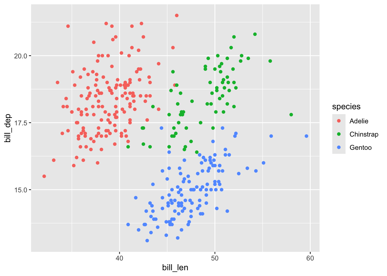
A number of preset themes are available within ggplot, such as theme_bw(). To use one, just add it onto the ggplot call:
ggplot(penguins,
       aes(x = bill_len,
           y = bill_dep,
           color = species)) +
  geom_point() +
  theme_bw()
Warning: Removed 2 rows containing missing values or values outside the scale range
(`geom_point()`).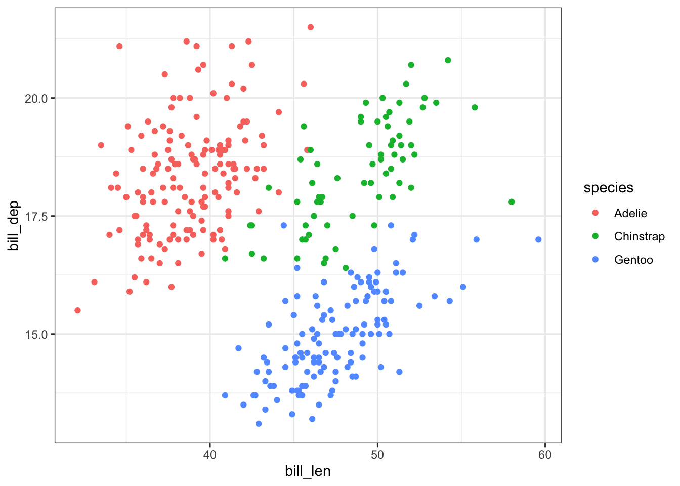
See ?theme_bw to be taken to a help page with all the other preset themes.
If you need to have finer control over a plot, such as using a thicker line around the main panel and removing gridlines, do that with theme(). See ?theme for all that can be customized.
When using both a preset theme like theme_bw() and specific customizations with theme(), you must add theme() after the preset. If not, the preset will overwrite any customizations since they are essentially theme() with a bunch of argument defaults.
If we include theme() first, we will get the same plot as above:
ggplot(penguins,
       aes(x = bill_len,
           y = bill_dep,
           color = species)) +
  geom_point() +
  theme(panel.border = element_rect(linewidth = 1.5),
        panel.grid = element_blank()) +
  theme_bw()
Warning: Removed 2 rows containing missing values or values outside the scale range
(`geom_point()`).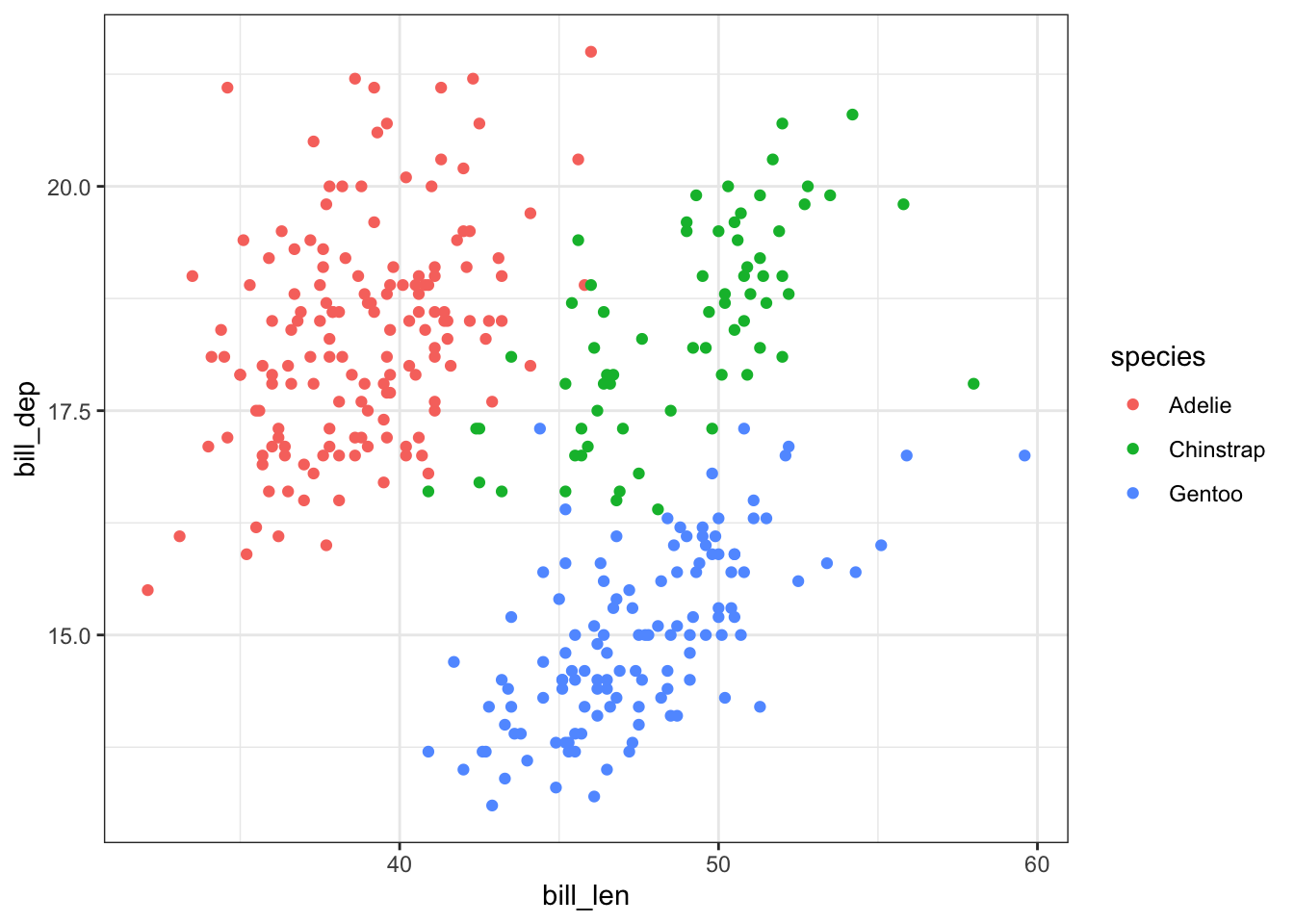
But if we correctly put theme() after the preset, its changes take effect:
ggplot(penguins,
       aes(x = bill_len,
           y = bill_dep,
           color = species)) +
  geom_point() +
  theme_bw() +
  theme(panel.border = element_rect(linewidth = 1.5),
        panel.grid = element_blank())
Warning: Removed 2 rows containing missing values or values outside the scale range
(`geom_point()`).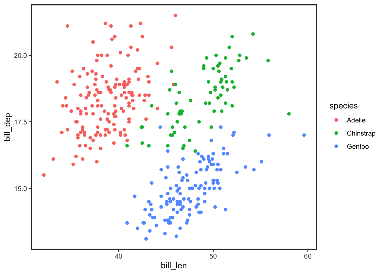
5.2 Labels
You need to change your axis and legend labels because ggplot directly uses the variable names from your dataset.
You have been working with the variables in your dataset for so long and typing their names again and again in models, so you know what cryptic names like rt and s16b mean, but your reader does not. You may have variables whose names appear to have some meaning, like body_mass or supp_income, but these are not the kind of names you want to be displayed as-is in a figure. The goal is to make your plots readily interpretable, with minimal effort from your reader. That usually means names should be longer and have spaces, which are not typically how we name objects in R. For example, you might relabel the penguins dataset’s body_mass variable to be “Body mass (in grams).”
labs() can also be used to set the main title, subtitle, and caption. However, most journals disallow such text and require those notes to be within the figure caption.
5.2.1 Aesthetics
Begin with this plot from above:
ggplot(penguins,
       aes(x = bill_len,
           y = bill_dep,
           color = species)) +
  geom_point()
Warning: Removed 2 rows containing missing values or values outside the scale range
(`geom_point()`).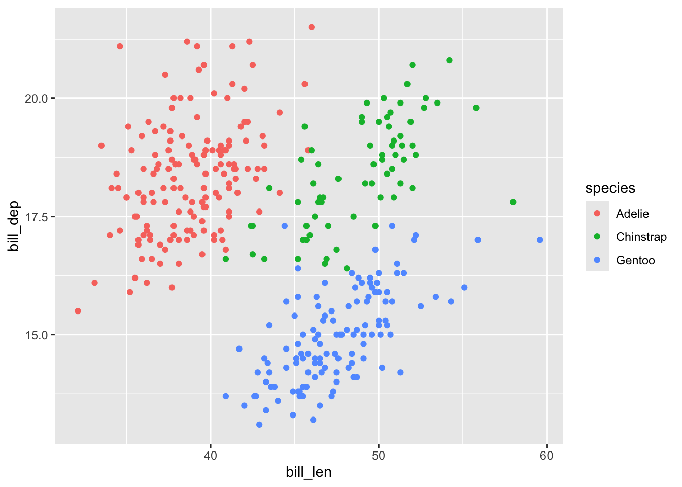
We should change the variables associated with the x-axis (bill_len), y-axis (bill_dep), and legend (species). To change the label associated with an aesthetic, use the labs() function and use the pattern aesthetic = "label".
bill_len is x, so to change the x-axis label it generates, set x = "Bill length (mm)". The same goes for y: y = "Bill depth (mm)".
For the legend, identify which aesthetic is associated with the legend. Is it generated because of the color, linetype, shape, or something else? Check the aesthetic name within aes(). To change the legend title here where the legend is from color, just set color = "Species".
ggplot(penguins,
       aes(x = bill_len,
           y = bill_dep,
           color = species)) +
  geom_point() +
  labs(x = "Bill length (mm)",
       y = "Bill depth (mm)",
       color = "Species")
Warning: Removed 2 rows containing missing values or values outside the scale range
(`geom_point()`).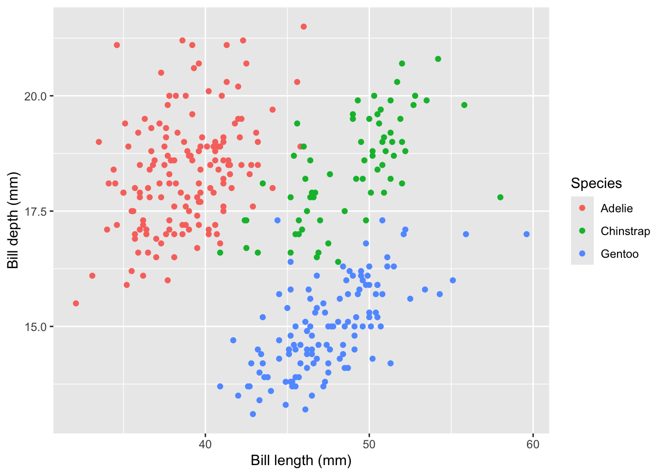
At times you may have multiple aesthetics associated with a single variable, and each one sets its own legend. Here, set both color and shape to species. If only one aesthetic’s label is changed in labs(), two legends with different titles will be generated.
ggplot(penguins,
       aes(x = bill_len,
           y = bill_dep,
           color = species,
           shape = species)) +
  geom_point() +
  labs(x = "Bill length (mm)",
       y = "Bill depth (mm)",
       color = "Species")
Warning: Removed 2 rows containing missing values or values outside the scale range
(`geom_point()`).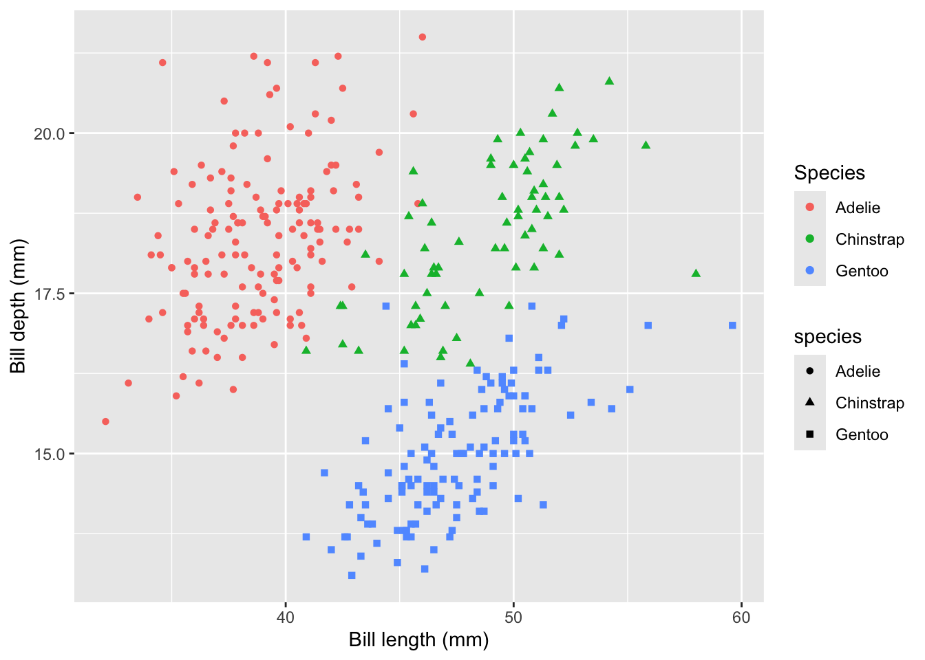
Instead, set both color = "Species" and shape = "Species" within labs().
ggplot(penguins,
       aes(x = bill_len,
           y = bill_dep,
           color = species,
           shape = species)) +
  geom_point() +
  labs(x = "Bill length (mm)",
       y = "Bill depth (mm)",
       color = "Species",
       shape = "Species")
Warning: Removed 2 rows containing missing values or values outside the scale range
(`geom_point()`).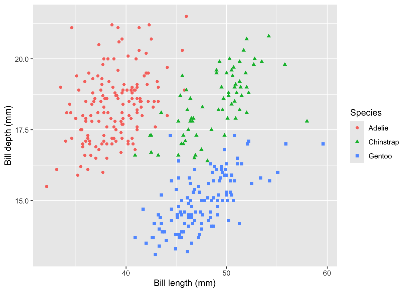
5.2.2 Labels within legends
labs() is used to change the titles associated with aesthetics, but how about the labels within the legend?
Examine the legend in this plot where color = sex. We may want to change the names “female” and “male” to start with capital letters (“Female” and “Male”), and also change “NA” to something more interpretable to a non-programmer (such as “Unknown”).
ggplot(penguins,
       aes(x = bill_len,
           y = bill_dep,
           color = sex)) +
  geom_point()
Warning: Removed 2 rows containing missing values or values outside the scale range
(`geom_point()`).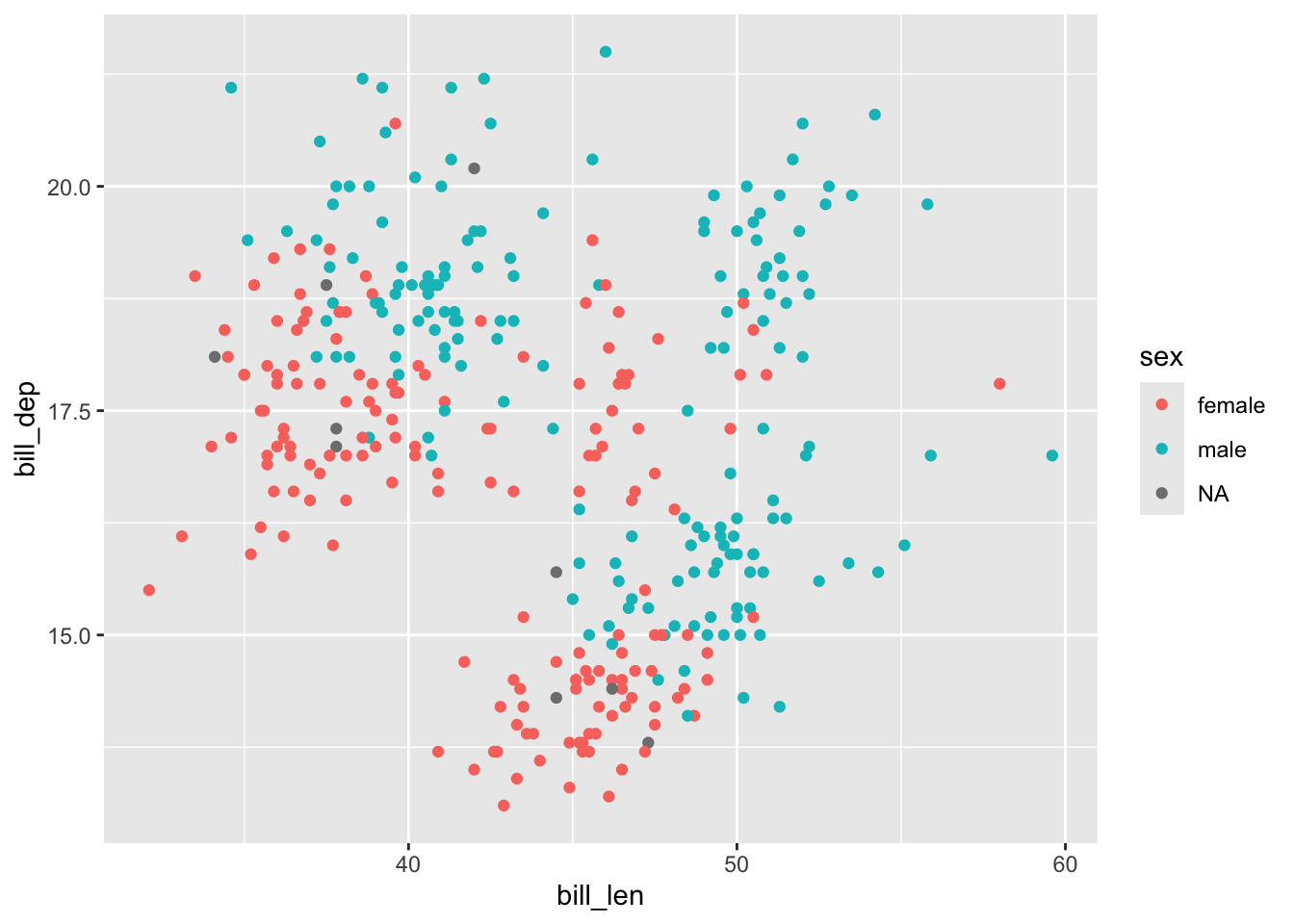
The simplest way to change adjust the labels is to use functions from the forcats package to work with sex as a factor. (Learn more about working with factors.)
First, use fct_na_value_to_level() to code NA as its own level (such as “Unknown”) and then use fct_recode() to rename existing levels with new names:
penguins |>
  mutate(sex =
           sex |>
           fct_na_value_to_level("Unknown") |>
           fct_recode("Male" = "male", "Female" = "female")) |>
  ggplot(aes(x = bill_len,
             y = bill_dep,
             color = sex)) +
  geom_point()
Warning: Removed 2 rows containing missing values or values outside the scale range
(`geom_point()`).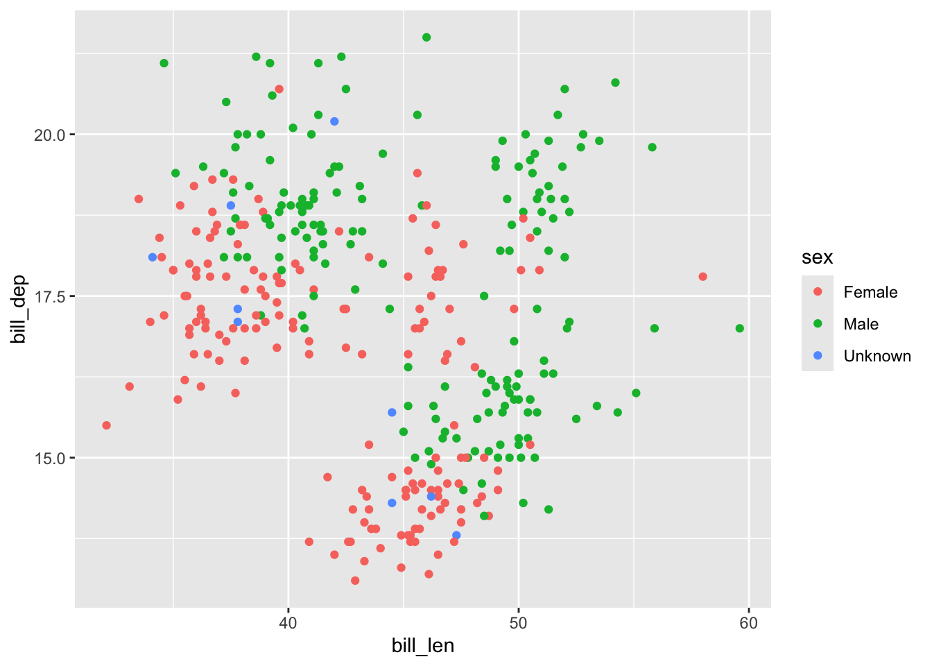
5.2.3 Facets
Other labels we may need to change in a plot are those generated when using facets. Make a scatterplot faceted by sex:
penguins |>
  ggplot(aes(x = bill_len,
             y = bill_dep)) +
  geom_point() +
  facet_wrap(~ sex)
Warning: Removed 2 rows containing missing values or values outside the scale range
(`geom_point()`).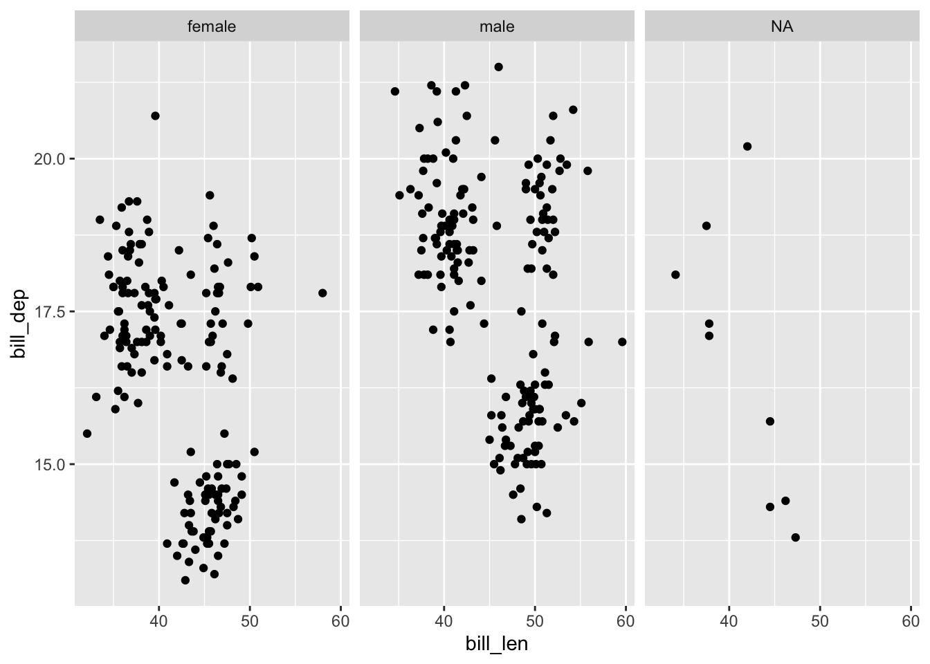
To change the headers associated with the facets (“male”, “female”, and “NA”), change them with factor wrangling functions outside of ggplot, just as before:
penguins |>
  mutate(sex =
           sex |>
           fct_na_value_to_level("Unknown") |>
           fct_recode("Male" = "male", "Female" = "female")) |>
  ggplot(aes(x = bill_len,
             y = bill_dep)) +
  geom_point() +
  facet_wrap(~ sex)
Warning: Removed 2 rows containing missing values or values outside the scale range
(`geom_point()`).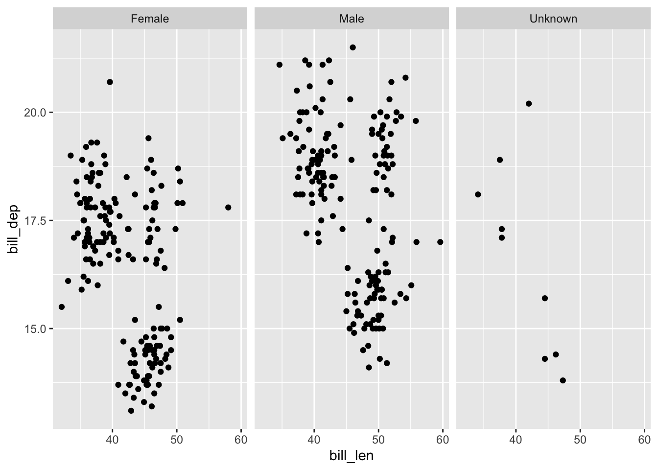
5.3 Legend
5.3.1 Position
ggplot puts the legend to the right by default, but some journals may require it to be somewhere else (like below or inside the plot), or omitted entirely.
First take a subset of the built-in population dataset to experiment with its legend placement.
pop_small <-
  population |>
  filter(country %in% unique(country)[32:35],
         year %in% 1995:2000)
Now make a plot where linetype = country, generating a legend to the right:
pop_small |>
  ggplot(aes(x = year,
             y = population,
             linetype = country)) +
  geom_line() +
  theme_bw()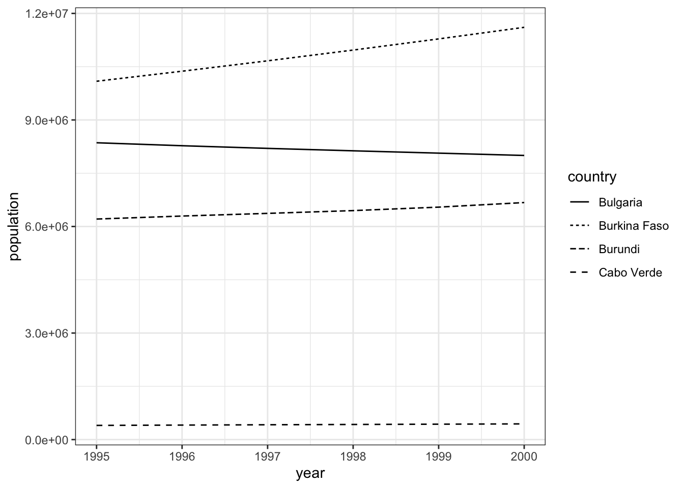
To move it below the legend, set theme(legend.position = "bottom"), making sure to put this modification after any preset theme:
pop_small |>
  ggplot(aes(x = year,
             y = population,
             linetype = country)) +
  geom_line() +
  theme_bw() +
  theme(legend.position = "bottom")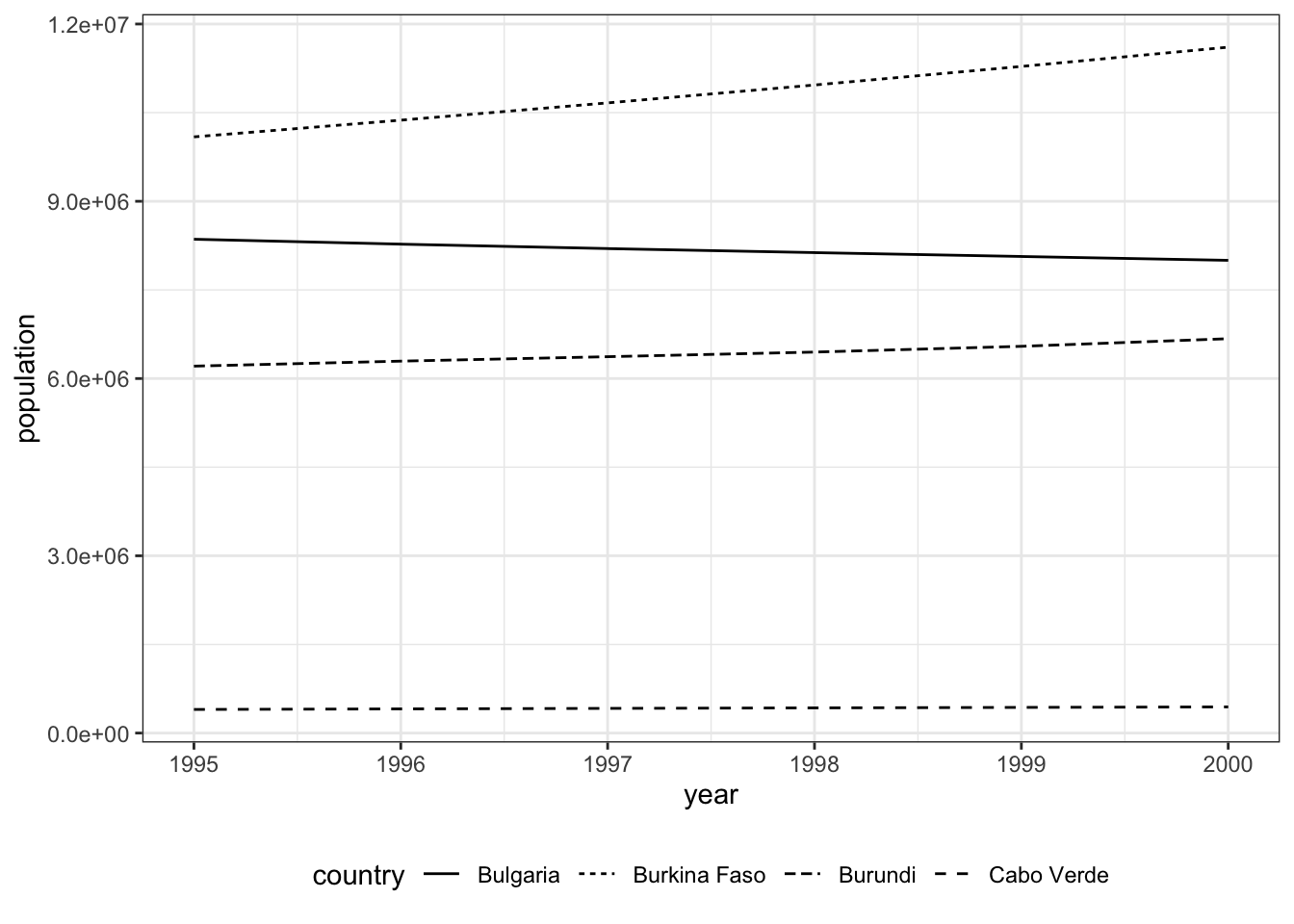
To omit the legend, set theme(legend.position = "none"). This would mean you must clarify within the figure caption which each line represents (e.g., “The solid line is for Bulgaria,” and so on, but this particular set of lines would prove difficult to distinguish by words alone).
pop_small |>
  ggplot(aes(x = year,
             y = population,
             linetype = country)) +
  geom_line() +
  theme_bw() +
  theme(legend.position = "none")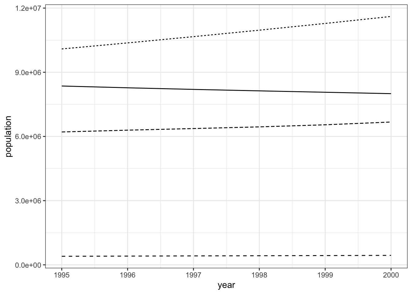
Other journals may require you to place the plot inside the plotting area. This requires a fair amount of trial-and-error to get just right. To begin, set
theme(legend.background = element_rect(color = "black"),
      legend.position = "inside",
      legend.position.inside = c(x1, y1),
      legend.justification = c(x2, y2))`
legend.background = element_rect(color = "black") simply puts a black border around the legend.
Within legend.position.inside = c(x1, y1), x1 and y1 are the coordinates for where to place the legend in the plotting area (not including the axes and labels). c(0, 0) is the bottom-left corner, c(0, 1) is the top-left corner, c(1, 1) is the top-right corner, and c(1, 0) is the bottom right corner.
Within legend.justification = c(x2, y2), x2 and y2 refer to which part of the legend is anchored at the coordinates given by legend.position.inside. By default, it is set to c(0.5, 0.5), which means the center of the legend is at those coordinates. The corners of the legend are some combination of 0s and 1s, such as c(0, 1) for the top-left corner of the legend.
Together, this means that if you want the legend’s top-left corner to be in the top-left corner of the plotting area, set legend.position.inside = c(0, 1) and legend.justification = c(0, 1)
pop_small |>
  ggplot(aes(x = year,
             y = population,
             linetype = country)) +
  geom_line() +
  theme_bw() +
  theme(legend.background = element_rect(color = "black"),
        legend.position = "inside",
        legend.position.inside = c(0, 1),
        legend.justification = c(0, 1))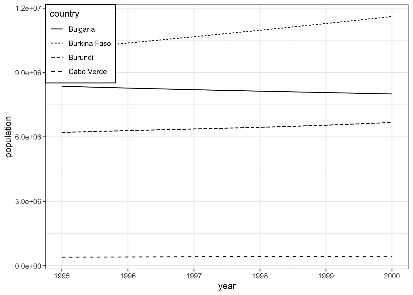
We can do better:
- Move the legend just a little bit away from the corner with
legend.position.inside = c(0.02, 0.97) - Expand the plotting area with
scale_y_continuous(expand = expansion(mult = c(0.05, .4))). The default is to expand the plotting area by 0.05 (5%) in each direction. The plot does not need to be widened (so leave it at 0.05), but it does need to be made taller. Some trial and error lands on 0.4 (40%). - Make the legend into two columns with
guides(linetype = guide_legend(ncol = 2)). Making columns here lets us not make the plot so terribly tall just to fit the legend inside.
pop_small |>
  ggplot(aes(x = year,
             y = population,
             linetype = country)) +
  geom_line() +
  theme_bw() +
  theme(legend.background = element_rect(color = "black"),
        legend.position = "inside",
        legend.position.inside = c(0.02, .97),
        legend.justification = c(0, 1)) +
  scale_y_continuous(expand = expansion(mult = c(0.05, .4))) +
  guides(linetype = guide_legend(ncol = 2))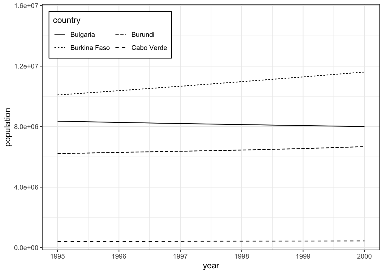
5.3.2 Clarify
For linetypes in particular, the sample given in the legend is sometimes too short to accurately distinguish between the different lines. To fix this, set theme(legend.key.width = unit(1.5, "cm")), which extends the sample to 1.5 cm. Use other numbers and units as appropriate.
Fix the last plot to have longer lines within the legend:
pop_small |>
  ggplot(aes(x = year,
             y = population,
             linetype = country)) +
  geom_line() +
  theme_bw() +
  theme(legend.background = element_rect(color = "black"),
        legend.position = "inside",
        legend.position.inside = c(0.02, .97),
        legend.justification = c(0, 1)) +
  scale_y_continuous(expand = expansion(mult = c(0.05, .4))) +
  guides(linetype = guide_legend(ncol = 2)) +
  theme(legend.key.width = unit(1.5, "cm"))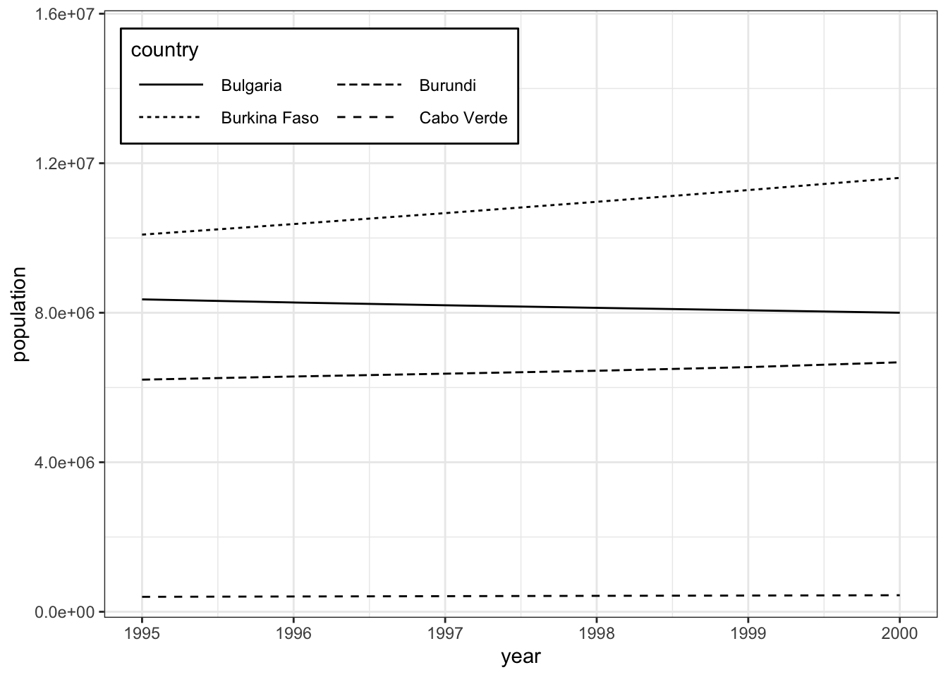
As an alternative or in addition to that, you can manually select linetypes that are more distinguishable. See ?scale_linetype for choices.
pop_small |>
  ggplot(aes(x = year,
             y = population,
             linetype = country)) +
  geom_line() +
  theme_bw() +
  theme(legend.background = element_rect(color = "black"),
        legend.position = "inside",
        legend.position.inside = c(0.02, .97),
        legend.justification = c(0, 1)) +
  scale_y_continuous(expand = expansion(mult = c(0.05, .4))) +
  guides(linetype = guide_legend(ncol = 2)) +
  theme(legend.key.width = unit(1.5, "cm")) +
  scale_linetype_manual(values = c(1, 3, 4, 5))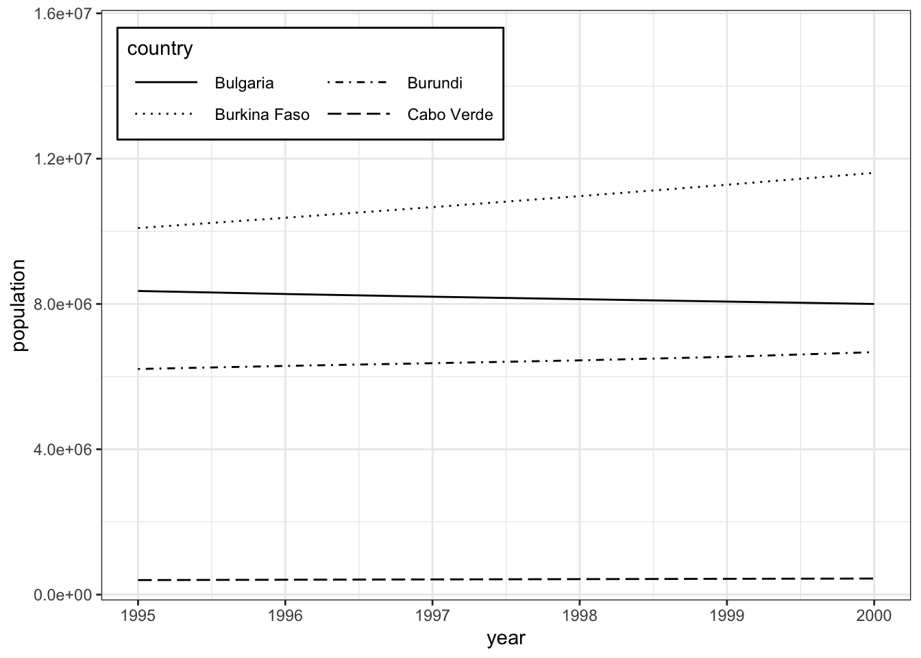
For yet another alternative, combine multiple aesthetics. Here, use both linetype and color for country. Within scale_linetype_manual() and scale_color_manual(), order the two sets of values to create all four combinations of 1/2 and black/gray:
pop_small |>
  ggplot(aes(x = year,
             y = population,
             linetype = country,
             color = country)) +
  geom_line() +
  theme_bw() +
  theme(legend.background = element_rect(color = "black"),
        legend.position = "inside",
        legend.position.inside = c(0.02, .97),
        legend.justification = c(0, 1)) +
  scale_y_continuous(expand = expansion(mult = c(0.05, .4))) +
  guides(linetype = guide_legend(ncol = 2)) +
  theme(legend.key.width = unit(1.5, "cm")) +
  scale_linetype_manual(values = c(1, 2, 1, 2)) +
  scale_color_manual(values = c("black", "black", "gray", "gray"))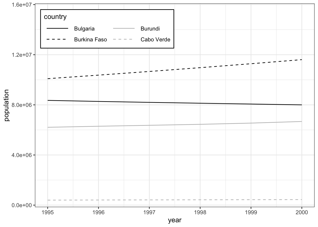
Fine-tuning your plot so that it can clearly communicate your data can take a lot of work, and many lines of code.
5.4 Scales
Look again at the tick labels along the y-axis. R has conservative defaults for when it switches to scientific notation for very small (< .001) or very large numbers (>= 100,000). Numbers like xe±y are interpreted as \(x \times 10^y\), so “6.0e+06” = 6 * 10^6 = 6,000,000.
To express large numbers without scientific notation, using commas instead (as in 6,000,000), set labels = labels_comma() within the appropriate scale_x_continuous() or scale_y_continuous() function, depending on which axis needs adjustment.
Here, our y-axis needs to be adjusted, so use scale_y_continuous():
pop_small |>
  ggplot(aes(x = year,
             y = population,
             linetype = country)) +
  geom_line() +
  theme_bw() +
  scale_y_continuous(labels = label_comma())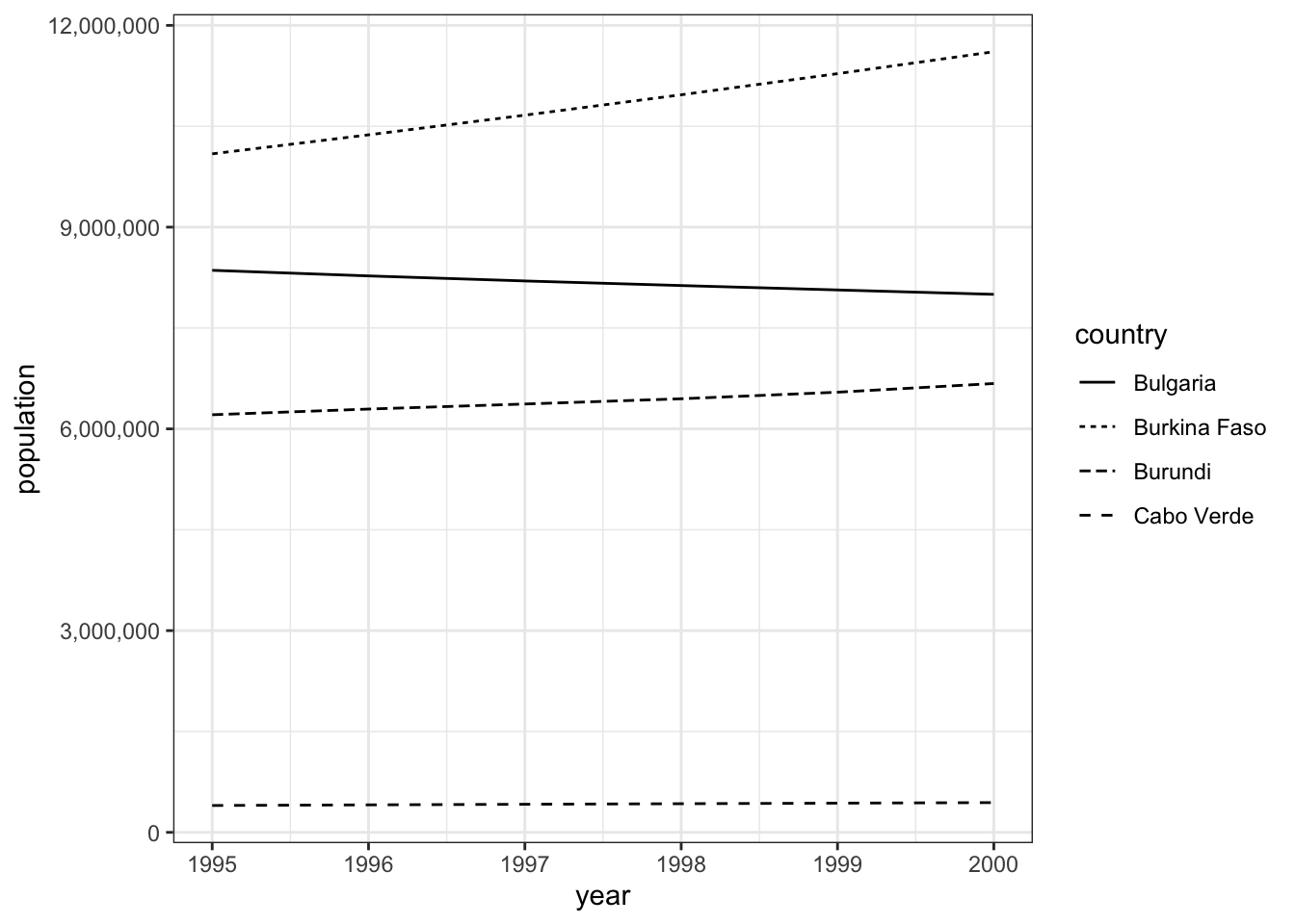
We could also scale an axis by some arbitrary number, like one million. To do that, use label_number() and set its scale argument to 1e-6, which is \(\frac{1}{1,000,000}\), and then append a suffix of “M” denoting million (or ” million”, with the space).
Caution
We could put scale = 1/1000000, but it is far too easy to type the wrong number of zeros. Scientific notation does have its advantages.
pop_small |>
  ggplot(aes(x = year,
             y = population,
             linetype = country)) +
  geom_line() +
  theme_bw() +
  scale_y_continuous(labels = label_number(scale = 1e-6, suffix = "M"))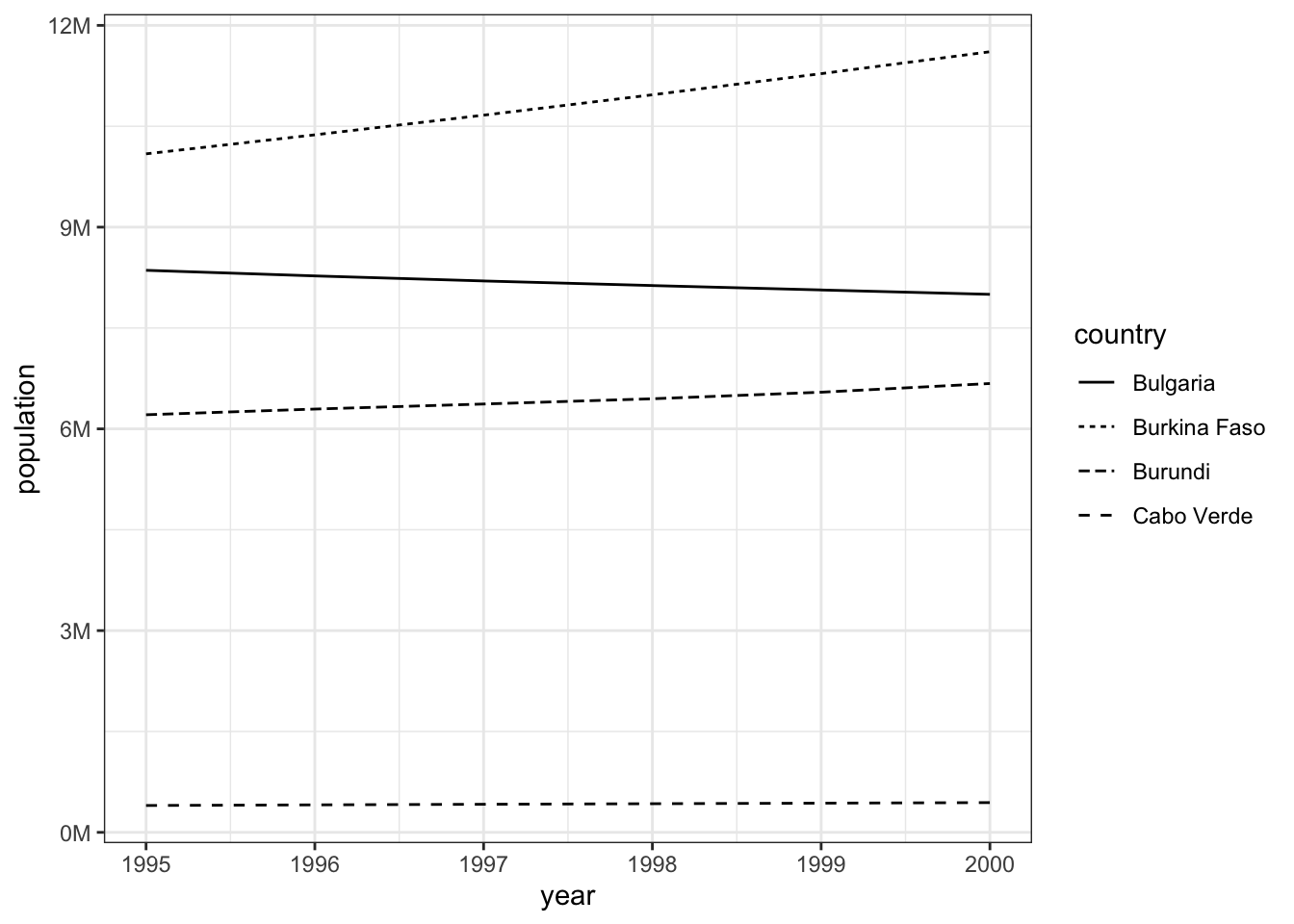
Or leave off the “M” suffix and change the axis label:
pop_small |>
  ggplot(aes(x = year,
             y = population,
             linetype = country)) +
  geom_line() +
  theme_bw() +
  scale_y_continuous(labels = label_number(scale = 1e-6)) +
  labs(y = "Population (in millions)")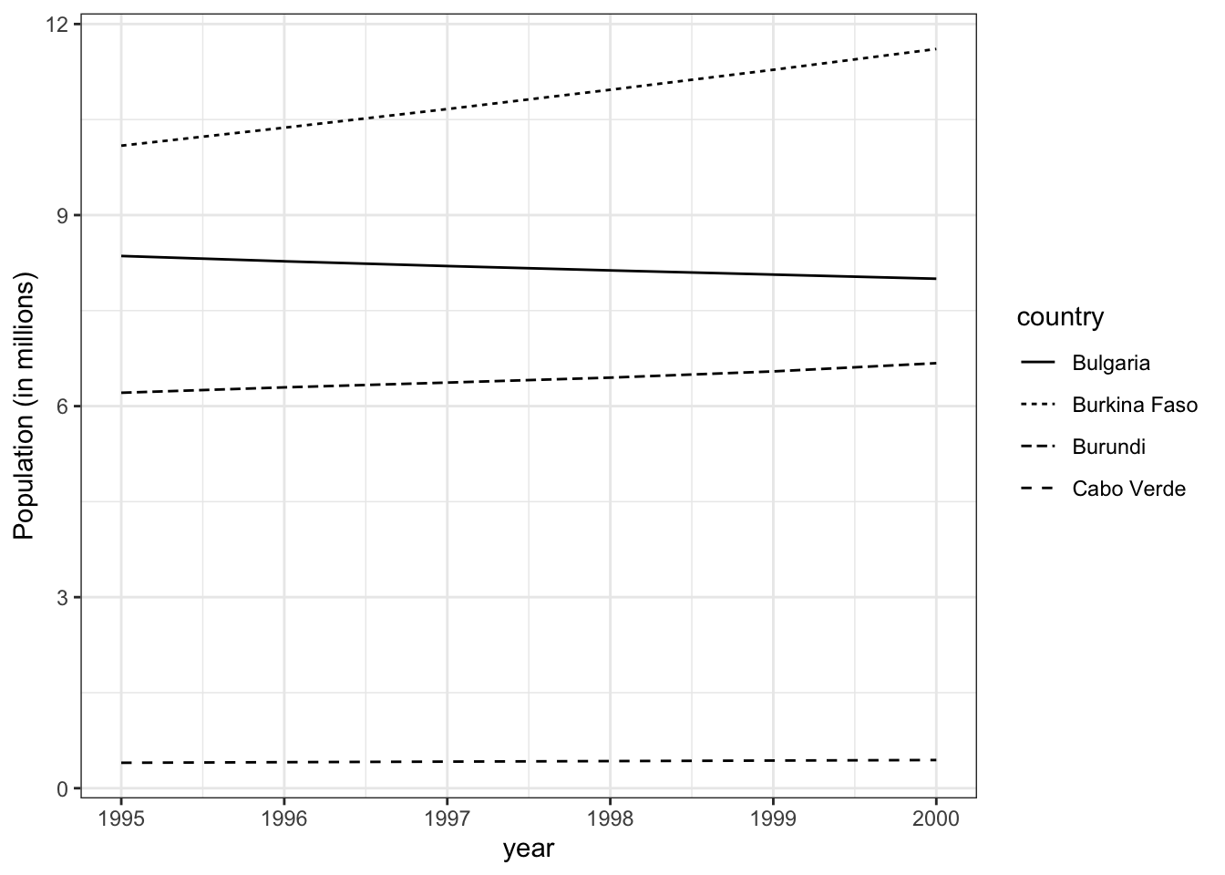
5.5 Fonts
We may need to adjust the fonts used in the plot. ggplot defaults to “sans”, a sans serif (without serifs) font that varies by operating system (e.g. Arial, Helvetica). Change that to “serif” to get a font with serifs (e.g., Times New Roman).
pop_small |>
  ggplot(aes(x = year,
             y = population,
             linetype = country)) +
  geom_line() +
  theme_bw() +
  theme(text = element_text(family = "serif"))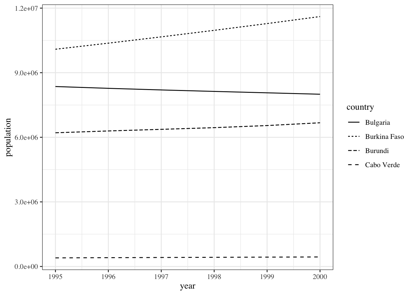
You may set family to a specific font installed on your computer, such as Times New Roman.
How can you know which fonts are installed on your computer and available to ggplot? See them with:
systemfonts::system_fonts() |> View()(systemfonts is installed with tidyverse as a dependency.)
You can use a value from the family column to get its base variant (e.g., “Times New Roman”), or a specific name from the name column (e.g., “TimesNewRomanPS-BoldItalicMT”).
If you have no match for a specific font, R may fall back on an alternative (like Liberation Serif on Linstat), or it could give an error. However, journals rarely require a specific font, instead requiring just any font that is either sans serif or serif.
5.6 Multiple plots
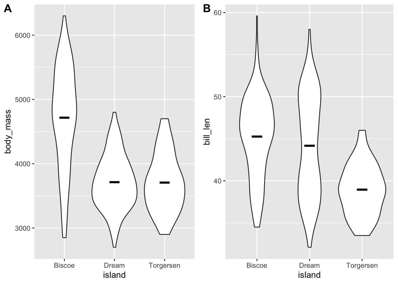
You may need to combine multiple plots into a single figure. To do so, assign each plot to an object (below, plot1 and plot2), and then pass these as arguments to the ggpubr package’s ggarrange() function.
Include the argument labels = "AUTO" to add capital letters (A, B, etc.), or labels = "auto" for lowercase letters (a, b, etc.).
You can also pass labels a vector of arbitrary labels, like labels = c("x", "y"), but if these are more than one character, they will most likely overlap with the plot. To fix that, manually increase the margin around each plot (with theme(plot.margin = margin(...)))) and then in ggarrange() use hjust and/or vjust to adjust the label positions.
plot1 <-
  ggplot(penguins,
         aes(x = island,
             y = body_mass)) +
  geom_violin() +
  stat_summary(fun = "mean", geom = "crossbar", width = .2)

plot2 <-
  ggplot(penguins,
         aes(x = island,
             y = bill_len)) +
  geom_violin() +
  stat_summary(fun = "mean", geom = "crossbar", width = .2)

ggarrange(plot1, plot2, labels = "AUTO")
Warning: Removed 2 rows containing non-finite outside the scale range
(`stat_ydensity()`).Warning: Removed 2 rows containing non-finite outside the scale range
(`stat_summary()`).Warning: Removed 2 rows containing non-finite outside the scale range
(`stat_ydensity()`).Warning: Removed 2 rows containing non-finite outside the scale range
(`stat_summary()`).