library(tidyverse)
library(ggrepel)2 ggplot Basics
All the pages in this book require ggplot2 (henceforth just called “ggplot”) and other packages within the tidyverse. The top of each page within this book will tell you if any other packages are needed. For this page, load the tidyverse and ggrepel (a package for adding labels to a plot).
2.1 What is a plot?
A plot is a layered visualization of data, where visible properties such as location, size, or color represent values, which are either in or derived from our dataset.
We plot to understand and communicate data:
- To understand data, better than we can by looking through summary statistics. In data exploration, we can observe the distributions of variables, the direction and complexity of trends, and the presence of outliers.
- To communicate data, highlighting relationships we think are important.
2.1.1 Making data visible
Plots take what may or may not be readily visible and map it to some visible dimension. In other words, plots are visualizations of data, or just “data visualizations.”
What does height look like? That is easy enough. Height is the distance from the bottom of somebody’s feet to the top of their head when they are standing or otherwise stretched out. (People are essentially walking bar graphs.)
What does total hours of sleep look like? Now that’s more difficult, since ther is no way to see lengths of time. Let’s use the msleep data to make a scatterplot of total sleep (in hours) by body weight (in kilograms), and color each point by its diet (carnivore, omnivore, herbivore, or insectivore):
ggplot(msleep,
       aes(x = bodywt,
           y = sleep_total,
           color = vore)) +
  geom_point()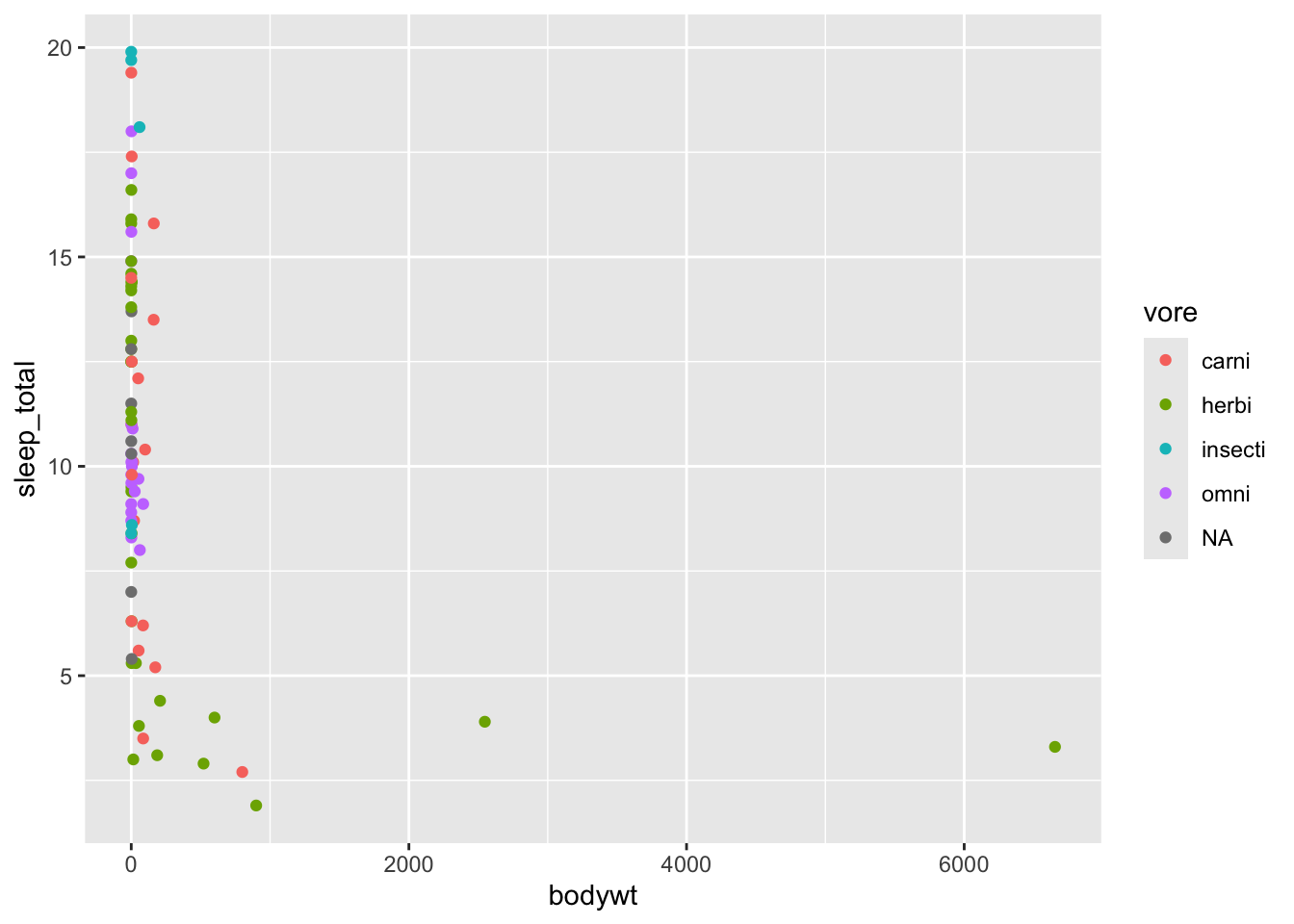
What our plot does is take hours of sleep and map it to the y-axis. The more “up” a point is, the more hours of sleep, and the more “down” it is, the fewer hours of sleep. We can now see lengths of time! Body weight is on the x-axis, so points more to the right represent heavier animals than those on the left. Diet is mapped to color, so we can quickly identify what an animal eats based on its color (somthing we would not be able to do from the color of the animal itself!).
What do you see in the plot? That green point on the far right stands out. There is an herbivore out there that weighs a ton (several tons, in fact) and sleeps very little.
There also seems to be a trend that lighter animals have greater variation in their hours of sleep while heavier animals tend to sleep less.
2.2 ggplot basics
A plot can be decomposed into at least four elements:
- data, the dataframe
- aesthetic mappings, meaning which variable (
age,income,race, etc.) maps to which aesthetic (visible properties like x coordinates, y coordinates, color, shape, etc.) - coordinate system, the positioning system of points
- geoms, short for geometric objects, such as lines or points
For a discussion of how plots can be further broken down into more elements, read Hadley Wickham’s A Layered Grammar of Graphics.
2.2.1 The essential layers
It is instructive to see these elements added in turn.
When we supply ggplot() with our dataframe, ggplot understands we want to use the built-in msleep dataset (part of the tidyverse), but it does not know how the plot should relate to the data, so we are given a blank plot:
ggplot(msleep)
Adding aesthetic mappings in the aes (short for aesthetic) argument gives rise to an axis label and vertical gridlines. At this point, ggplot knows there should be an x-axis that shows the bodywt variable, a y-axis for sleep_total, and colors for vore, but it does not know how to represent the data:
ggplot(msleep,
       aes(x = bodywt,
           y = sleep_total,
           color = vore))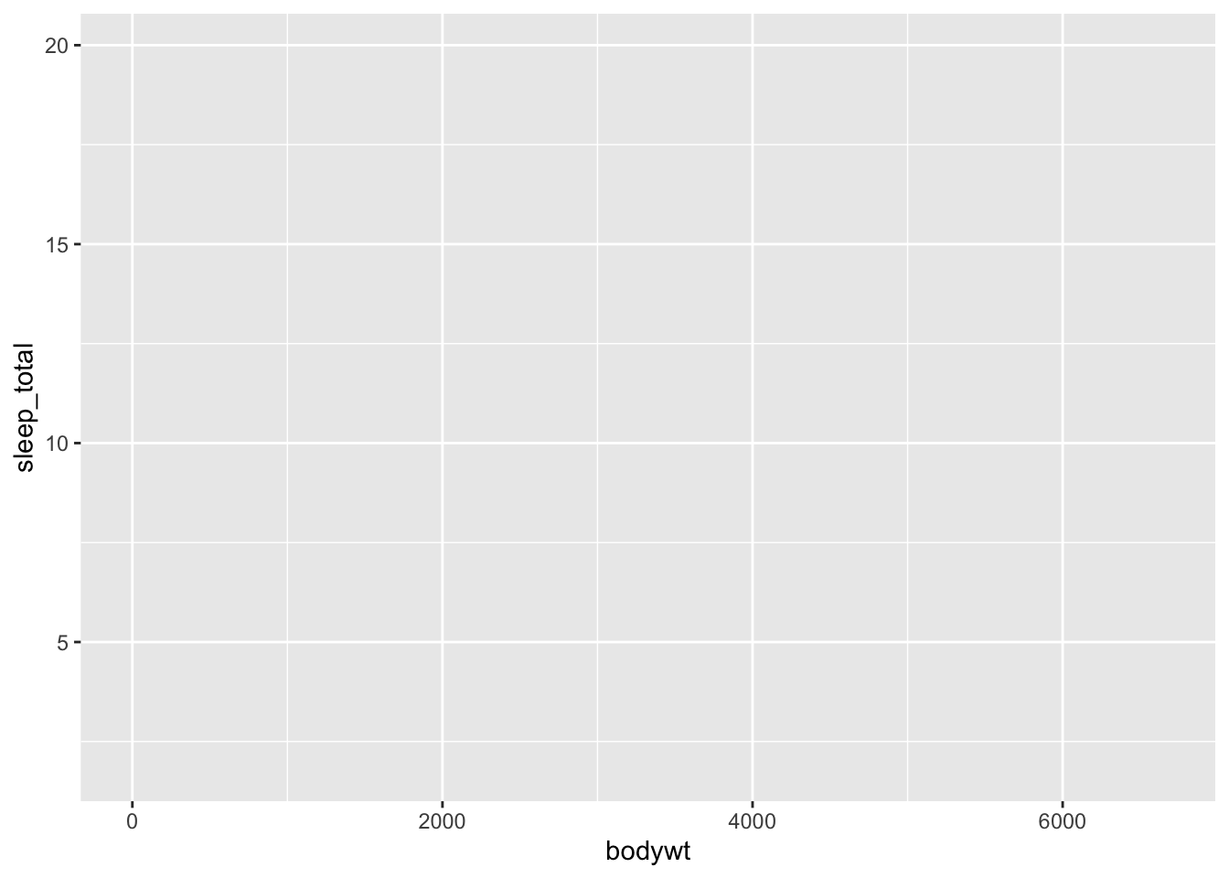
The default coordinate system is Cartesian coordinates (x, y), so we can skip this step.
Once a geom is supplied with any one of the many geom_*() functions, ggplot knows enough to create a useful plot. A geom_*() function is added to the ggplot() call with the addition operator +. You can use + to add additional geoms or other plot elements (labels, themes, etc.).
While the aesthetic mappings were supplied to ggplot(), these can also be given to the geom_*() function. If you supply aesthetics within a specific geom_*(), they will only apply to that geom_*(), and not any others you include. Usually, you will want to specify your aesthetics within ggplot(), which then passes this on to all geom_*() functions (unless you specify inherit.aes = FALSE within a geom_*() function).
ggplot(msleep,
       aes(x = bodywt,
           y = sleep_total,
           color = vore)) +
  geom_point()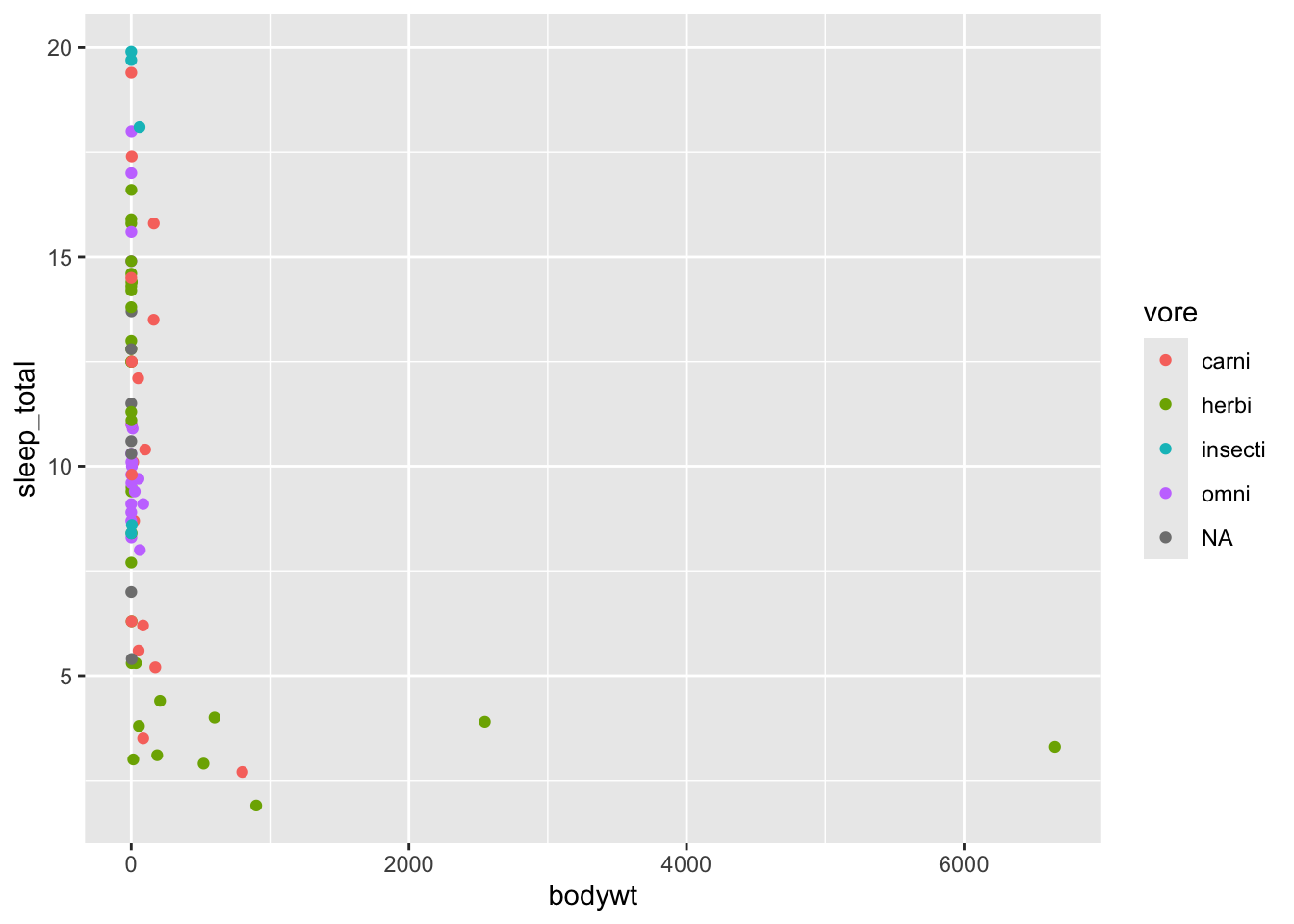
2.2.2 Adding more layers
From there, we can “add” on other layers and elements to our plot. After the first ggplot() call, use + to put add more elements (like data labels) or change existing ones (like axis text).
(This plot is far more complicated than the one above, but you are not expected to understand it quite yet. We will get there over the course of this book.)
msleep |>
  mutate(vore = fct_relabel(vore, \(x) paste0(x, "vore"))) |>
  ggplot(aes(x = bodywt,
             y = sleep_total,
             color = vore,
             label = name)) +
  geom_point() +
  geom_label_repel(show.legend = F) +
  labs(x = "Body weight (kilograms)",
       y = "Total amount of sleep (hours)",
       color = "Trophic group") +
  theme_bw()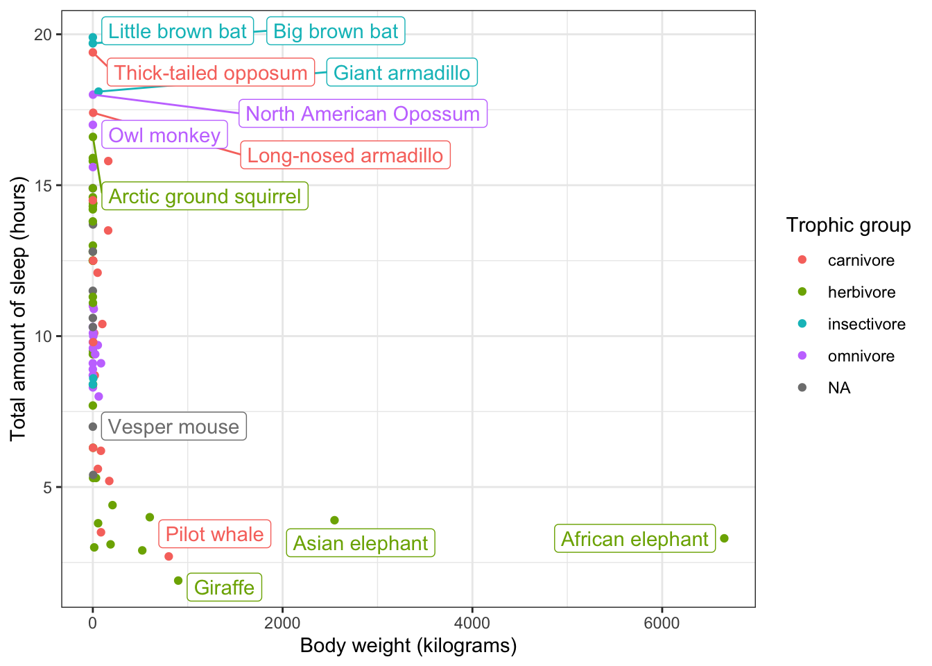
Now we can identify that herbivore that sleeps so little: the African elephant.
2.3 Data setup
Before you plot your data, you need to wrangle it. This includes ensuring that
- values are recognized for what kind of data they are (numeric, dates, categorical, etc.)
- missing data is coded as such (using
NAinstead of a numeric code like -999 or the string “missing”) - only observations that should be included are in the dataset (subsetting)
- formatting the dataset into the proper structure (reshaping)
and much, much more. Skills like these are outside the scope of this book, but you can learn them in Data Wrangling in R. The examples in this book all use tidy data, but it will serve our purposes here to see what plots can look like when the data is not sufficiently prepared. The purpose in mind is that you walk away knowing just how important data wrangling is.
2.3.1 Missing data
Imagine we have a student’s scores across 10 tests. This student was absent for one of them, and their missing score was coded as -999.
Here is a scatterplot of their scores over time:
dat <-
  data.frame(test = 1:10,
             score = c(72, 83, 75, 77, -999, 81, 90, 84, 95, 99))

ggplot(dat,
       aes(x = test,
           y = score)) +
  geom_point() +
  geom_smooth()
`geom_smooth()` using method = 'loess' and formula = 'y ~ x'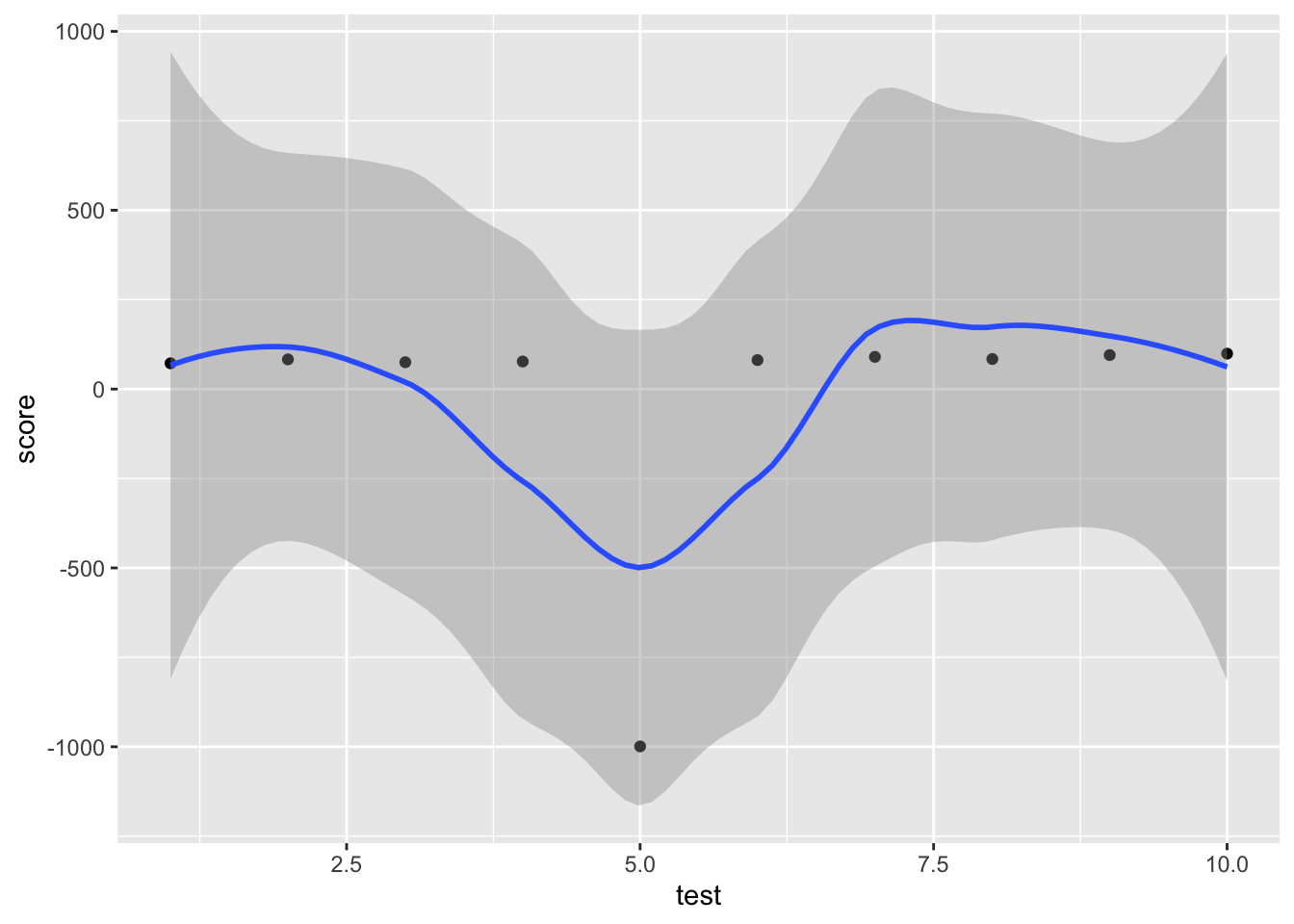
The blue line is a smoothed regression line, and the gray area around it is the 95% confidence band. Look how massive it is! That -999 greatly increases uncertainty around the mean.
Code -999 as NA and then replot:
dat |>
  mutate(score = ifelse(score == -999, NA, score)) |>
  ggplot(aes(x = test,
             y = score)) +
  geom_point() +
  geom_smooth()
`geom_smooth()` using method = 'loess' and formula = 'y ~ x'Warning: Removed 1 row containing non-finite outside the scale range
(`stat_smooth()`).Warning: Removed 1 row containing missing values or values outside the scale range
(`geom_point()`).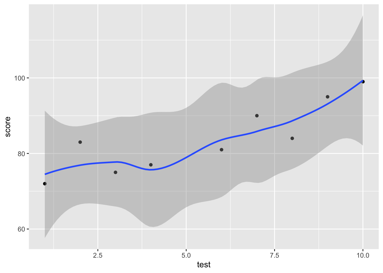
Now we can detect a positive trend in this student’s scores.
Your missing data might not be as obvious as in this case. Perhaps you have data that ranges 1-5, and 8 means missing. In any case, you need to carefully read the documentation for your dataset and explore the range of values in each variable.
2.3.2 Categorical data
Here, imagine we have a dataset with some weekdays and their observed temperature.
dat <-
  data.frame(day = c("Monday", "Tuesday",
                     "Wednesday", "Thursday",
                     "Friday"),
             temp = c(73, 78, 82, 83, 80))

ggplot(dat,
       aes(x = day,
           y = temp)) +
  geom_point() +
  geom_smooth()
`geom_smooth()` using method = 'loess' and formula = 'y ~ x'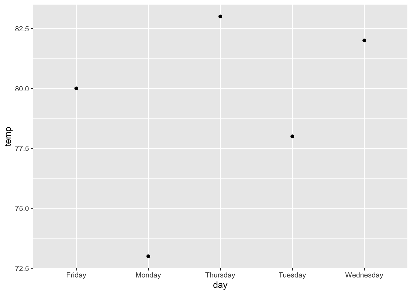
What is wrong in this plot? The x-axis, day, was ordered alphabetically! For unordered categorical variables like state or political party, alphabetical order may be fine, but for categorical variables with a natural order, we should order them accordingly.
Fix that issue outside of ggplot by first releveling day:
dat |>
  mutate(day = fct_relevel(day,
                           "Monday", "Tuesday",
                           "Wednesday", "Thursday",
                           "Friday")) |>
  ggplot(aes(x = day,
             y = temp)) +
  geom_point() +
  geom_smooth()
`geom_smooth()` using method = 'loess' and formula = 'y ~ x'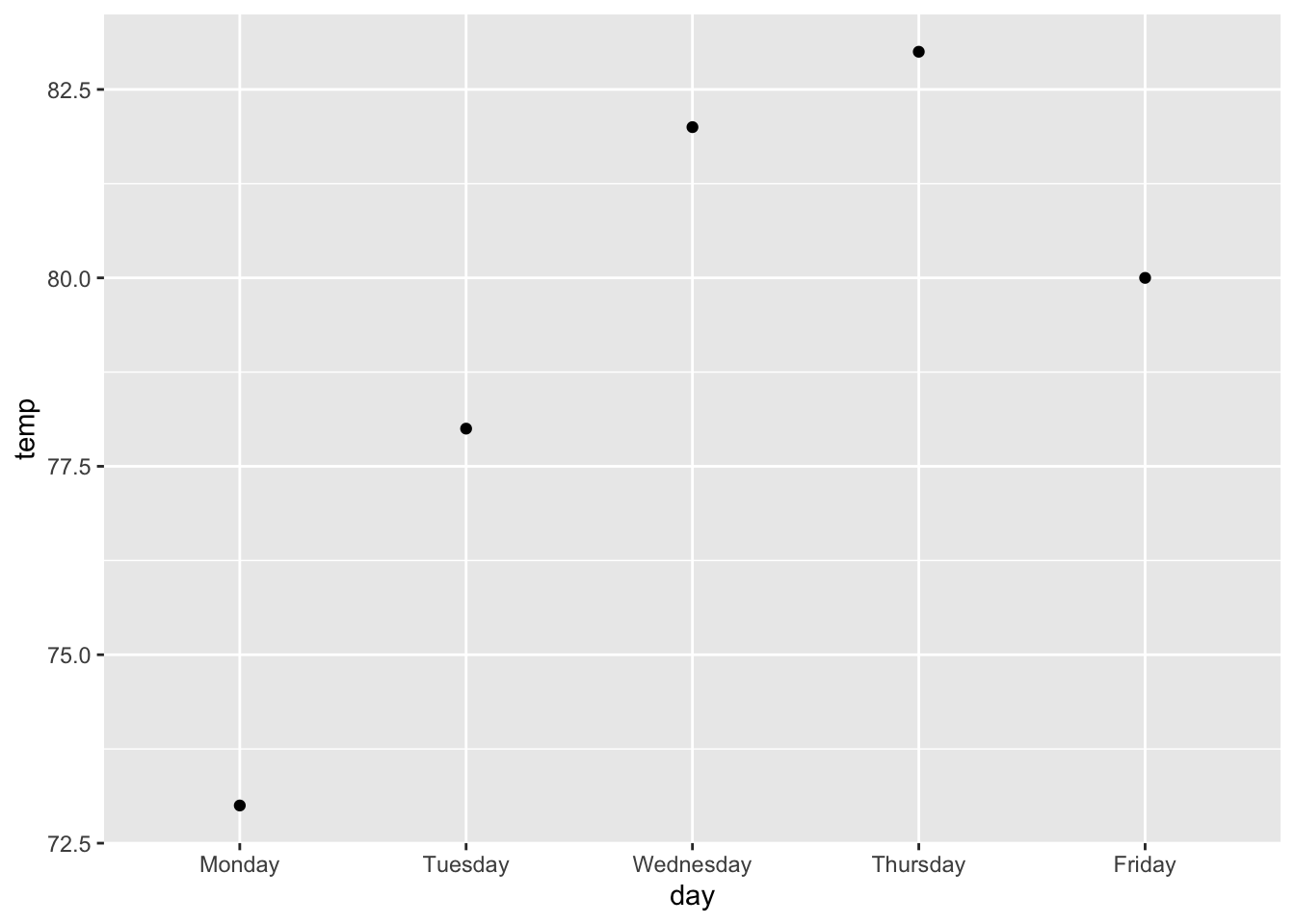
2.3.3 Wide, grouped data
For ggplot, your data needs to be in a long format. That means each row has a single observation, and the units of observation (day of the week, ID, etc.) are repeated down a column.
Learn more about data shapes and how to switch between them in the chapter on reshaping dataframes in Data Wrangling in R.
As an example of what can go wrong, use this subset of baby weight data from the World Health Organization. The data is in wide format, where the units of observation, sex, are on one row each, and each row has multiple observations. Each column gives the median weight for some month, so that med_wt_3 is the median weight for a three-month-old baby.
baby_weight <- read.csv("https://www.sscc.wisc.edu/sscc/pubs/dvresearch/data/baby_weight.csv")
baby_weight
sex med_wt_0 med_wt_1 med_wt_2 med_wt_3 med_wt_4 med_wt_5 med_wt_6
1 male 3.3464 4.4709 5.5675 6.3762 7.0023 7.5105 7.934
2 female 3.2322 4.1873 5.1282 5.8458 6.4237 6.8985 7.297
med_wt_7 med_wt_8 med_wt_9 med_wt_10 med_wt_11 med_wt_12 med_wt_13 med_wt_14
1 8.2970 8.6151 8.9014 9.1649 9.4122 9.6479 9.8749 10.0953
2 7.6422 7.9487 8.2254 8.4800 8.7192 8.9481 9.1699 9.3870
med_wt_15 med_wt_16 med_wt_17 med_wt_18 med_wt_19 med_wt_20 med_wt_21
1 10.3108 10.5228 10.7319 10.9385 11.1430 11.3462 11.5486
2 9.6008 9.8124 10.0226 10.2315 10.4393 10.6464 10.8534
med_wt_22 med_wt_23 med_wt_24
1 11.7504 11.9514 12.1515
2 11.0608 11.2688 11.4775If we want to graph median weight by month, we cannot do that with how the data is organized. We can only give ggplot a single column for each dimension, but here median weight is spread across 25 columns.
To fix this, we first need to make the data long, so that each row gives the median weight for a single month:
baby_weight_long <-
  baby_weight |>
  pivot_longer(cols = starts_with("med_wt_"),
               names_prefix = "med_wt_",
               names_to = "month",
               names_transform = as.numeric,
               values_to = "med_wt")

baby_weight_long
# A tibble: 50 × 3
sex month med_wt
<chr> <dbl> <dbl>
1 male 0 3.35
2 male 1 4.47
3 male 2 5.57
4 male 3 6.38
5 male 4 7.00
6 male 5 7.51
7 male 6 7.93
8 male 7 8.30
9 male 8 8.62
10 male 9 8.90
# ℹ 40 more rowsNow, plot med_wt by month:
ggplot(baby_weight_long,
       aes(x = month,
           y = med_wt)) +
  geom_line()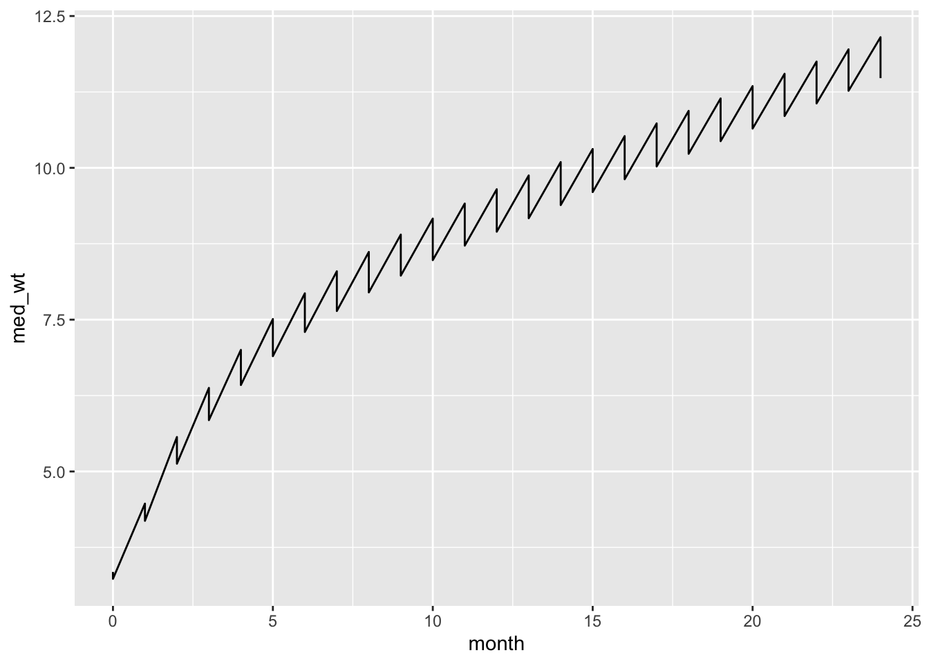
We successfully plotted the data, but what is the zig-zag about? This is a sign that we omitted a grouping variable. Each x-value (month) is associated with two y-values (med_wt), one for each value of sex. Male and female each have a weight for 0 months, 1 month, and so on. When we make a line graph, ggplot connects all of those values together. We will learn more strategies to handle a third variable in plots in the chapter on customizing plots, but for now, tell ggplot to use a different linetype for each sex:
ggplot(baby_weight_long,
       aes(x = month,
           y = med_wt,
           linetype = sex)) +
  geom_line()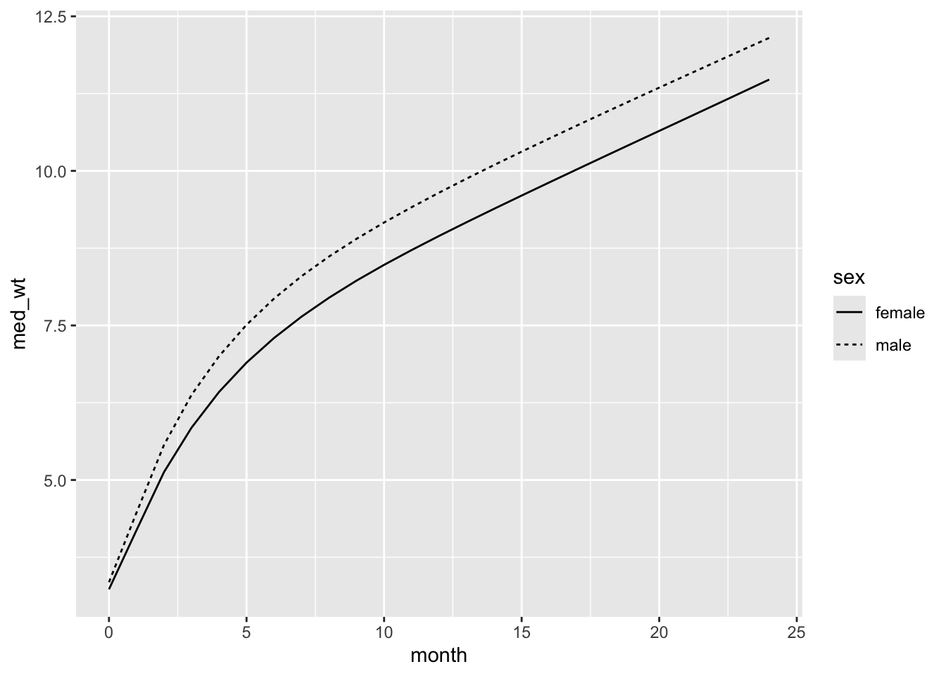
Nice plot!
2.3.4 Data prep matters
The examples above are intended to give you a sense that data wrangling cannot be overlooked. Your raw data is not ready for visualization. You need to understand how it is structured, check variable types and the values they contain, ensure the data is free of errors, and more. Data wrangling is an essential step in the data visualization workflow.
Read Data Wrangling in R and work through the exercises on your own, or take it as a workshop.
Now that we understand how to create a basic plot with ggplot (specify the data, variable-aesthetic mappings, and geoms), we can accomplish our real task: using data visualization to understand and communicate our data. We will first look at a variety of strategies for understanding our data through plots, then how to save and customize plots for publication, and finally how to make plots from statistical models.