 Supporting Statistical Analysis for Research
3.4 Relationships between more than two variables
3.4.1 Exploring
3.4.1.1 Variables mapped to aesthetics
There are a number of ways to show the relationship between
three variables.
One of the most common ways this is done is to add a third variable to
a scatter plot of and two continuous variables.
The third variable would be mapped to either the color, shape, or size
of the observation point.
When a categorical variable is mapped to one of these aesthetics,
a different color, shape, or size is used for
for each level.
When a continuous variable is mapped to color or size,
a gradient scale is used.
That is the color or size changes gradually from the smallest to
the largest value of the variable.
There is no continuous scale for the shape parameter.
This approach can be used with other geom_*() functions.
(The * in geom_*() represents all the different
geom types that can be used, such as point, boxplot, etc.)
3.4.1.2 Faceting graphs
When the third variable is categorical, it may be useful to draw a separate graph for each of the category levels. This is called facetting in ggplot.
Facets can be combined with mapping variables to color, shape, and size. This can allow displaying the relationship between four or more variables.
3.4.2 Programming - ggplot beyond layers
3.4.2.1 Facets
There are two faceting functions in ggplot,
facet_wrap() and facet_grid().
The facet_wrap() function is used to facet on
a single variable and facet_grid() to facet on
two variables with the graphs arranged as a grid.
The facet variables are specified as follows
`facet_wrap(~x3)`
`facet_grid(x4 ~ x3)`
The x4 levels are used on the y axis of the grid
and the x3 levels are used on the x axis of the grid.
The facet_*() functions are added to a ggplot
object the same as layers, with the + operator.
3.4.2.2 Other non-layer plotting features
The background for the graph layers
is called a theme.
There are a number of complete themes available in ggplot.
Several of the common alternatives to the default theme
are theme_bw(), theme_light(), and theme_clasic().
The theme() function can be used to tweak the look of
any of the themes.
The labels of a graph can be set by the labs() function.
The labels include the title, axis, and legend.
Note, there are other convenience functions that can be
use for some of these labels, such as
ggtitle(), xlab(), and ylab().
The guide_ledgend() function can be used to control the
position and look of a legend.
There are functions to control the coordinates system used and the scales of the axis and mappings to other aesthetics.
All of these functions are added to a plot object with the
+ operator.
Further details on the use of these functions will not be
covered in this book.
They are left for you to investigate on your own.
3.4.3 Examples - R
These examples use the auto.csv data set.
We begin by using the same code as in the prior section to load the tidyverse and import the csv file. The
originvariable is imported as a factor variable as before.library(tidyverse)auto_path <- file.path("..", "datasets", "auto.csv") auto <- read_csv(auto_path, col_types = cols(origin = col_factor(NULL)))Warning: Missing column names filled in: 'X1' [1]glimpse(auto)Observations: 392 Variables: 10 $ X1 <dbl> 1, 2, 3, 4, 5, 6, 7, 8, 9, 10, 11, 12, 13, 14, 15... $ mpg <dbl> 18, 15, 18, 16, 17, 15, 14, 14, 14, 15, 15, 14, 1... $ cylinders <dbl> 8, 8, 8, 8, 8, 8, 8, 8, 8, 8, 8, 8, 8, 8, 4, 6, 6... $ displacement <dbl> 307, 350, 318, 304, 302, 429, 454, 440, 455, 390,... $ horsepower <dbl> 130, 165, 150, 150, 140, 198, 220, 215, 225, 190,... $ weight <dbl> 3504, 3693, 3436, 3433, 3449, 4341, 4354, 4312, 4... $ acceleration <dbl> 12.0, 11.5, 11.0, 12.0, 10.5, 10.0, 9.0, 8.5, 10.... $ year <dbl> 70, 70, 70, 70, 70, 70, 70, 70, 70, 70, 70, 70, 7... $ origin <fct> 1, 1, 1, 1, 1, 1, 1, 1, 1, 1, 1, 1, 1, 1, 3, 1, 1... $ name <chr> "chevrolet chevelle malibu", "buick skylark 320",...
3.4.3.1 Exploring - Mapping variables to non-axis aesthetics
This example creates a scatter plot of
weightandmpg. Theoriginvariable is used as the color aesthetic. The points will have a unique color for each level oforigin.ggplot(data=auto, mapping = aes(x = weight, y = mpg)) + geom_point(aes(color = origin)) + theme_bw()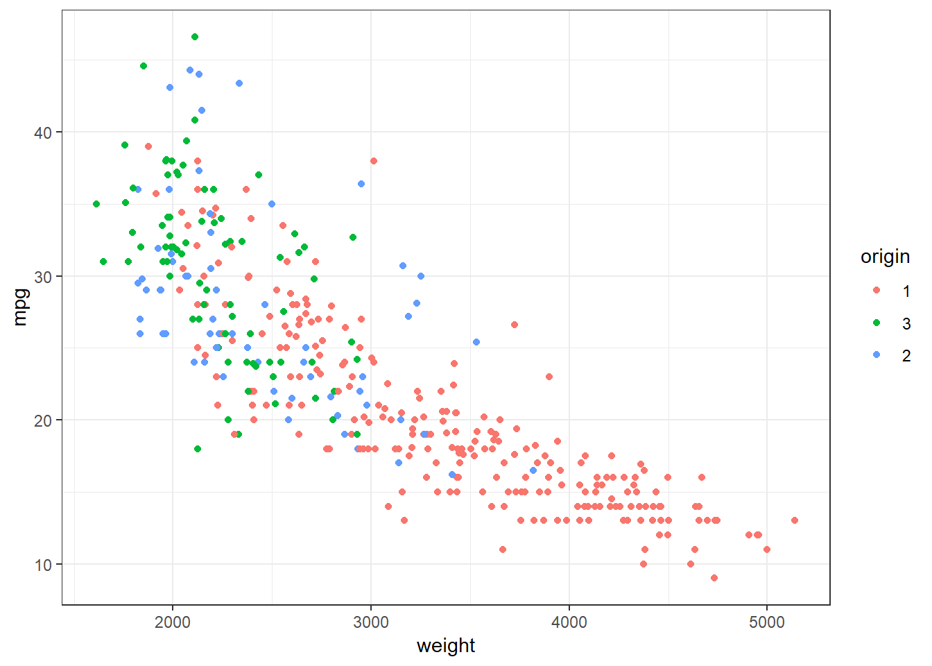
This graph allows us to see that level 1 of
origincontains automobiles that not only have lower gas mileage than the other two levels, but also that are heavier. The boxplots in the prior section informed us that level 1 had lowermpgautomobiles than the other two levels. But we could not see that this might be influenced by the weight of the automobiles.
3.4.3.2 Exploring - Facet
This example explores the relationships between the same three variables as the prior example. This example facets on
origininstead of mappingoriginto color.ggplot(data=auto, mapping = aes(x = weight, y = mpg)) + geom_point() + facet_wrap(~origin) + theme_bw()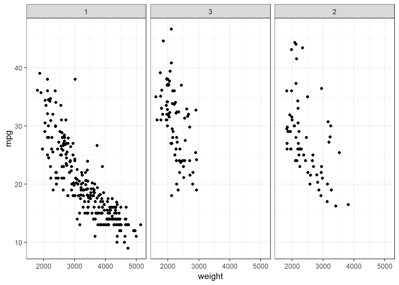
The faceted graph provides similar information as the graph that used color. Which one you use is a matter of personal preference and the purpose. For example, if I am looking to see details about the individual levels, I use faceting. If I am looking at contrasting the levels to each other, I use color.
The next two examples demonstrate some of the other themes, legend displays, and titles and labels that can be used.
3.4.3.3 Exploring - Legends
This example starts with the color mapped graph. The theme has been changed from black on white to the light theme. Also, the legend position is moved to the bottom, the legend title is removed, and names are given to the levels. A legend position of
"none"can be used to remove the legend.ggplot(data=auto, mapping = aes(x = horsepower, y = mpg)) + geom_point(aes(color = origin)) + theme_light() + theme(legend.position = "bottom", legend.title=element_blank()) + scale_color_discrete(labels = c("American", "European", "Japanese"))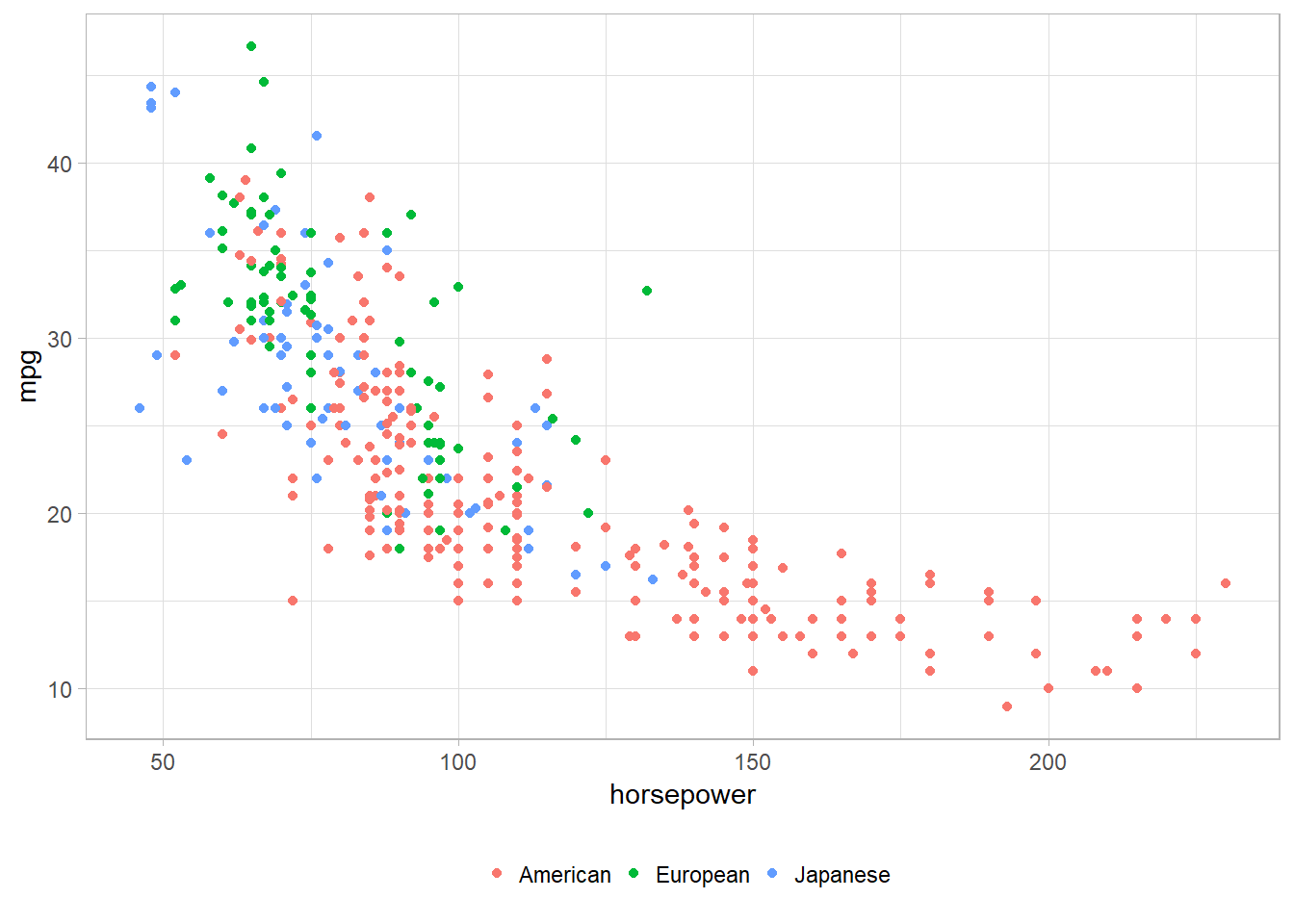
3.4.3.4 Exploring - Titles and axis labels
This example starts with the color mapped graph. The theme has been changed from black on white to the classic theme. Also, a title is given and the axis labels are changed. The default title position is left aligned. The default can be changed to centered with
"theme_update(plot.title = element_text(hjust = 0.5))".ggplot(data=auto, mapping = aes(x = weight, y = horsepower)) + geom_point(aes(color = origin)) + theme_classic() + ggtitle("Automobile Horsepower and Weight") + theme(plot.title = element_text(hjust = 0.5)) + xlab("Weight in Pounds") + ylab("Miles/Gallon")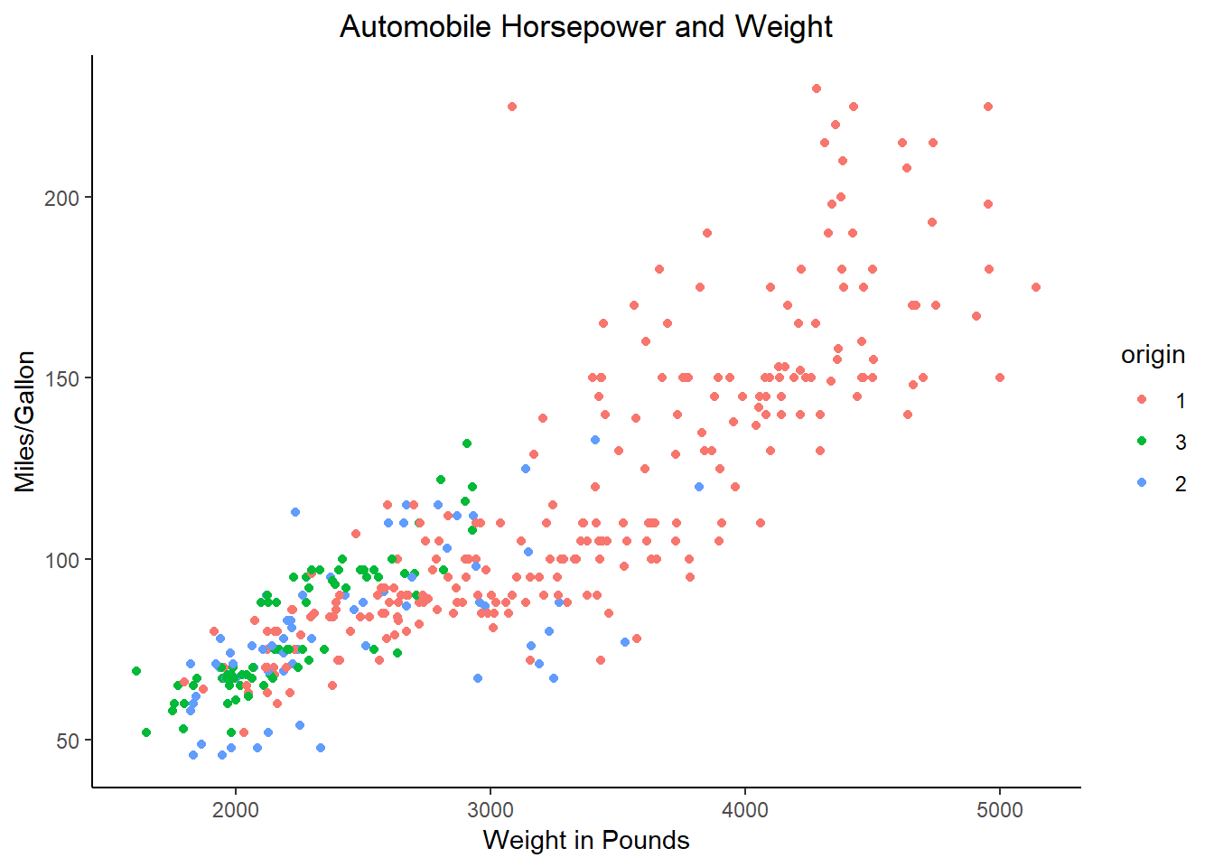
3.4.4 Examples - Python
These examples use the auto.csv data set.
We begin by using the same code as in the prior section to load packages and import the csv file. The
originvariable is imported as a category variable as before.from pathlib import Path import pandas as pd import plotnine as p9auto_path = Path('..') / 'datasets' / 'Auto.csv' auto = pd.read_csv(auto_path, dtype={'origin': 'category'}) print(auto.dtypes)Unnamed: 0 int64 mpg float64 cylinders int64 displacement float64 horsepower int64 weight int64 acceleration float64 year int64 origin category name object dtype: object
3.4.4.1 Exploring - Mapping variables to non-axis aesthetics
This example creates a scatter plot of
weightandmpg. Theoriginvariable is used as the color aesthetic. The points will have a unique color for each level oforigin.print( p9.ggplot(auto, p9.aes(x='weight', y='mpg')) + p9.geom_point(p9.aes(color='origin')) + p9.theme_bw())<ggplot: (143602164053)>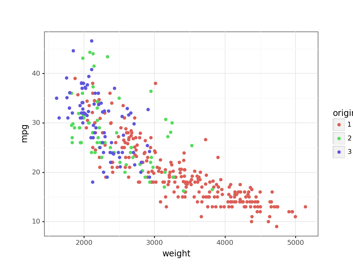
This graph allows us to see that level 1 of
origincontains automobiles that not only have lower gas mileage than the other two levels, but also that are heavier. The boxplots in the prior section informed us that level 1 had lowermpgautomobiles than the other two levels. But we could not see that this might be influenced by the weight of the automobiles.
3.4.4.2 Exploring - Facet
This example explores the relationships between the same three variables as the prior example. This example facets on
origininstead of mappingoriginto color.print( p9.ggplot(auto, p9.aes(x='weight', y='mpg')) + p9.geom_point() + p9.facet_wrap('~ origin') + p9.theme_bw())<ggplot: (-9223371893260404413)>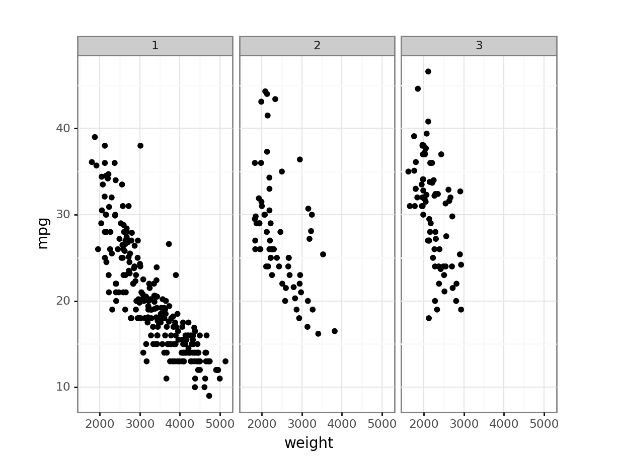
The faceted graph provides similar information as the graph that used color. Which one you use is a matter of personal preference and the purpose. For example, if I am looking to see details about the individual levels, I use faceting. If I am looking at contrasting the levels to each other, I use color.
The next two examples demonstrate some of the other themes, legend displays, and titles and labels that can be used.
3.4.4.3 Exploring - Legends
This example starts with the color mapped graph. The theme has been changed from black on white to the light theme. Also, the legend position is moved to the bottom, the legend title is removed, and names are given to the levels. A legend position of
"none"can be used to remove the legend.The legend position parameter in R can use
bottom. Ifbottomis used in plotnine, the legend may be positioned on top of part of the graph. To put the legend undereth the graph in plotnine you may need to shrink the plot withsubplots_adjustand then manually create the bottom legend usinglegend_positionandlegend_direction.print( p9.ggplot(auto, p9.aes(x='horsepower', y='mpg')) + p9.geom_point(p9.aes(color='origin')) + p9.theme_light() + p9.theme(subplots_adjust={'bottom': 0.2}) + p9.theme( legend_position=(.5, .05), legend_direction='horizontal', legend_title=p9.element_blank()) + p9.scale_color_discrete(labels=['American', 'European', 'Japanese']))<ggplot: (-9223371893252628827)>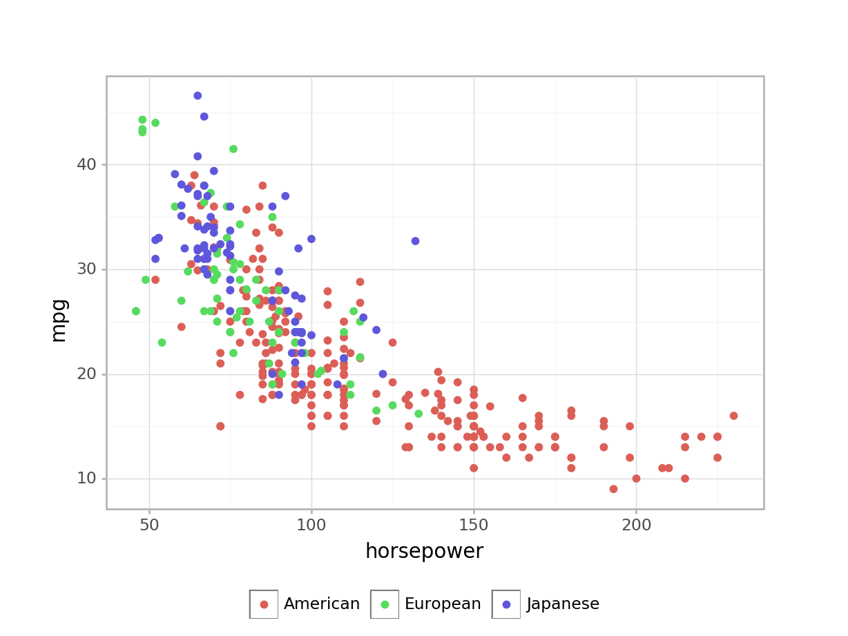
3.4.4.4 Exploring - Titles and axis labels
This example starts with the color mapped graph. The theme has been changed from black on white to the classic theme. Also, a title is given and the axis labels are changed. The default title position in plotnine is centered. The default can be changed using
theme_update. For example,theme_update(plot_title = element_text(hjust = 0.5))provides the default centered title. Changing the value ofhjustwill move the text to the right or left.print( p9.ggplot(auto, p9.aes(x='weight', y='horsepower')) + p9.geom_point(p9.aes(color='origin')) + p9.theme_classic() + p9.ggtitle('Automobile Horsepower and Weight') + p9.xlab('Weight in Pounds') + p9.ylab('Miles/Gallon'))<ggplot: (143597514118)>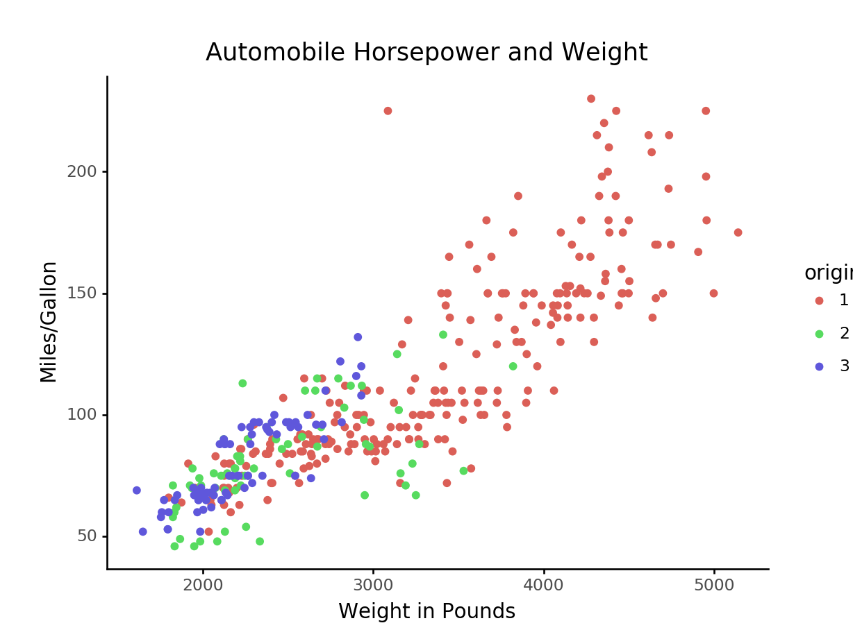
3.4.5 Exercises
These exercises use the Mroz.csv data set
that was imported in the prior sections of this chapter.
Create a scatter plot for
ageagainstlwg. Use color to display women college attendance status.Facet the prior plot on
hc.Add a loess smoothing line
hc.If the prior plot produces a message or warning, change the code to avoid the warning.
Add a title and provide better axis labels.
Create a plot that explores the relationship between at least three variables. Use at least one different value than was used in the prior exercise.