use http://ssc.wisc.edu/sscc/pubs/stata_bar_graphs/bar_example.dtaBar Graphs in Stata
Bar graphs are simple but powerful (or rather, powerful because they are simple) tools for conveying information. They can be understood at a glance by both technical and non-technical audiences, and often tell you much more than summary statistics. This article will show you how to make a variety of useful bar graphs using Stata, and make then look good.
The Example Data Set
You can load the example data set used by this article directly from the SSCC web site:
It is a fictional workplace satisfaction survey with 1,000 observations and four variables:
sat: responses to the question “In general, how satisfied are you with your job?” on a five-point scale ranging from “Very Dissatisfied” to “Very Satisfied.”eng: a numeric measure of employee engagement from 1 to 100.leave: responses to the question “How likely are you to leave your job in the next year?” on a five-point scale ranging from “Very Likely” to “Very Unlikely.”stay: a binary variable based onleave. It is 0 if the respondent said they were likely to leave and 1 otherwise.female: a binary variable which is 1 if the respondent is female and 0 if the respondent is male.
Distribution of a Single Categorical Variable
The most basic task of a bar graph is to help you understand the distribution of a single categorical variable. Begin with the sat variable (job satisfaction). The graph bar command tells Stata you want to make a bar graph, and the over() option tells it which variable defines the categories to be described. By default it will tell you the percentage of observations that fall in each category. Unfortunately, the result is not very satisfactory:
graph bar, over(sat)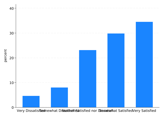
So let’s improve it.
The categories are labeled using the value labels of the sat variable, but they’re unreadable because they overlap. You can fix this problem easily and naturally by making the whole graph horizontal rather than vertical. Just change graph bar to graph hbar.
graph hbar, over(sat)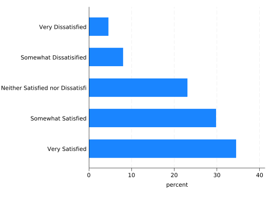
Horizontal really should be your default orientation for bar graphs.
The title “percent” is vague. Make it clear with a ytitle() option. Note how in a horizontal graph, the y axis is horizontal. Think of it as the dependent variable axis.
Stata graph commands often get long; you can make them more readable by splitting them across multiple lines if you use /// to tell Stata the command continues on the next line. Consider putting one option per line:
graph hbar, ///
    over(sat) ///
    ytitle("Percent of Respondents")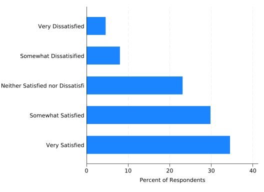
The graph is also in dire need of an overall title, which can be added using the title() option. For graphs describing surveys, the question text is often a useful title. Title text doesn’t always need to go in quotes, but this one does because it contains a comma. Without quotes, Stata will think you’re trying to set title options (more on those in a moment):
graph hbar, ///
    over(sat) ///
    ytitle("Percent of Respondents") ///
    title("In general, how satisfied are you with your job?")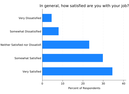
Much better! But the label “Neither Satisfied nor Dissatisfied” is being truncated. One solution is to use a shorter label. Another is to make the text smaller. How can we do that?
Usually, the size of text is controlled by a size() option. It directly follows the text it controls and a comma: it’s an option for an option! Try making the title very large (vlarge):
graph hbar, ///
    over(sat) ///
    ytitle("Percent of Respondents") ///
    title("In general, how satisfied are you with your job?", size(vlarge))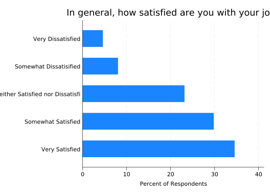
Now the title doesn’t fit either, but note how it’s not using the space above the labels on the left. You can tell the title to span the entire width of the graph with the span option:
graph hbar, ///
    over(sat) ///
    ytitle("Percent of Respondents") ///
    title("In general, how satisfied are you with your job?", size(vlarge) span)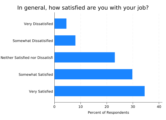
Now let’s get back to making the label text fit. Label text is an exception: you set its size with a labsize() option that goes in a label() option that follows the over() variable:
graph hbar, ///
    over(sat, label(labsize(small))) ///
    ytitle("Percent of Respondents") ///
    title("In general, how satisfied are you with your job?", size(vlarge) span)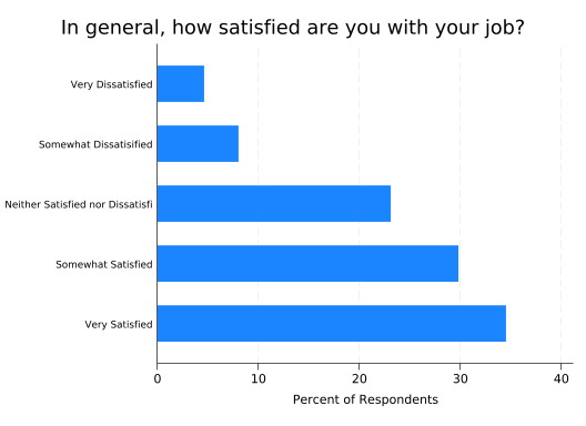
That helped, but it’s not enough. And it makes the labels hard to read. A better solution is to break up the label into multiple lines.
The relabel() option allows you to modify the labels to be used in your graph without changing the value labels in the dataset. An elegant command called splitvallabels by Nick Winter and Ben Jann will take the existing value labels, split them into multiple lines where appropriate, and make them available as an r(relabel) macro in a form the relabel() option can understand. You can get splitvallabels by running:
ssc install splitvallabelsYou only need to run this command once—don’t put it in a research do file that you’ll run over and over.
Putting this together:
splitvallabels sat

graph hbar, ///
    over(sat, relabel(`r(relabel)')) ///
    ytitle("Percent of Respondents") ///
    title("In general, how satisfied are you with your job?", size(vlarge) span)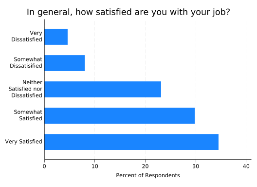
This fixes the truncated label and reduces the amount of space taken up by the labels in general, leaving more space for the graph.
If you are new to macros, note that the character at the left of `r(relabel)’ is the left single quote, found on the left side of your keyboard under the tilde, and the character at the right of it is the right single quote, found on the right side of your keyboard under the double quote. See Stata Macros and Loops for much, much more detail.
Because the splitvallabels command stores the new labels in the r() vector, they’ll be replaced by any other command that stores results in the r() vector, including graph. If you’ll be using a set of labels repeatedly, you could use the local() option to store them in a separate local macro. Then you’d use that macro in subsequent commands rather than r(relabel). For this article, I’ll run the splitvallabels command before each graph so the resulting code block can be run independently.
graph bar always numbers bars 1, 2, 3, etc. If your categorical variable uses different numbers, add the recode option to the splitvallabels command or the labels won’t be associated with the right bars.
This is now a usable graph, but some might complain that it does not have the precision of a table giving the percentages as numbers. No problem: you can have the numbers too by adding a blabel(bar) option, meaning Stata should label each bar with a number corresponding to the length of the bar. You’ll often want to control the number of decimal places displayed with a format() option like format(%4.1f). This means the number on each bar should take up four total spaces, including the decimal point, with one number after the decimal point.
splitvallabels sat

graph hbar, ///
    over(sat, relabel(`r(relabel)')) ///
    ytitle("Percent of Respondents") ///
    title("In general, how satisfied are you with your job?", size(vlarge) span) ///
    blabel(bar, format(%4.1f))
One final tweak: if someone prints this graph, the bars will use a lot of toner and, depending on the printer, the ink may streak. You can avoid that by reducing the “intensity” of the colors with the intensity() option. Some people prefer less intense colors in graphs anyway.
splitvallabels sat

graph hbar, ///
    over(sat, relabel(`r(relabel)')) ///
    ytitle("Percent of Respondents") ///
    title("In general, how satisfied are you with your job?", size(vlarge) span) ///
    blabel(bar, format(%4.1f)) ///
    intensity(25)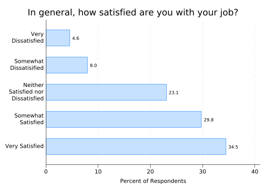
If you want frequencies rather than percentages, tell graph hbar that the thing you want to plot is the (count). You’ll also want to change the ytitle() and the format of the bar labels—with integers the default format will do so you can just remove the format() option entirely.
splitvallabels sat

graph hbar (count), ///
    over(sat, relabel(`r(relabel)')) ///
    ytitle("Number of Respondents") ///
    title("In general, how satisfied are you with your job?", size(vlarge) span) ///
    blabel(bar)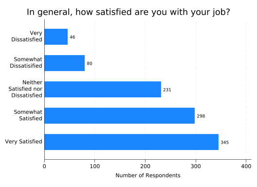
TipTip for Advanced Users
When working with survey data, you may find it useful to put the text for each question in a global macro with the same name as the variable:
global sat "In general, how satisfied are you with your job?"Then your graph commands can start with:
graph hbar, over(sat) title($sat)This is highly convenient in loops:
foreach question in sat stay leave female {
    graph hbar, over(`question') title($`question')
}
The macro processor will first replace the local macro question with a specific question (like sat), and then replace the resulting global macro with that question’s text.
If you create a do file that defines global macros for all your questions, you can just put:
include question_file.doearly in any do file that will use them and they’ll be ready to go.
Relationship between a Categorical Variable and a Quantitative Variable
Bar graphs are also good tools for examining the relationship (joint distribution) of a categorical variable and some other variable.
To create a bar graph where the length of the bar tells you the mean value of a quantitative variable for that category, just tell graph hbar to plot that variable. If you want a different summary statistic, like the median, put that summary statistic in parentheses before the variable name just like you did with (count).
You’ll also need to change the title and y axis title, and set the formatting of the bar labels.
splitvallabels sat

graph hbar eng, ///
    over(sat, relabel(`r(relabel)')) ///
    ytitle("Mean Engagement") ///
    title("Mean Engagement by Job Satisfaction") ///
    blabel(bar, format(%4.1f))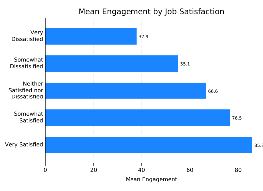
This suggests a strong but nonlinear relationship. sat is a categorial variable you so you shouldn’t expect to be able to do math with it.
The last label (85.8) is being truncated, so increase the range of the y axis to 90 with yscale(range(0 90)) so there’s room for it.
splitvallabels sat

graph hbar eng, ///
    over(sat, relabel(`r(relabel)')) ///
    ytitle("Mean Engagement") ///
    title("Mean Engagement by Job Satisfaction") ///
    blabel(bar, format(%4.1f)) ///
    yscale(range(0 90))
In this plot, the length of the bar measures how far away from zero the mean is. Sometimes that isn’t a meaningful measure: for example, a Lickert scale can never be zero. In those cases you might consider using a dot plot instead—just replace hbar with dot:
splitvallabels sat

graph dot eng, ///
    over(sat, relabel(`r(relabel)')) ///
    ytitle("Mean Engagement") ///
    title("Mean Engagement by Job Satisfaction") ///
    blabel(bar, format(%4.1f)) ///
    yscale(range(0 90))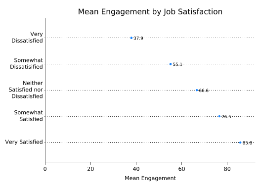
The trouble with this graph is that the dots interfere with the bar labels. You can fix that by putting a white box around each label which will cover up the dots. This is done with the box option, which applied to blabel, and both fcolor(white) and lcolor(white) to set the fill (inside) of the box and the line around it to white.
splitvallabels sat

graph dot eng, ///
    over(sat, relabel(`r(relabel)')) ///
    ytitle("Mean Engagement") ///
    title("Mean Engagement by Job Satisfaction") ///
    blabel(bar, format(%4.1f) box fcolor(white) lcolor(white)) ///
    yscale(range(0 90))
TipTip for Advanced Users
If you’d like to have the frequencies for each category in the graph too, put them in the value labels! The following code loops over the values of sat, stores the label associated with each value, counts how many observations have that value, constructs a new label containing both the old label and the number of observations, then applies it:
levelsof sat, local(vals)
foreach val of local vals {
    local oldlabel: label (sat) `val'
    count if sat==`val'
    label define newsat `val' "`oldlabel' (N=`r(N)')", add
}
label values sat newsat
1 2 3 4 5
46
80
231
298
345splitvallabels sat
graph dot eng, ///
over(sat, relabel(`r(relabel)')) ///
ytitle("Mean Engagement") ///
title("Mean Engagement by Job Satisfaction") ///
blabel(bar, format(%4.1f) box fcolor(white) lcolor(white)) ///
yscale(range(0 90))
Just remember to change the labels back to the original when you’re done:
label values sat satRelationship between a Categorical Variable and a Binary Variable
If you’re thinking of the binary variable as an outcome, then the proportion of “successes” (whatever that means in your data set) in each group may be of interest. But, assuming the binary variable is coded such that 1 means “success” and 0 means “failure,” the proportion of successes is just the mean of the binary variable and can be plotted just like the mean of eng:
splitvallabels sat

graph hbar stay, ///
    over(sat, relabel(`r(relabel)')) ///
    ytitle("Proportion Unlikely to Leave") ///
    title("Proportion Unlikely to Leave by Job Satisfaction") ///
    blabel(bar, format(%4.2f)) ///
    yscale(range(0 .90))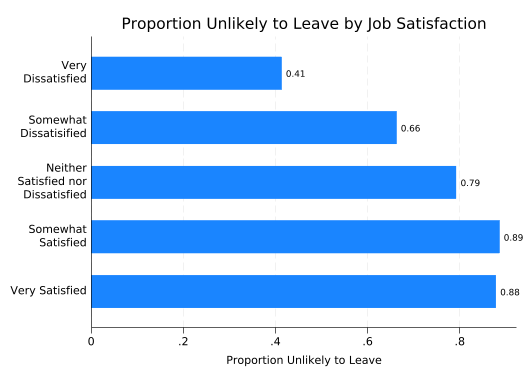
If the binary variable denotes two groups you’re comparing, like female, then you should consider frequencies or percentages (the default) for each combination of the two variables. Start with frequencies.
The binary variable to examine will be specified in a second over() option, but it makes a big difference which variable you put first. If you put first sat and then female, you’ll get:
splitvallabels sat

graph hbar (count), ///
    over(sat, relabel(`r(relabel)')) ///
    over(female) ///
    ytitle("Number of Respondents") ///
    title("Job Satisfaction by Gender") ///
    blabel(bar)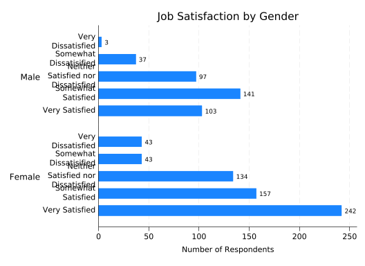
You could fix the overlapping labels by adding label(labsize(small)).
If you put female first and then sat, you’ll get:
splitvallabels sat

graph hbar (count), ///
    over(female) ///
    over(sat, relabel(`r(relabel)')) ///
    ytitle("Number of Respondents") ///
    title("Job Satisfaction by Gender") ///
    blabel(bar)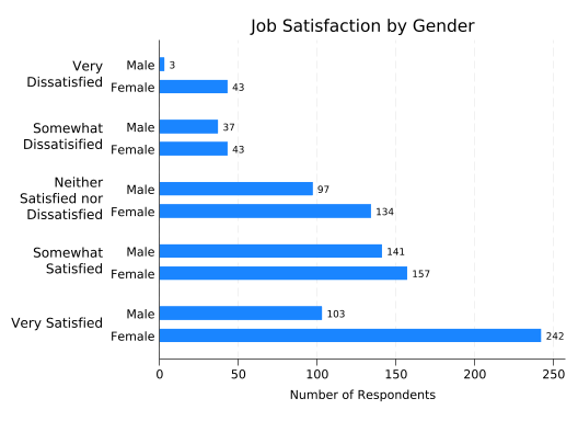
The latter form makes for easier comparisons between males and females. But in this case the only thing you can easily learn by comparing them is that more females answered the survey than males. It would be much more useful to look at what percentage of males and females are in each satisfaction category. Unfortunately, just telling graph hbar to plot percentages doesn’t do that:
splitvallabels sat

graph hbar (percent), ///
    over(female) ///
    over(sat, relabel(`r(relabel)')) ///
    ytitle("Percent of Respondents") ///
    title("Job Satisfaction by Gender") ///
    blabel(bar)
This gives you the percentages calculated across all respondents, not calculated separately for males and females. The graph hbar command does not allow you to control how the percentages are calculated.
Enter the very useful catplot, by Nick Cox. Get it with:
ssc install catplotThe catplot command is a “wrapper” for graph hbar so most of what we’ve done carries over directly. What it adds (among other things) is a percent() option that allows you to specify what groups percentages will be calculated over, in this case percent(female).
splitvallabels sat

catplot, ///
    over(female) ///
    over(sat, relabel(`r(relabel)')) ///
    ytitle("Percent of Respondents") ///
    title("Job Satisfaction by Gender") ///
    blabel(bar, format(%4.1f)) ///
    percent(female)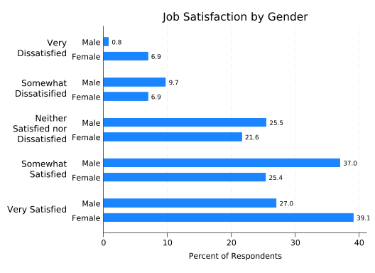
This allows us to see that the relationship between sat and female is complex in this (fictional) data set, with females more likely to be both very satisfied and very dissatisfied.
An alternative form of this graph uses color to distinguish between the groups, adding a legend to define their meanings. You can get this form by adding the asyvars option.
splitvallabels sat

catplot, ///
    over(female) ///
    over(sat, relabel(`r(relabel)')) ///
    ytitle("Percent of Respondents") ///
    title("Job Satisfaction by Gender") ///
    blabel(bar, format(%4.1f)) ///
    percent(female) ///
    asyvars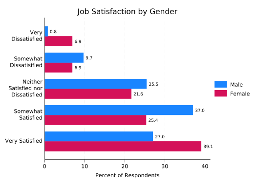
This greatly reduces the clutter on the left of the graph, at the cost of adding some to the right and forcing the reader to look in two places to understand what the bars mean. You should consider what the graph will look like to someone who is colorblind, and may need to think about whether the bars will be distinguishable if printed.
Relationship between Two Categorical Variables
The code for creating graphs that examine the relationship between two categorical variables is identical to comparing one categorical variable and one binary, but the result has a lot more bars.
splitvallabels sat

catplot, ///
    over(leave) ///
    over(sat, relabel(`r(relabel)')) ///
    ytitle("Percent of Respondents") ///
    title("Probability of Leaving by Job Satisfaction") ///
    blabel(bar, format(%4.1f)) ///
    percent(sat) ///
    asyvars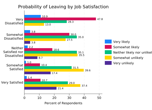
If you stare at this long enough you’ll see that higher levels of satisfaction are associated with a lower probability of leaving, but it takes some real effort. The relationship is much easier to see if the bars are stacked.
splitvallabels sat

catplot, ///
    over(leave) ///
    over(sat, relabel(`r(relabel)')) ///
    ytitle("Percent of Respondents") ///
    title("Probability of Leaving by Job Satisfaction") ///
    blabel(bar, format(%4.1f)) ///
    percent(sat) ///
    asyvars ///
    stack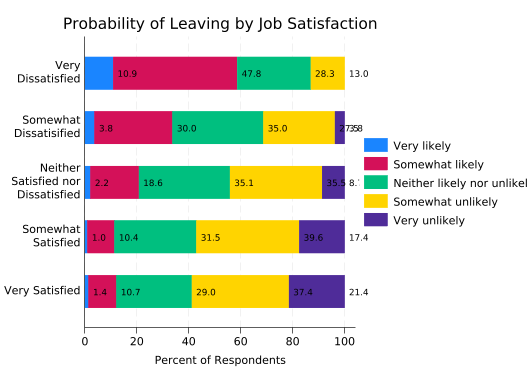
Now the association is very clear.
There are two problems with the bar labels, however. One is being covered up by the legend, and that could be fixed. But the last two labels for “Somewhat Dissatisfied” run together because the final bar is so small. That’s not easy to fix, so just remove the labels. You still need percent(sat) though, as the lengths of the bars are still percentages calculated over satisfaction categories.
splitvallabels sat

catplot, ///
    over(leave) ///
    over(sat, relabel(`r(relabel)')) ///
    ytitle("Percent of Respondents") ///
    title("Probability of Leaving by Job Satisfaction") ///
    percent(sat) ///
    asyvars ///
    stack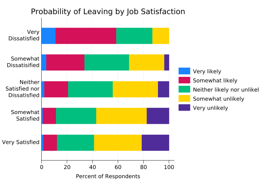
Another problem is truncated labels in the legend. We could solve that by making the labels smaller, but we’ll again choose to add line breaks instead. Sadly, labels in legends are handled just a bit differently so splitvallabels can’t do it for us.
The easy way to control legend labels is with the order() option. The number of each bar (in whatever order you want) is followed by the label to be applied to it, with each line in its own set of quotes.
splitvallabels sat

catplot, ///
    over(leave) ///
    over(sat, relabel(`r(relabel)')) ///
    ytitle("Percent of Respondents") ///
    title("Probability of Leaving by Job Satisfaction") ///
    percent(sat) ///
    asyvars ///
    stack ///
    legend(order( ///
        1 "Very likely" ///
        2 "Somewhat" "likely" ///
        3 "Neither likely" "nor unlikely" ///
        4 "Somewhat" "unlikely" ///
        5 "Very unlikely"))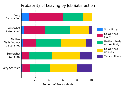
Likelihood of leaving is an ordered categorical variable, so it would be nice if the colors used reflected that. To take control of a bar, use the bar() option and specify which bar you’re controlling by number. Then add options like color() and fintensity() (fill intensity).
This version uses maroon for likely to leave, navy blue for unlikely to leave, and gray for neither, with the intensity of the color denoting how likely or unlikely. Tweak to taste.
splitvallabels sat

catplot, ///
    over(leave) ///
    over(sat, relabel(`r(relabel)')) ///
    ytitle("Percent of Respondents") ///
    title("Probability of Leaving by Job Satisfaction") ///
    percent(sat) ///
    asyvars ///
    stack ///
    legend(order( ///
        1 "Very likely" ///
        2 "Somewhat" "likely" ///
        3 "Neither likely" "nor unlikely" ///
        4 "Somewhat" "unlikely" ///
        5 "Very unlikely")) ///
    bar(1, color(maroon)) ///
    bar(2, color(maroon) fintensity(inten60)) ///
    bar(3, color(gray) fintensity(inten40)) ///
    bar(4, color(navy) fintensity(inten60)) ///
    bar(5, color(navy))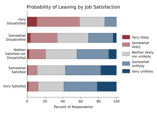
This graph often requires some explanation for lay audiences. But once people grasp that what they should be looking for is how the colors move left or right as you go up or down categories, they can see the relationship between the variables very easily.
The disadvantage of this graph is that it’s almost impossible to answer questions like “Which group has the most people who are neither likely nor unlikely to leave?” short of getting out a ruler. That can be fixed by giving each of the stacked bars a separate y axis.
This is a job for tabplot, also by Nick Cox, which you can install with:
ssc install tabplottabplot has its own syntax rather than imitating graph bar, as it can do a wide variety of things. Instead of specifying the two variables you’re interested in with over() options, you give them as a varlist. However the horizontal and percent() options are the same as in catplot.
tabplot sat leave, ///
    horizontal ///
    percent(sat)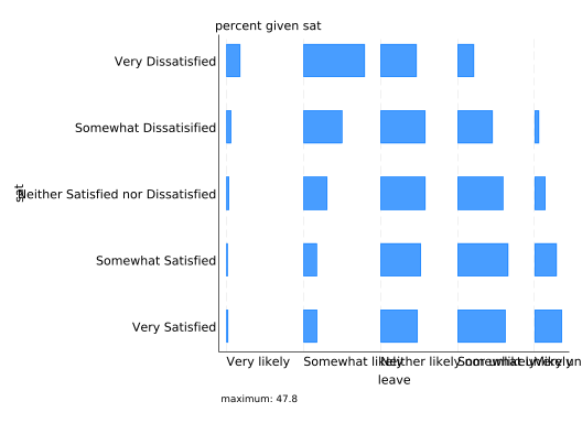
Stare at that for a bit and you’ll see that it’s the same bars as before, just spaced out.
Obviously the labels need some work. Start by eliminating the extra labels that tabplot puts in by default. You can do that by explicitly setting them to an empty string: "", but you need to know what they’re called. “percent given sat” is a subtitle, “maximum: 47.8” is a note, and “sat” and “leave” on the left and bottom are the ytitle and xtitle respectively. Note that these options work with any Stata graph.
Technically, what tabplot creates are twoway plots rather than bar plots. That’s why both axes are labeled by default and the horizontal axis is the x-axis. It’s also why the value labels of the second variable are on the x-axis. That’s not going to leave room for something like “Percent of Respondents” on the bottom, so put it on the top instead, under the title. Normally a second, smaller line of text under the title would be a subtitle. But tabplot moves the subtitle over to the left, so to make the text centered under the title use the t2title (“second top title”) option instead.
tabplot sat leave, ///
    horizontal ///
    percent(sat) ///
    subtitle("") ///
    note("") ///
    ytitle("") ///
    xtitle("") ///
    title("Probability of Leaving by Job Satisfaction") ///
    t2title("Percent of Respondents")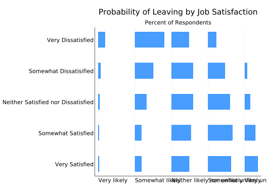
Now let’s deal with the overlapping value labels, and, as usual, we’ll fix them by inserting line breaks. Unfortunately, we can’t have splitvallabels do it for us. And there’s another wrinkle: presumably because of the way it hands data off to other commands, tabplot needs each value label to be a single string. That means you need to wrap it in compound double quotes. Normally a string starts with ” and ends with “. But if a string starts with `”, then it only ends with “’. (Note the similarity to macros.) This allows you to put double quotes inside a string. So a value label with two lines of text will look like:
`""line 1" "line 2""'(Unfortunately, compound double quotes confuse Quarto’s syntax highlighting, as you’ll see shortly, but that only affects how they appear in web documents like this one.)
Setting all the value labels is admittedly tedious, but not hard:
tabplot sat leave, ///
    horizontal ///
    percent(sat) ///
    subtitle("") ///
    note("") ///
    ytitle("") ///
    xtitle("") ///
    title("Probability of Leaving by Job Satisfaction") ///
    t2title("Percent of Respondents") ///
    ylabel( ///
        1 `""Very" "Satisfied""' ///
        2 `""Somewhat" "Satisfied""' ///
        3 `""Neither Satisfied" "nor Dissatisfiend""' ///
        4 `""Somewhat" "Dissatified""' ///
        5 `""Very" "Dissatisfied""') ///
    xlabel( ///
        1 `""Very" "likely""' ///
        2 `""Somewhat" "likely""' ///
        3 `""Neither likely" "nor unlikely""' ///
        4 `""Somewhat" "unlikely""' ///
        5 `""Very" "unlikely""')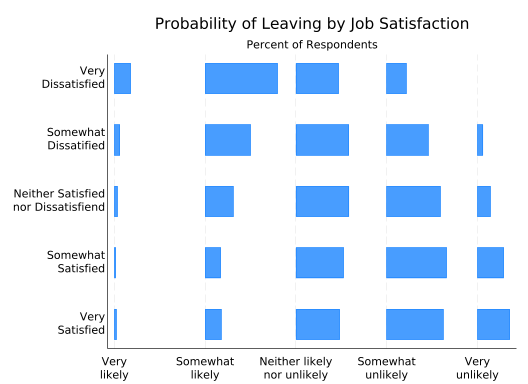
Much better! However, it’s somewhat difficult to interpret. We know all the bars on a single row add up to 100%, but with the bars separated it’s hard to estimate their individual lengths. That’s okay, because with space between the bars there’s now room for bar labels again. You tell tabplot you want them with the showval option.
tabplot sat leave, ///
    horizontal ///
    percent(sat) ///
    subtitle("") ///
    note("") ///
    ytitle("") ///
    xtitle("") ///
    title("Probability of Leaving by Job Satisfaction") ///
    t2title("Percent of Respondents") ///
    ylabel( ///
        1 `""Very" "Satisfied""' ///
        2 `""Somewhat" "Satisfied""' ///
        3 `""Neither Satisfied" "nor Dissatisfiend""' ///
        4 `""Somewhat" "Dissatified""' ///
        5 `""Very" "Dissatisfied""') ///
    xlabel( ///
        1 `""Very" "likely""' ///
        2 `""Somewhat" "likely""' ///
        3 `""Neither likely" "nor unlikely""' ///
        4 `""Somewhat" "unlikely""' ///
        5 `""Very" "unlikely""') ///
    showval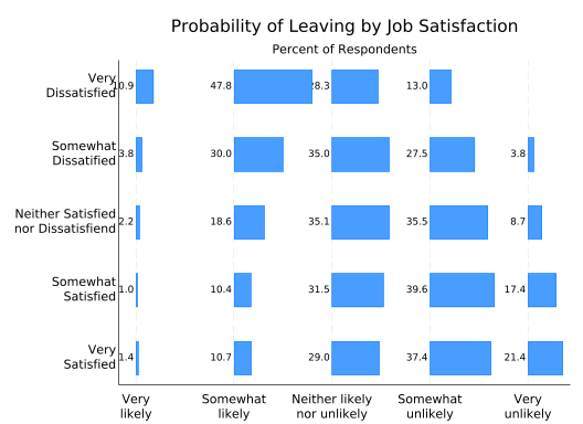
Well, there’s almost room for bar labels. First, you need a bit more room on the left. Since tabplot makes twoway plots, you can do that by having the x-axis start at, say, 0.8 rather than 1. You also need more room between the bars. This is done with the height option, which in a horizontal graph controls the length of all the bars. It’s basically a scale. The default is 0.8, so reduce it to 0.7 to get slightly shorter bars and more room for labels.
tabplot sat leave, ///
    horizontal ///
    percent(sat) ///
    subtitle("") ///
    note("") ///
    ytitle("") ///
    xtitle("") ///
    title("Probability of Leaving by Job Satisfaction") ///
    t2title("Percent of Respondents") ///
    ylabel( ///
        1 `""Very" "Satisfied""' ///
        2 `""Somewhat" "Satisfied""' ///
        3 `""Neither Satisfied" "nor Dissatisfiend""' ///
        4 `""Somewhat" "Dissatified""' ///
        5 `""Very" "Dissatisfied""') ///
    xlabel( ///
        1 `""Very" "likely""' ///
        2 `""Somewhat" "likely""' ///
        3 `""Neither likely" "nor unlikely""' ///
        4 `""Somewhat" "unlikely""' ///
        5 `""Very" "unlikely""') ///
    showval ///
    xscale(range(0.8 5)) ///
    height(0.7)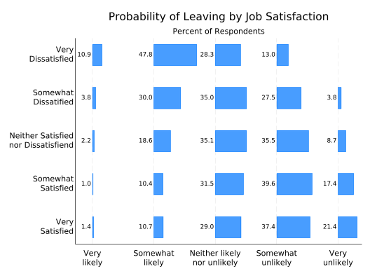
So what about colors? The tabplot equivalent of asyvar is separate(). This tells tabplot to treat the each bar for a given variable as a separate entity, which by default means to give it a different color. In this plot, it’s leave that defines the bars to be treated separately.
tabplot sat leave, ///
    horizontal ///
    percent(sat) ///
    subtitle("") ///
    note("") ///
    ytitle("") ///
    xtitle("") ///
    title("Probability of Leaving by Job Satisfaction") ///
    t2title("Percent of Respondents") ///
    ylabel( ///
        1 `""Very" "Satisfied""' ///
        2 `""Somewhat" "Satisfied""' ///
        3 `""Neither Satisfied" "nor Dissatisfiend""' ///
        4 `""Somewhat" "Dissatified""' ///
        5 `""Very" "Dissatisfied""') ///
    xlabel( ///
        1 `""Very" "likely""' ///
        2 `""Somewhat" "likely""' ///
        3 `""Neither likely" "nor unlikely""' ///
        4 `""Somewhat" "unlikely""' ///
        5 `""Very" "unlikely""') ///
    showval ///
    xscale(range(0.8 5)) ///
    height(0.7) ///
    separate(leave)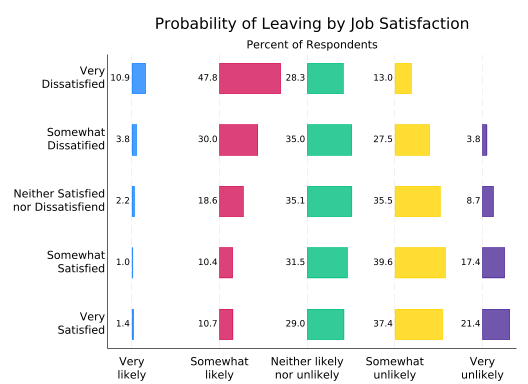
Controlling the colors works almost the same as with catplot (or graph hbar) but not quite. Instead of saying bar(1, color...), bar(2, color...) etc. you say bar1(color...), bar2(color...), etc. The options that actually control the bars are the same.
tabplot sat leave, ///
    horizontal ///
    percent(sat) ///
    subtitle("") ///
    note("") ///
    ytitle("") ///
    xtitle("") ///
    title("Probability of Leaving by Job Satisfaction") ///
    t2title("Percent of Respondents") ///
    ylabel( ///
        1 `""Very" "Satisfied""' ///
        2 `""Somewhat" "Satisfied""' ///
        3 `""Neither Satisfied" "nor Dissatisfiend""' ///
        4 `""Somewhat" "Dissatified""' ///
        5 `""Very" "Dissatisfied""') ///
    xlabel( ///
        1 `""Very" "likely""' ///
        2 `""Somewhat" "likely""' ///
        3 `""Neither likely" "nor unlikely""' ///
        4 `""Somewhat" "unlikely""' ///
        5 `""Very" "unlikely""') ///
    showval ///
    xscale(range(0.8 5)) ///
    height(0.7) ///
    separate(leave) ///
    bar1(color(maroon)) ///
    bar2(color(maroon) fintensity(inten60)) ///
    bar3(color(gray) fintensity(inten40)) ///
    bar4(color(navy) fintensity(inten60)) ///
    bar5(color(navy))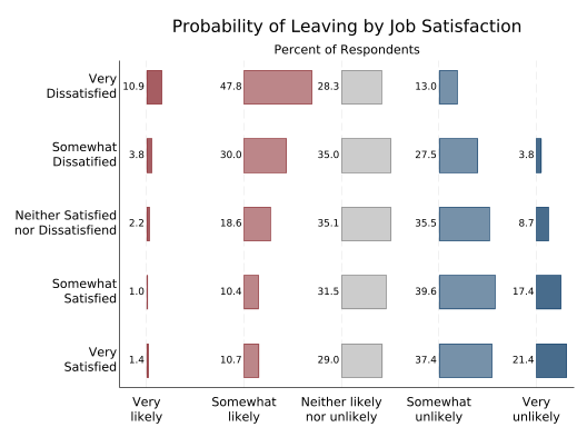
The downside of this graph compared to a standard stacked bar graph is that it’s harder to see cumulative effects. It’s not obvious, for example, that among the very dissatisfied the percentage who are likely to leave is greater than the percentage that are likely or “neither” among the satisfied. As always, the choice of graph depends on what information you most want to convey to your readers.