4 Normality
What this assumption means: Model residuals are normally distributed.
Why it matters: Normally distributed residuals are necessary for estimating accurate standard errors for the model parameter estimates.
How to diagnose violations: Visually inspect a quantile-quantile plot (Q-Q plot) to assess whether the residuals are normally distributed, and use the Shapiro-Wilk test of normality.
How to address it: Modify the model, fit a generalized linear model, or transform the outcome.
4.1 Example Model
If you have not already done so, download the example dataset, read about its variables, and import the dataset into Stata.
Then, use the code below to fit this page’s example model.
use acs2019sample, clear
reg income age hours_worked weeks_worked i.english
Source | SS df MS Number of obs = 142
-------------+---------------------------------- F(6, 135) = 12.79
Model | 6.1537e+10 6 1.0256e+10 Prob > F = 0.0000
Residual | 1.0824e+11 135 801801415 R-squared = 0.3625
-------------+---------------------------------- Adj R-squared = 0.3341
Total | 1.6978e+11 141 1.2041e+09 Root MSE = 28316
------------------------------------------------------------------------------
income | Coefficient Std. err. t P>|t| [95% conf. interval]
-------------+----------------------------------------------------------------
age | 750.8306 165.3873 4.54 0.000 423.7454 1077.916
hours_worked | 1101.709 188.1917 5.85 0.000 729.5239 1473.894
weeks_worked | 283.6156 188.276 1.51 0.134 -88.73637 655.9676
|
english |
Well | -11057.59 6060.286 -1.82 0.070 -23042.97 927.7936
Not well | -14621.56 8789.041 -1.66 0.099 -32003.58 2760.458
Not at all | -7890.813 14533.27 -0.54 0.588 -36633.16 20851.53
|
_cons | -42101.77 10849.01 -3.88 0.000 -63557.77 -20645.77
------------------------------------------------------------------------------4.2 Statistical Tests
Use the Shapiro-Wilk test of normality to assess normality statistically. The null hypothesis for the test is normality, so a low p-value indicates that the observed data is unlikely under the assumption it was drawn from a normal distribution.
The Shapiro-Wilk test is only intended for relatively small samples. R’s shapiro.test() is for samples of 5,000 or less, and Stata’s swilk for 2,000 or less. The two versions will also return different but similar W statistics. Furthermore, as sample sizes grow, increasingly trivial departures from normality (which are almost always present in real data) will result in small p-values. For this reason, visual tests are more useful.
Get standardized residuals from the model with predict newvar, rstandard, and then use the swilk command to perform the test:
predict res_std, rstandard
swilk res_std
(4,858 missing values generated)
Shapiro–Wilk W test for normal data
Variable | Obs W V z Prob>z
-------------+------------------------------------------------------
res_std | 142 0.81271 20.794 6.860 0.00000
Note: The normal approximation to the sampling distribution of W'
is valid for 4<=n<=2000.The small p-value leads us to reject the null hypothesis of normality.
4.3 Visual Tests
Use a Q-Q plot with standardized residuals from the model to assess normality visually.
A Q-Q (quantile-quantile) plot shows how two distributions’ quantiles line up, with our theoretical distribution (e.g., the normal distribution) as the x variable and our model residuals as the y variable. If two distributions follow the exact same shape, we would expect a perfect line of points where \(y = x\) in a Q-Q plot, but this is never the case. Instead, the points tend to follow a curve one way or the other or in both directions.
In general, when points are below the line \(y = x\), this means we have observed more data than expected by this quantile, and when it is above the line \(y = x\), we have observed less data than expected.
It is important to note that we do not check the distribution of the outcome, but rather the distribution of the model residuals. A non-normally distributed outcome is fine and sometimes violations of normality can be addressed by including a non-normal predictor (e.g., skewed, categorical)! Any transformations that we perform, however, are done on the actual variables, not on the residuals.
Create a Q-Q plot with qnorm and supply it with the standardized residuals (res_std), and make the reference line red with rlopts(lcolor(red)):
qnorm res_std, rlopts(lcolor(red)) aspect(1)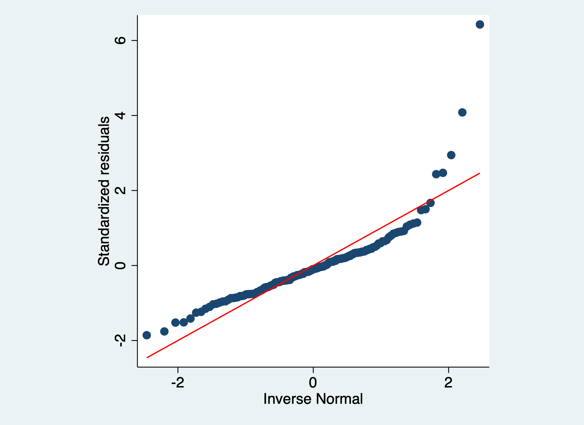
Following the guide below, the J-shape in this Q-Q plot indicates that the residuals are positively skewed.
4.4 Guide to Q-Q Plots
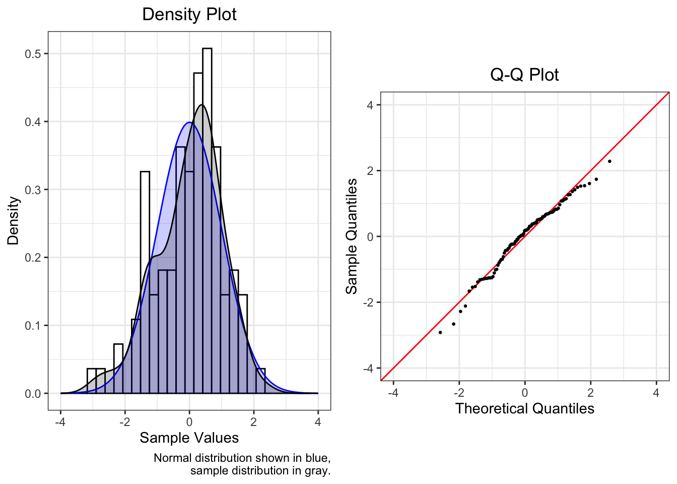
Each of the plots that follow are composed of two plots. The density plot on the left shows the observed data as a histogram and as a gray density curve. The blue density curve is the normal distribution. On the right, the Q-Q plot shows the observed data as points and the line \(y = x\) in red. Select summary statistics are also provided.
The plots below are intended to serve as an incomplete reference for the patterns we often encounter in Q-Q plots. Some corrective actions that can be considered are also discussed. Most of the plots below use data that were generated from a single data generating process (e.g., rgamma()). In the social sciences especially, observed data are the result of many processes, so not only Q-Q plots based on real data look a bit messier than these plots, but corrections will also not so easily remedy violations of normality.
The data used to create each plot consist of 10,000 values and were scaled to have mean 0 and variance 1.
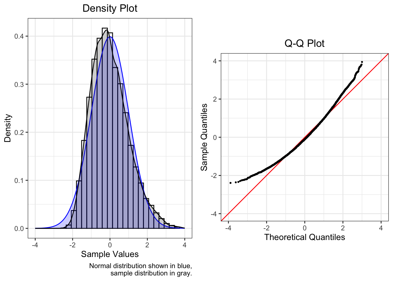
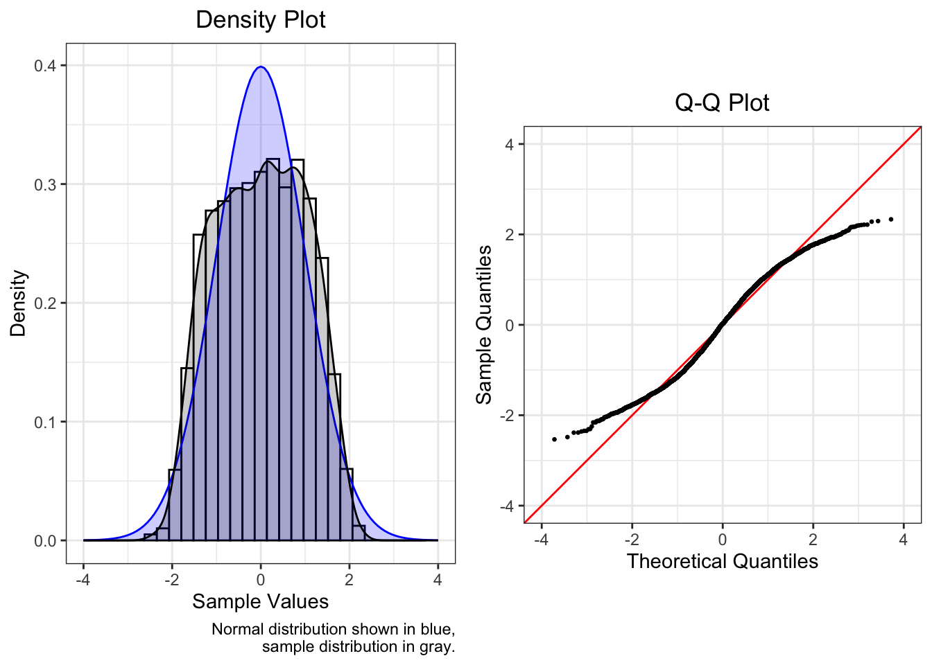
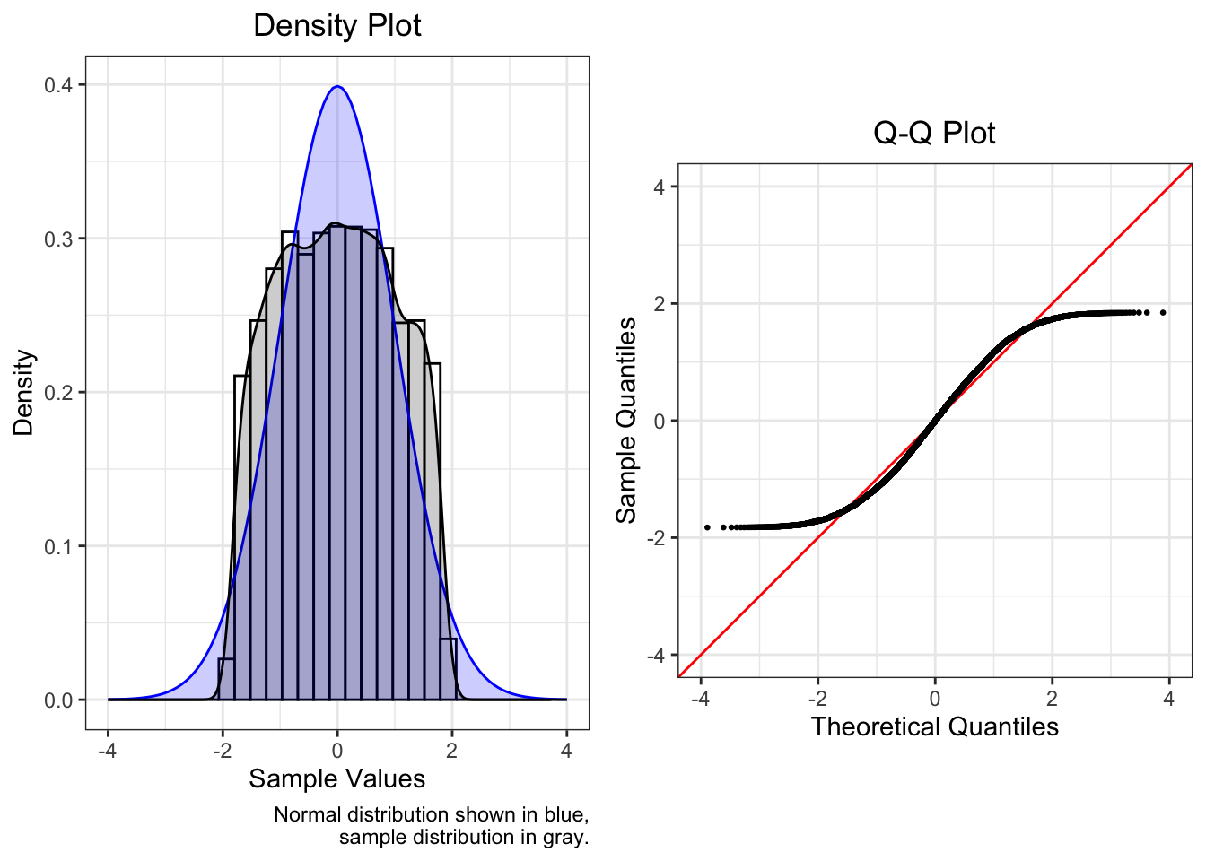
4.4.1 Normal
Data drawn from a normal distribution fall along the line \(y = x\) in the Q-Q plot.
With such a large sample, the points have only minor deviations from the red line. In the tails, due to lower density, deviations are expected but not of concern. It is more important that the points do not deviate too greatly from the red line within the range [-2, 2].
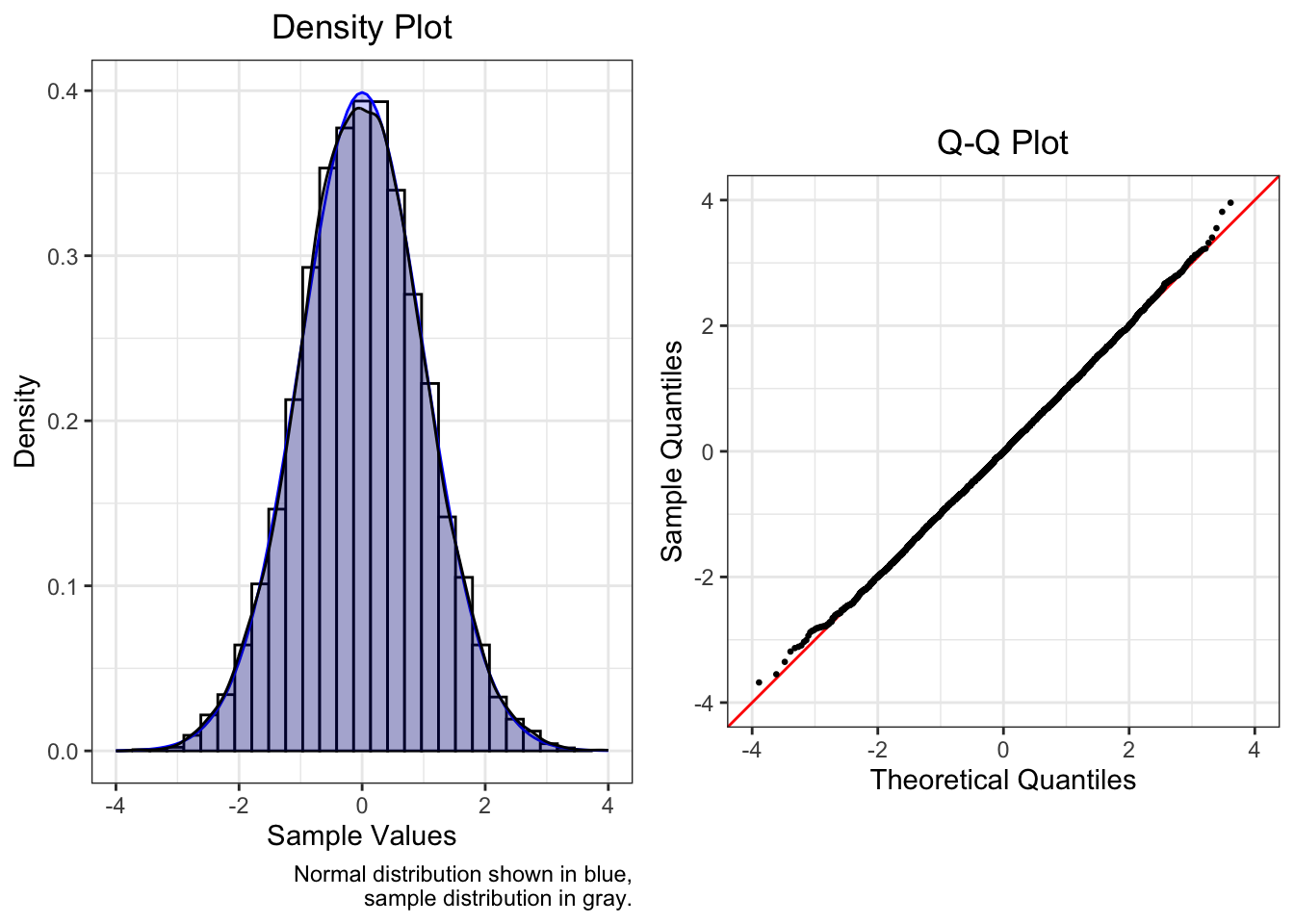
| Mean | SD | Median | Skew | Kurtosis |
|---|---|---|---|---|
| 0 | 1 | -0.008 | 0.037 | 0.021 |
With less data, however, more deviation is observed. The data below was drawn from a normal distribution, but it consists now of only 100 values. The Shapiro-Wilk test of normality is marginally significant with p = 0.074.
| Mean | SD | Median | Skew | Kurtosis |
|---|---|---|---|---|
| 0 | 1 | 0.177 | -0.498 | 0.053 |
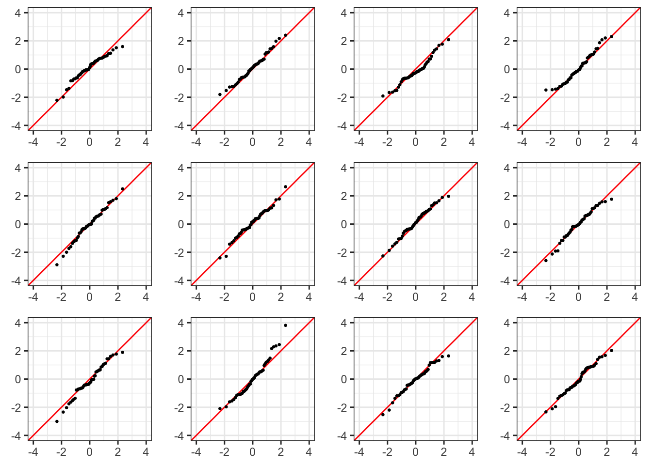
The Q-Q plots below each consist of 50 values generated from a normal distribution. The best way to become better at visually identifying departures from normality is to become more familiar with the appearance of (relatively) normal data.
4.4.2 Skew
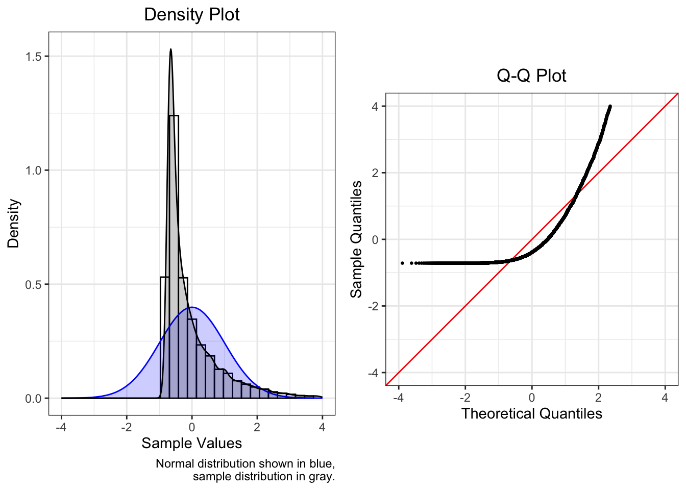
4.4.2.1 Positive Skew
Positively skewed (mean > median) data have a J-shaped pattern in the Q-Q plot.
This plot is of a skew normal distribution with scale 2 and shape 5.

| Mean | SD | Median | Skew | Kurtosis |
|---|---|---|---|---|
| 0 | 1 | -0.178 | 0.82 | 0.562 |
This plot shows a gamma distribution with shape 9 and rate 2.
| Mean | SD | Median | Skew | Kurtosis |
|---|---|---|---|---|
| 0 | 1 | -0.104 | 0.642 | 0.597 |
The plot below is of a squared normal distribution.
One identifying characteristic of truncated or censored data (see Truncated / Censored below) is the presence of horizontal lines in the Q-Q plot at the minimum or maximum in the data. The lowest point in the data below is -0.72, and the Q-Q plot has a horizontal band of points where y = -0.72.
| Mean | SD | Median | Skew | Kurtosis |
|---|---|---|---|---|
| 0 | 1 | -0.387 | 2.903 | 14.269 |
The similarity between the three plots above means that it is difficult to work backward from density and Q-Q plots to figure out the data generating model.
4.4.3 Fat or Thin Tails
Fat-tailed distributions have a higher proportion of data in the tail(s) than is expected, while thin-tailed distributions have relatively few observations in the tail(s). Although the plots below are symmetric, fat- or thin-tailed distributions can be asymmetric, in which case they would be skewed distributions, which are distributions with a thin tail on one side and a fat tail on the other.
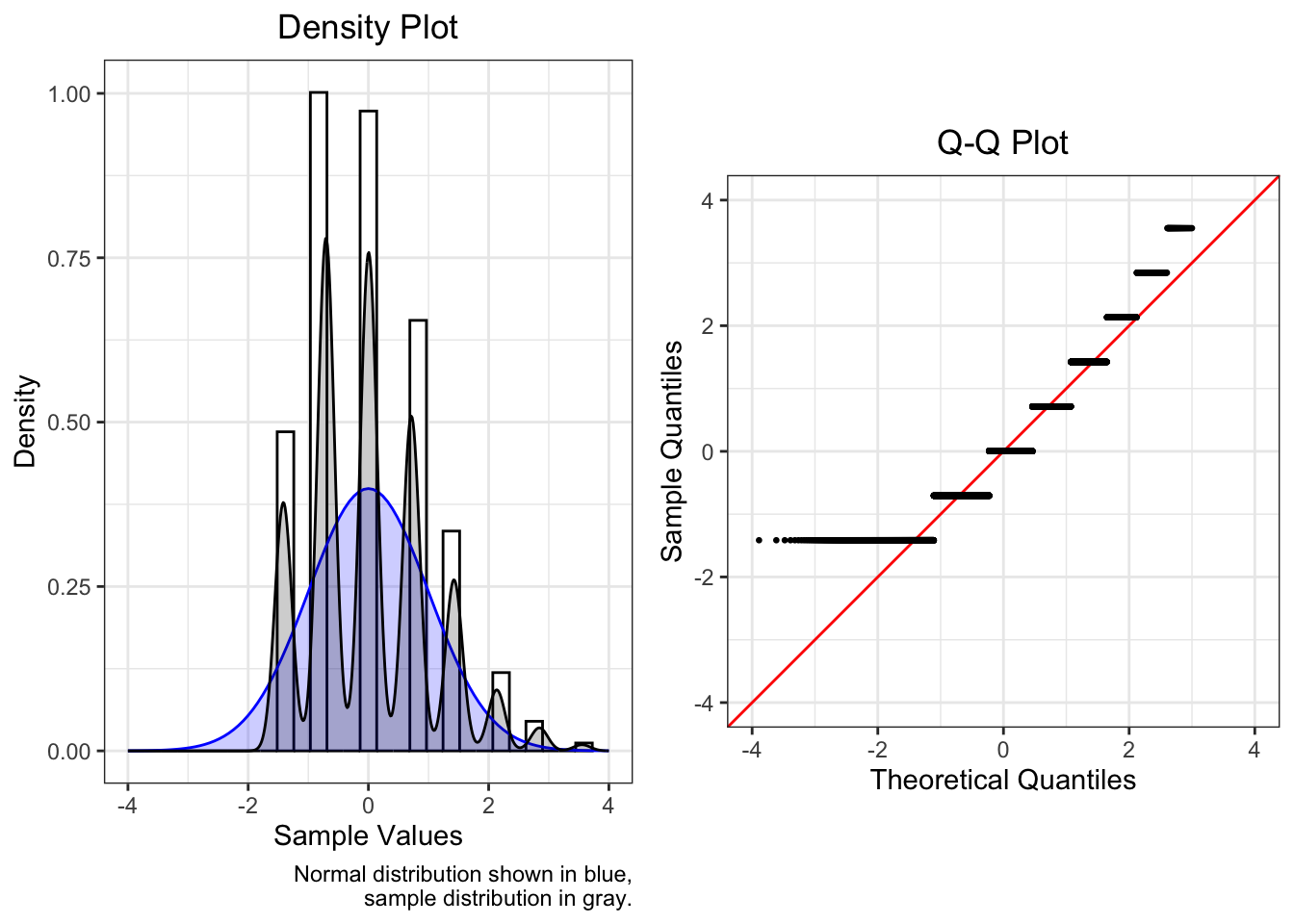
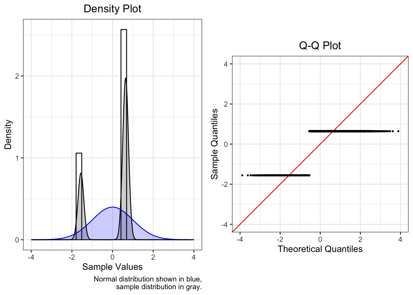
4.4.4 Multiple Peaks
If model residuals are bimodal or polymodal, almost certainly missing a categorical variable
A density plot is more useful than a Q-Q plot in this situation.
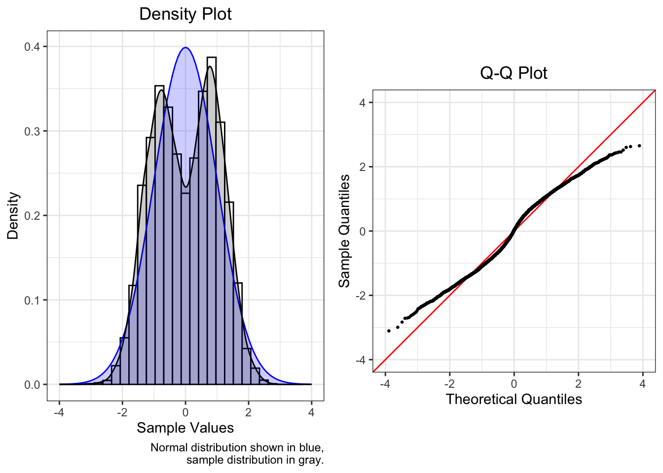
| Mean | SD | Median | Skew | Kurtosis |
|---|---|---|---|---|
| 0 | 1 | 0.022 | -0.044 | -0.931 |
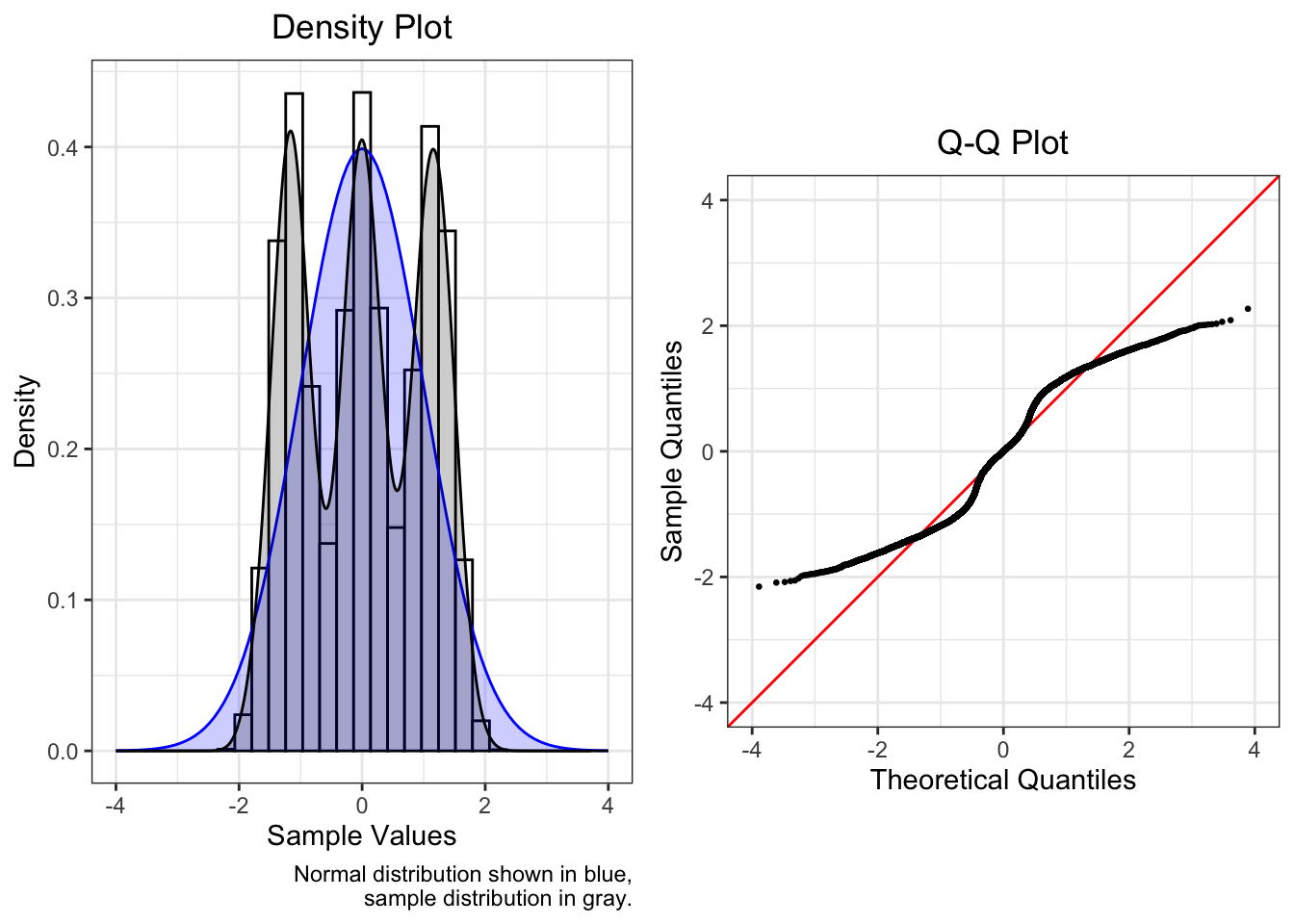
| Mean | SD | Median | Skew | Kurtosis |
|---|---|---|---|---|
| 0 | 1 | 0.001 | -0.006 | -1.247 |
4.4.5 Truncation / Censoring
Truncation is when observations above or below a certain limit are excluded, and censoring is when those observations are assigned the value(s) of the limit(s).
Examples of truncation include income when looking only at individuals above or below the poverty line, or the ages of children in grade school.
Examples of censoring include bottom- or top-coded data (as in IPUMS or Census data), or floor or ceiling effects (as with some survey items or measurement scales).
The examples below all use truncated normal distributions.
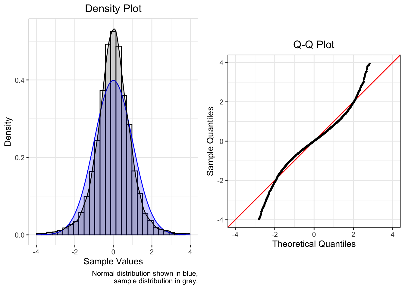
4.4.5.1 Left
The plot below is of a truncated normal with a lower limit of -1.
Note how the plots are similar to those of a positively skewed distribution.

| Mean | SD | Median | Skew | Kurtosis |
|---|---|---|---|---|
| 0 | 1 | -0.099 | 0.614 | 0.072 |
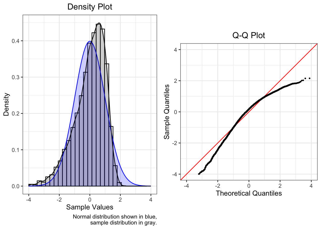
4.4.5.2 Right
Below is a truncated normal with an upper limit of 1.
Note how the plots are similar to those of a negatively skewed distribution.
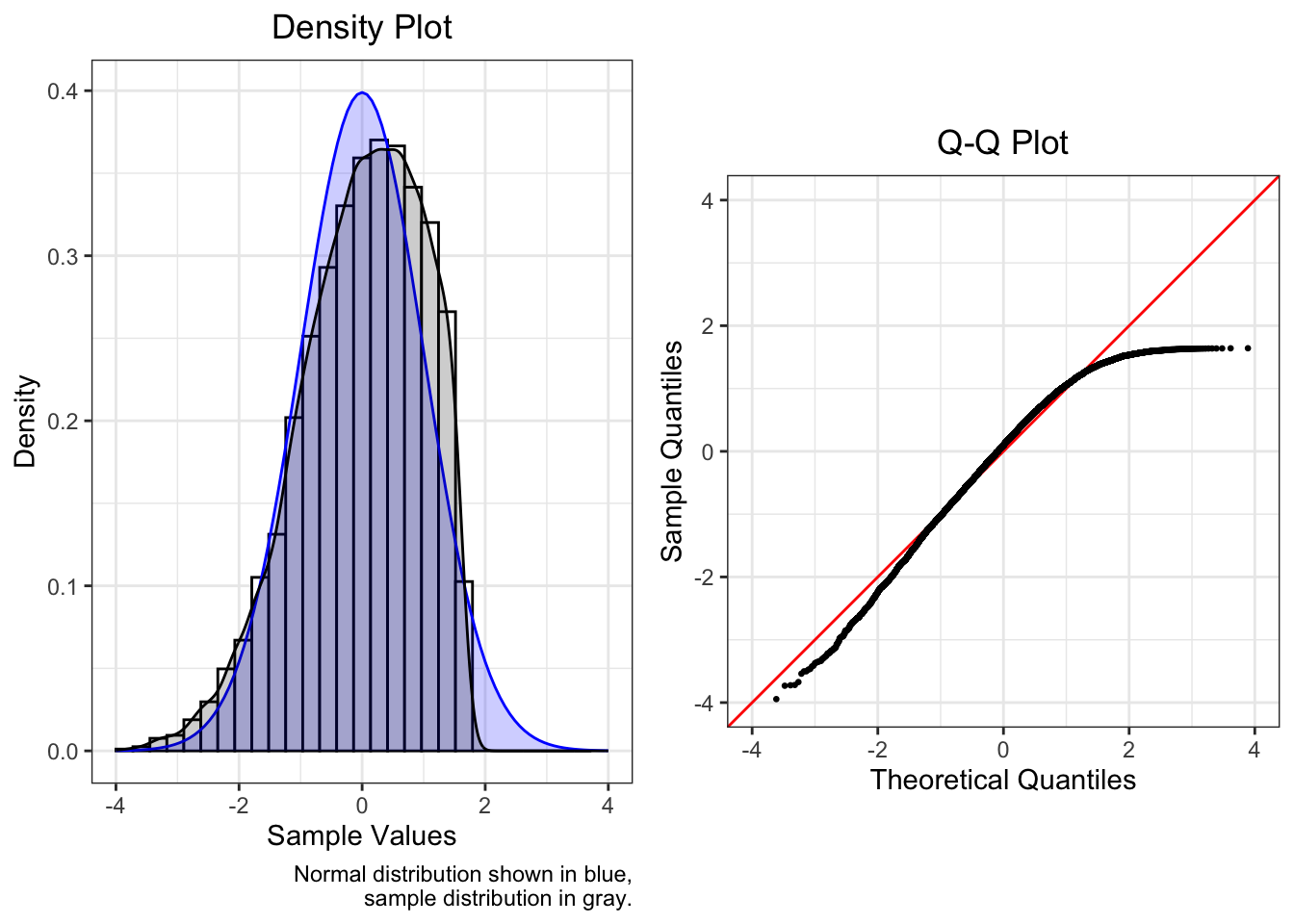
| Mean | SD | Median | Skew | Kurtosis |
|---|---|---|---|---|
| 0 | 1 | 0.097 | -0.568 | -0.054 |
4.4.5.3 Both
This plot shows a truncated normal with a lower limit of -1 and an upper limit of 1.
Note how the plots are similar to those of a thin-tailed distribution.
| Mean | SD | Median | Skew | Kurtosis |
|---|---|---|---|---|
| 0 | 1 | -0.004 | 0.019 | -1.085 |
Truncation or censoring is at times hardly noticeable. Would we notice if our normal distribution did not have any observations outside of [-4, 4], and would this affect our models? Probably not. The severity of the limits on the shape of the distribution helps us decide whether we need to take action.
4.5 Corrective Actions
Below is a non-exhaustive list of recommendations for handling non-normal residuals when fitting regression models.
The first solution to be considered in every case is whether the model was specified correctly, that there are not any additional variables we should have included in our model. You should also check the other regression assumptions, since a violation of one can lead to a violation of another.
First,
- Consider whether the model was specified correctly, and add or drop variables or interaction terms.
- Check the other regression assumptions, since a violation of one can lead to a violation of another.
If evidence of non-normality remains,
- Determine the shape of the residual distribution from the Q-Q plot
- Choose and apply a correction from the list below.
- Note: A drawback of outcome variable transformations is that predicted values are not on the original scale, so variables need to be back-transformed to recover interpretability.
- After you have applied any corrections or changed your model in any way, you must re-check this assumption and all of the other assumptions.
4.5.1 Corrections by Residual Distribution Shape
- Skew:
- Fit a generalized linear model (e.g., gamma, inverse Gaussian, binomial)
- Transform outcome1 (\(y\)) after adding or subtracting a constant (\(c\)) so that the minimum is 1:2
- Moderate positive skew: \(\sqrt{y+c}\), where \(c = 1 - \min(y)\)
- Substantial positive skew: \(\log (y+c)\), where \(c = 1 - \min(y)\)
- Severe positive skew: \(\frac {1} {y+c}\), where \(c = 1 - \min(y)\)
- Moderate negative skew: \(\sqrt{c-y}\), where \(c = 1 + \max(y)\)
- Substantial negative skew: \(\log (c-y)\), where \(c = 1 + \max(y)\)
- Severe negative skew: \(\frac {1} {c-y}\), where \(c = 1 + \max(y)\)
- As an alternative for any case, apply a Box-Cox transformation after making the minimum value 1.
- Multiple peaks:
- Add a categorical predictor
- Fat or thin tails:
- If asymmetric, see “Skew” above
- If fat-tailed, transform outcome with an inverse hyperbolic sine transformation with the
asinh()function3
- Truncated / censored:
- Fit a Heckman model
- If limited on both sides, fit a generalized linear model (e.g., beta, logit)
- Discrete distributions:
- Fit a generalized linear model (e.g., multinomial logit, Poisson)
Tabachnick, B. G., & Fidell, L. S. (2013). Using multivariate statistics (6th ed.). Pearson.↩︎
Osborne, J. (2002). Notes on the use of data transformations. Practical Assessment, Research, and Evaluation, 8(6), 1-7. https://doi.org/10.7275/4vng-5608↩︎
Pence, K. M. (2006). The role of wealth transformations: An application to estimating the effect of tax incentives on saving. Contributions to Economic Analysis & Policy, 5(1), 1-24. https://doi.org/10.1515/1538-0645.1430.↩︎