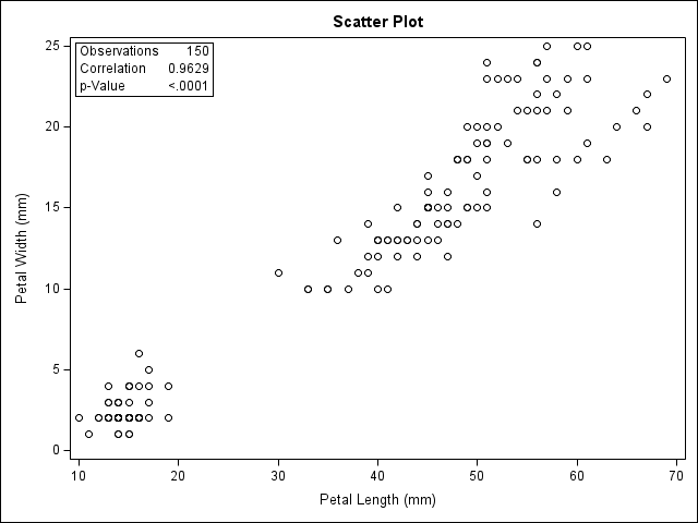
title 'Fisher (1936) Iris Data';
proc sgplot data=sashelp.iris;
   scatter x=petallength y=petalwidth;
run;Common SAS Plots
Note that PROC SGPLOT and graphs produced in statistical PROCs sometimes have different titles, regardless of the TITLE statement.
The TITLE statement is a global option, that affects page titles as well as (some) graph titles.
Scatter Plots
sgplot

With groups identified by color or marker, depending on the style template.
title 'Fisher (1936) Iris Data';
proc sgplot data=sashelp.iris;
   scatter x=petallength y=petalwidth / group=species;
run;
proc corr
title 'Fisher (1936) Iris Data';
ods select scatterplot;
proc corr data=sashelp.iris plots=scatter(ellipse=none);
    var petallength petalwidth;
    run;
Frequency Plots (Bar Charts)
Bar charts are often abused to show point estimates, like means. They are used to best visual effect when they represent counts and percents.
sgplot
title "Framingham Heart Study";
proc sgplot data=sashelp.heart;
    vbar status / stat=percent;
    run;
proc freq (one-way)
title "Framingham Heart Study";
ods select freqplot;
proc freq data=sashelp.heart;
    tables status / plots=freqplot(scale=percent);
    run;
Grouped Frequencies
sgplot
title "Framingham Heart Study";
proc sgplot data=sashelp.heart;
    vbar sex / group=status groupdisplay=cluster;
    run;
proc freq (crosstabs)
title "Framingham Heart Study";
ods select freqplot;
proc freq data=sashelp.heart;
    tables status*sex / plots=freqplot(twoway=cluster);
    run;
Box Plots
Box plots are commonly used to show the distribution of the data within categories. Keep in mind that they do not show you standard deviations or standard errors. Instead they seek to identify observations that are outliers.
In this example, note that strain is a character variable, so the category order is alphabetic order. Reorder them with informats and formats.
data Clover;
   input Strain $ Nitrogen @@;
   datalines;
3DOK1  19.4 3DOK1  32.6 3DOK1  27.0 3DOK1  32.1 3DOK1  33.0
3DOK5  17.7 3DOK5  24.8 3DOK5  27.9 3DOK5  25.2 3DOK5  24.3
3DOK4  17.0 3DOK4  19.4 3DOK4   9.1 3DOK4  11.9 3DOK4  15.8
3DOK7  20.7 3DOK7  21.0 3DOK7  20.5 3DOK7  18.8 3DOK7  18.6
3DOK13 14.3 3DOK13 14.4 3DOK13 11.8 3DOK13 11.6 3DOK13 14.2
COMPOS 17.3 COMPOS 19.4 COMPOS 19.1 COMPOS 16.9 COMPOS 20.8
;
sgplot
title1 'Nitrogen Content of Red Clover Plants';
proc sgplot data=Clover;
    vbox nitrogen / category=strain;
    run;
glm
title1 'Nitrogen Content of Red Clover Plants';
ods select BoxPlot;
proc glm data = Clover; /* or PROC ANOVA */
   class Strain;
   model Nitrogen = Strain;
run; quit;
Regression plots
sgplot
proc sgplot data=sashelp.cars;
    reg y=mpg_highway x=weight;
    run;
reg
ods select FitPlot;
proc reg data=sashelp.cars;
    model mpg_highway = weight;
    run; quit;
Regression with a Categorical Variable
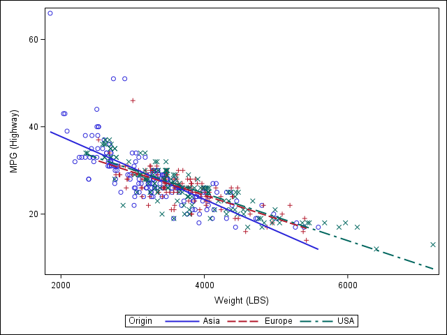
Different categories produce different lines. In other words, if this were a regression, it would include interaction terms.
sgplot
proc sgplot data=sashelp.cars;
    reg y=mpg_highway x=weight / group=origin;
    run;
sgpanel
proc sgpanel data=sashelp.cars;
    panelby origin;
    reg y=mpg_highway x=weight;
    run;